Teatro Aveirense_1
Graphic Identity
This graphic identity is part of a multi-faceted project commemorating one hundred and forty years of the Teatro Aveirense (Aveiro Municipal Theatre). The other parts of the project are a special-edition book, and an exhibition.
1. The Graphic Identity
2. The Logo
3. The disembodiment of the project
1. The Graphic Identity
In aiming to design a new graphic identity for the theatre our concern from the outset extended well beyond simply creating a logo or a symbol. Our aim was to create a visual language – essentially, a graphic vocabulary and a way of putting that vocabulary together. The objective was for the future communications produced by the theatre to become as recognisable as possible precisely through the use of the graphic language we hoped to build – recognisable even in the absence of any logo.
We started therefore with a search for the visual ingredients that could form the basis of the language we wanted to build. And the best starting point for that exploration, was the archive of the theatre. That’s where we discovered a typographic wonderland, full of inspirational items pasted into archive books.
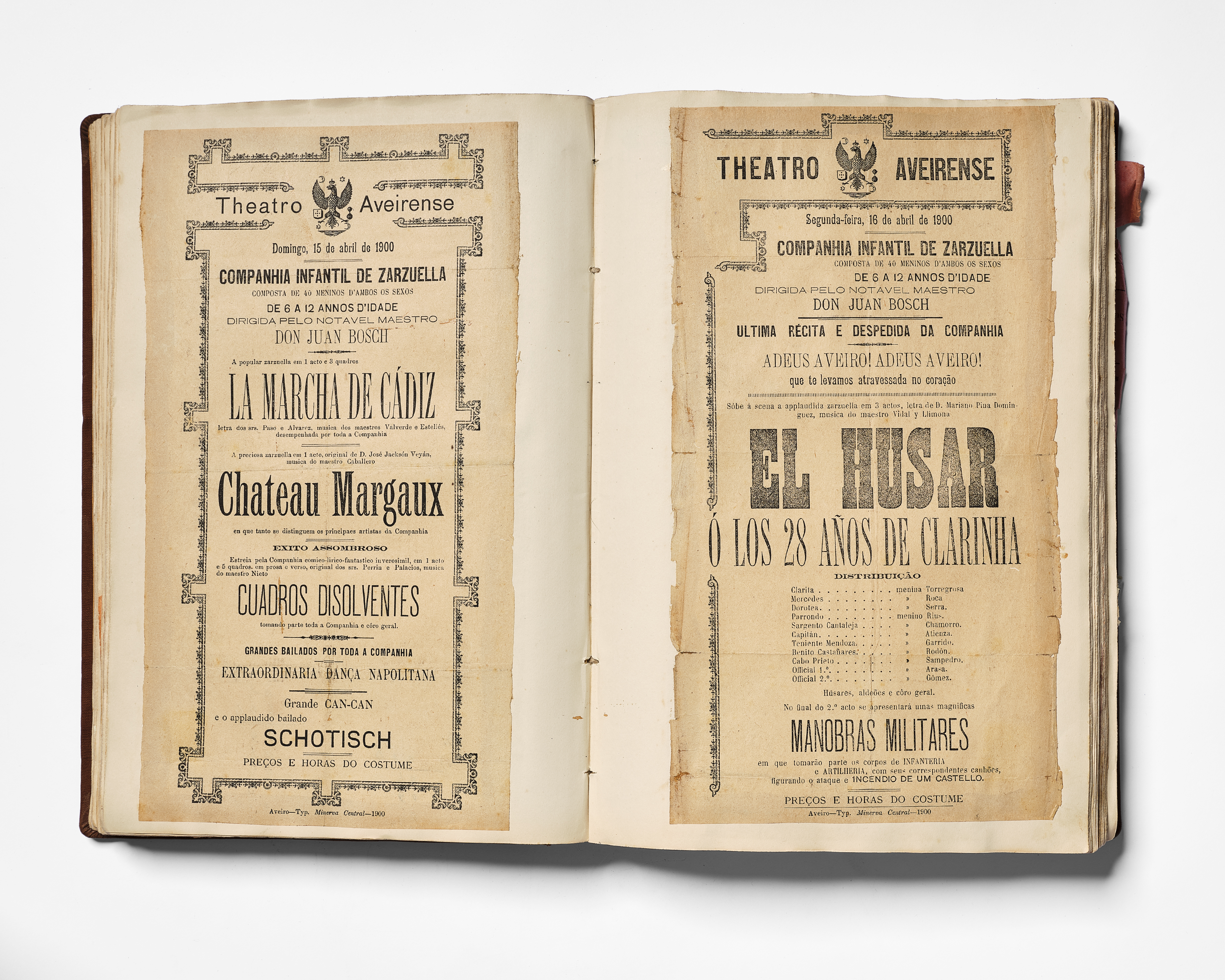
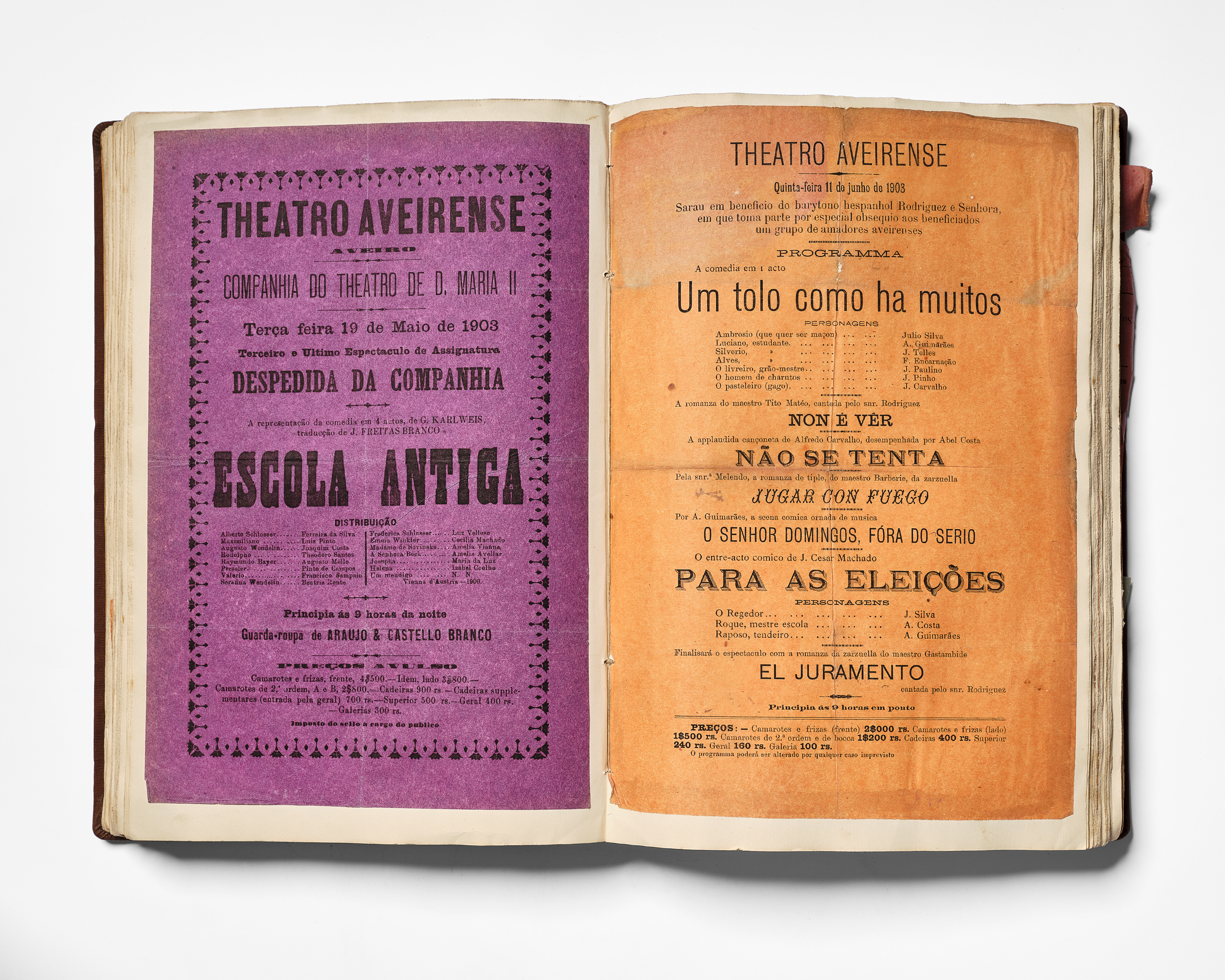
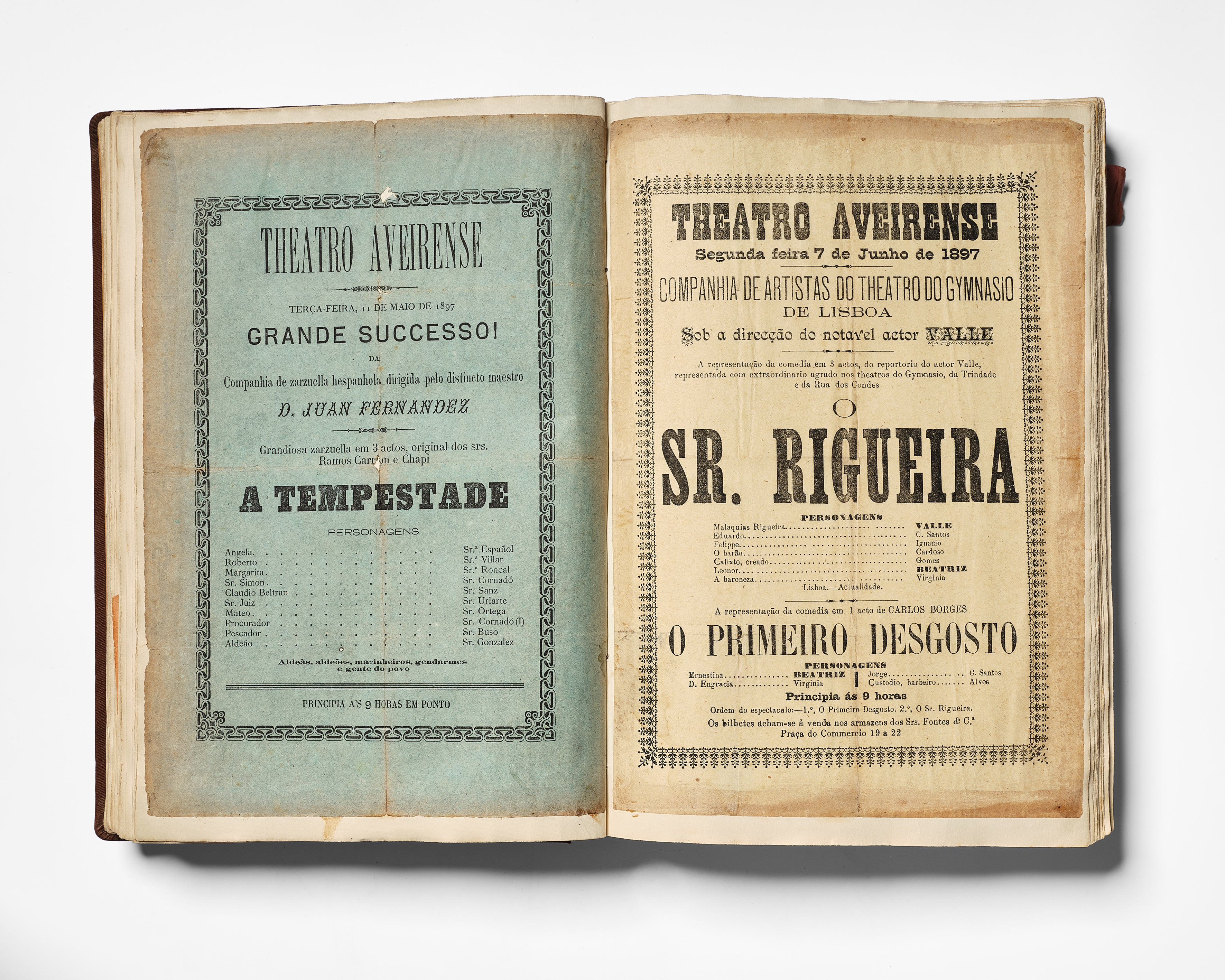
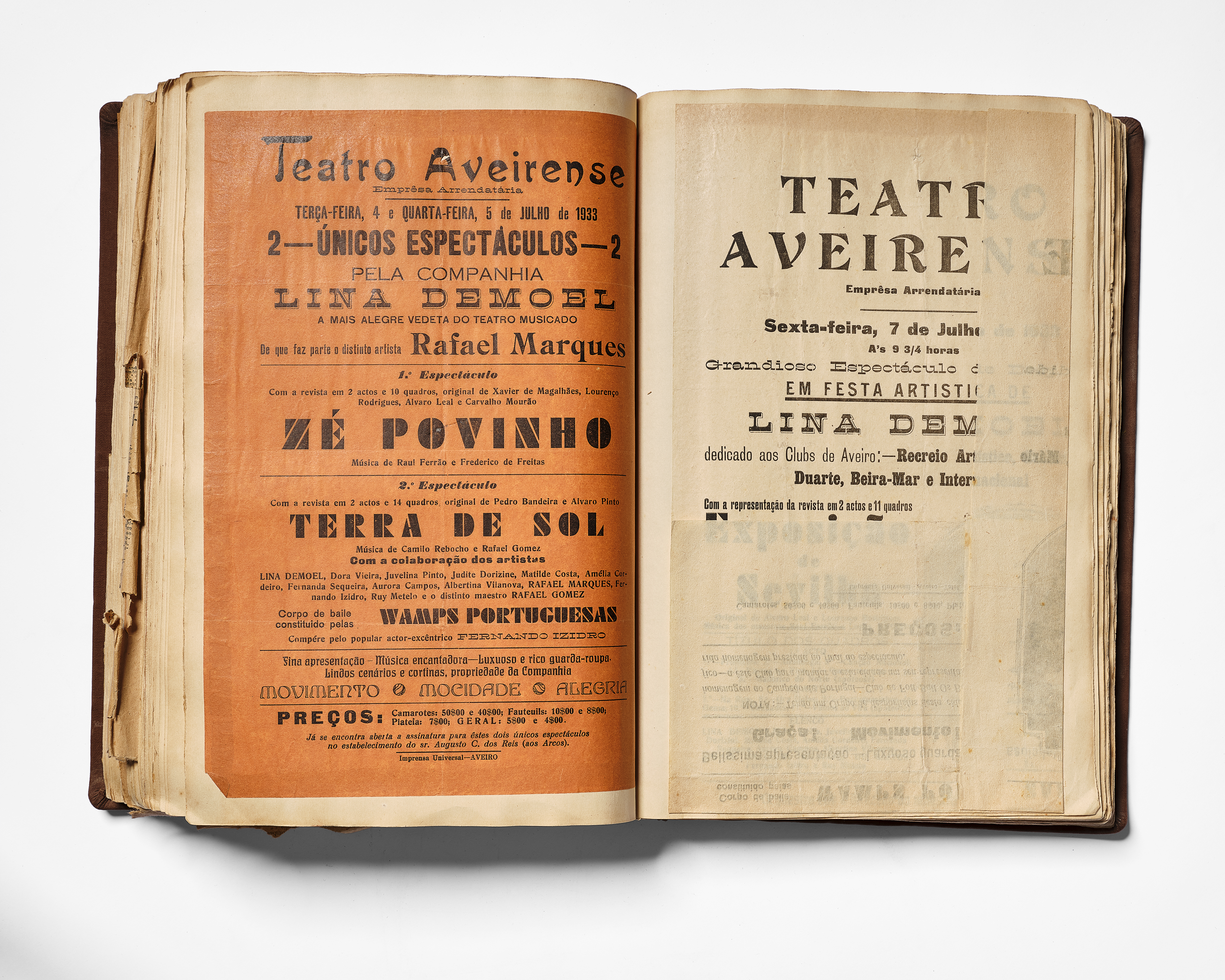
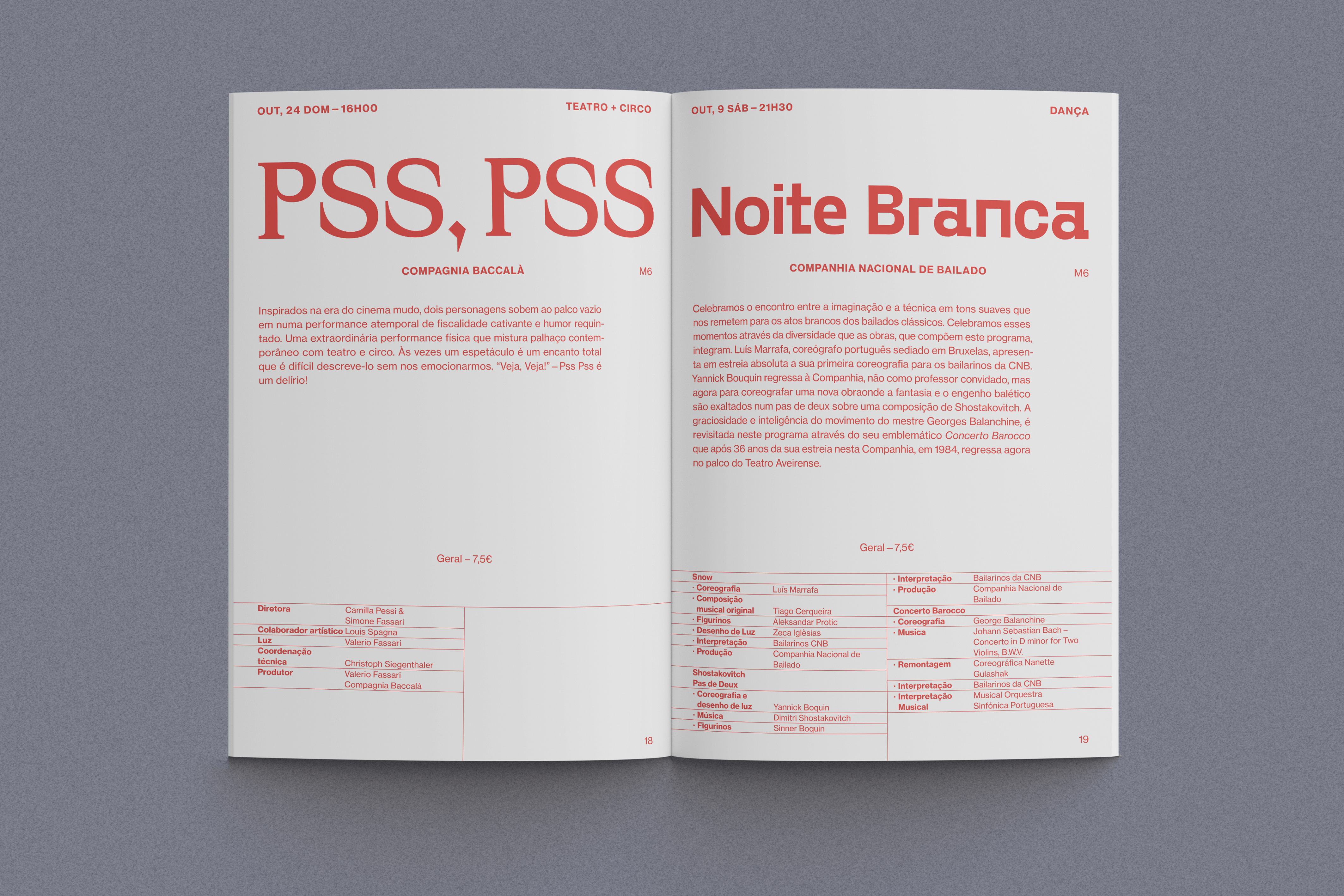
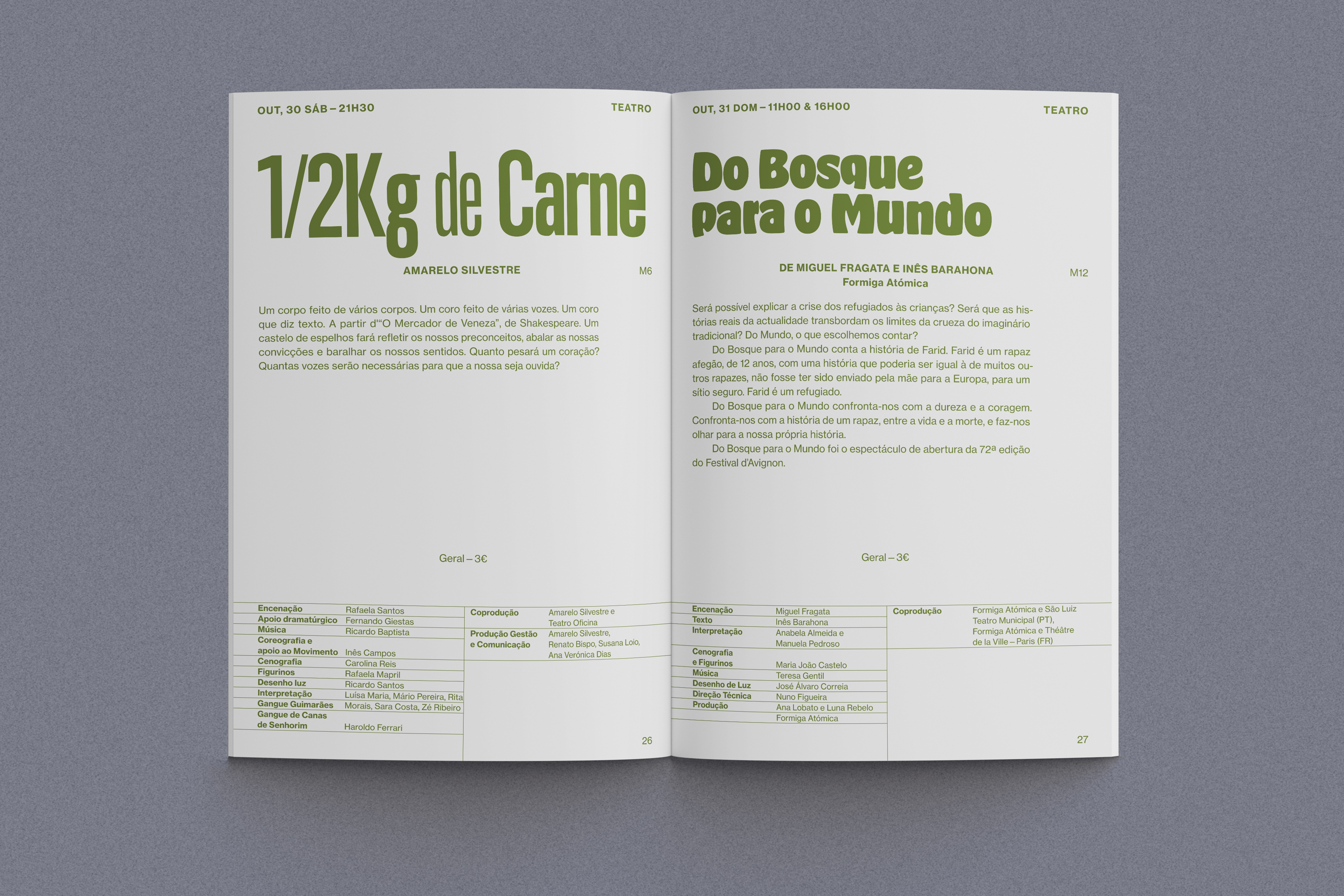
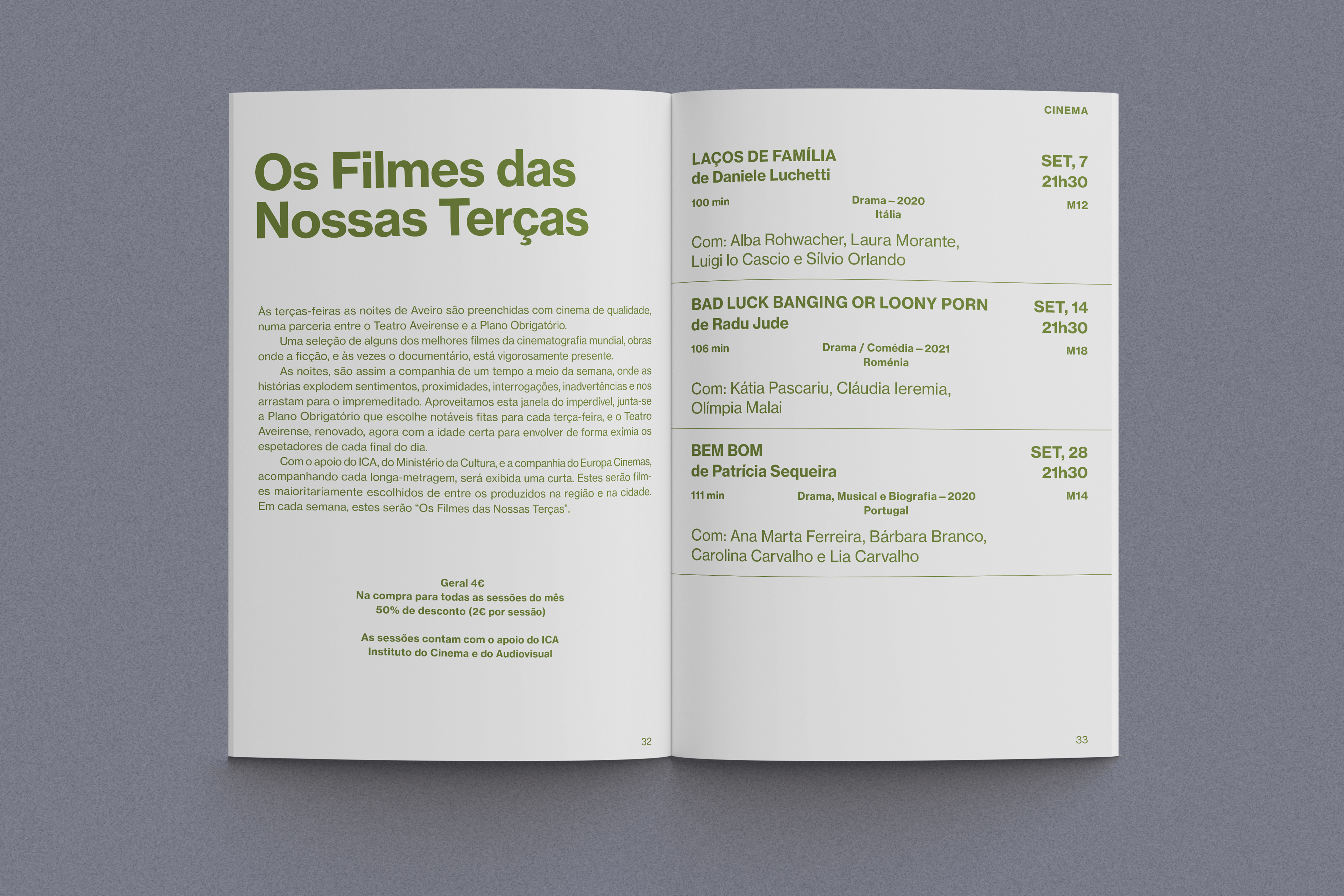
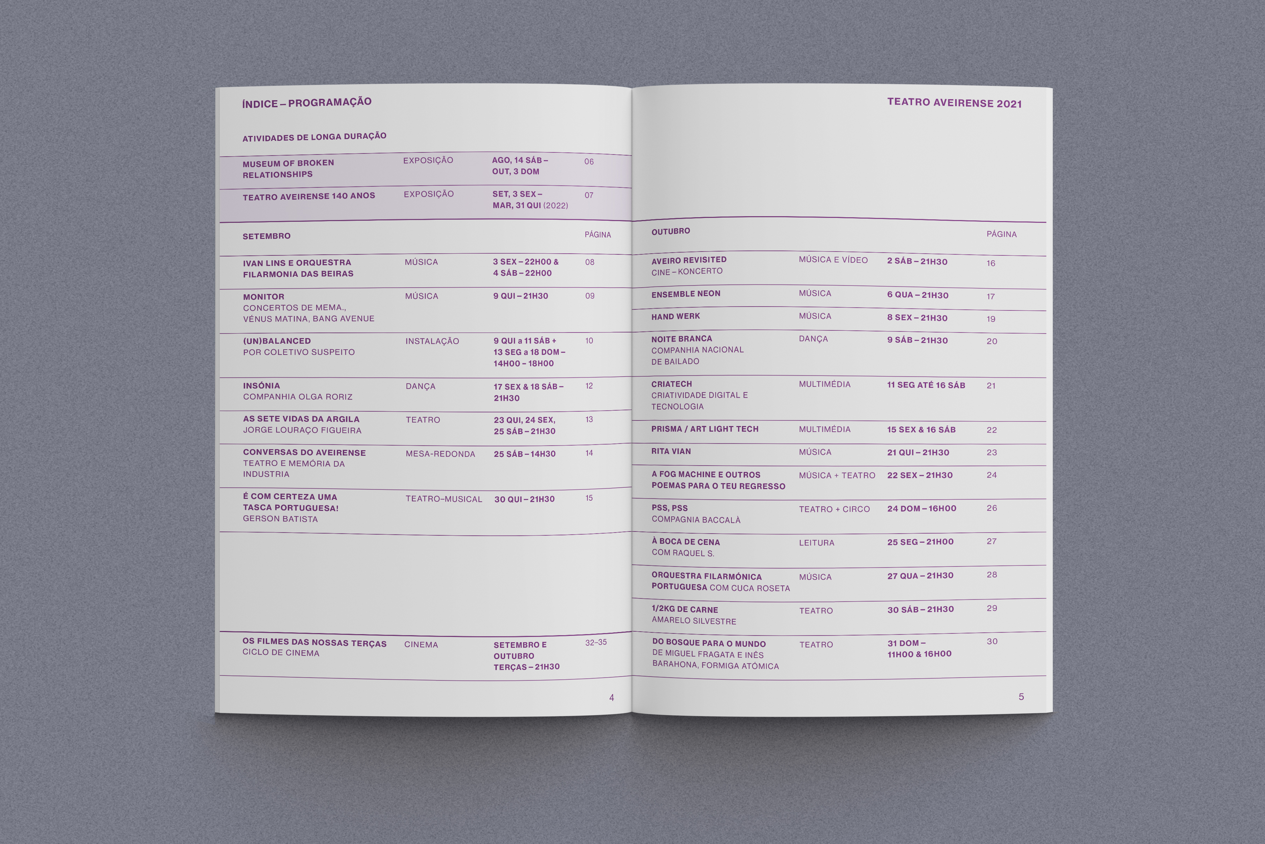
The most notable aspect of the historical programmes we discovered is their diverse use of type and typographic composition. This is related to the way in which they were made for the first 70 years of the theatre’s life—using letterpress printing (metal type).
We wanted to see if we could take this quite eclectic use of type as a starting point for the graphic language of the new identity, and the first element we wanted to apply it to was the quarterly printed programme of the theatre because it was (is) the item that most people come into contact with.
The quarterly programme became the centre of our attention. We analysed it in detail noting the many inconsistencies in the information presented as well as the haphazard use of typography and imagery.
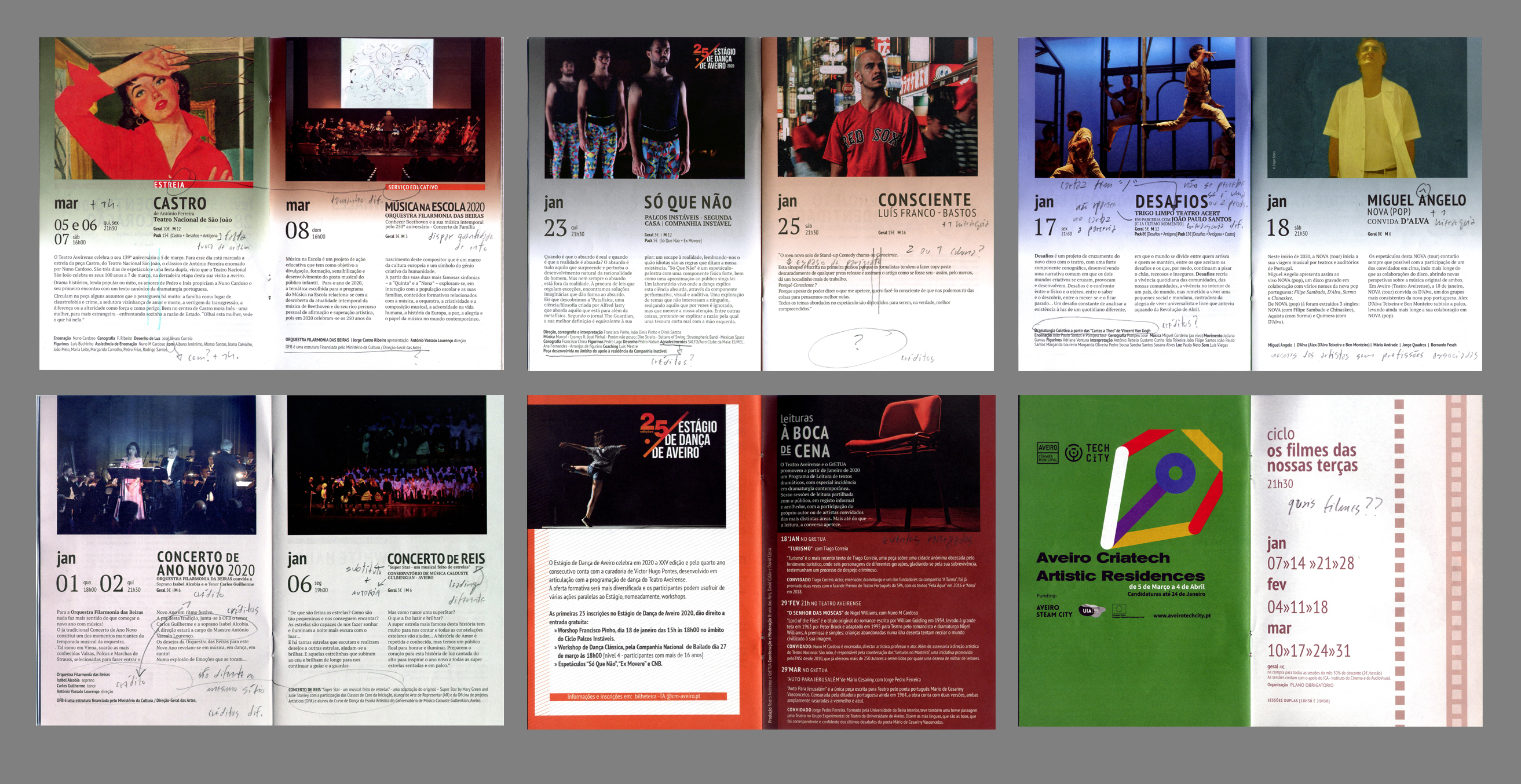
Two things became simultaneously apparent. The first was a dependancy on images for which there was no aesthetic consistency (design policy) or even technical quality, because the theatre had allowed image choice to be determined by what the visiting companies and performers sent them. The second was that beyond the quarterly programme their existed, in the theatre archive, an outstanding graphic patrimony, almost exclusively typographic in nature, that was being ignored.
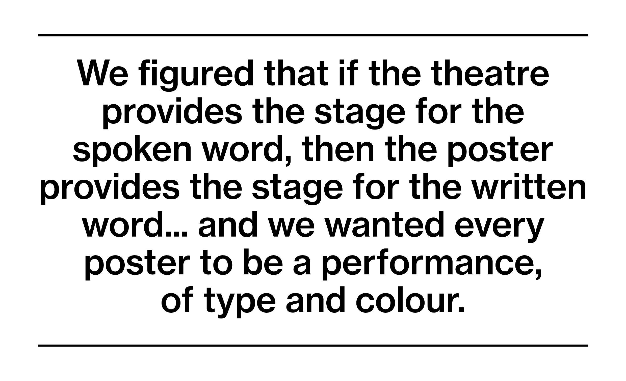
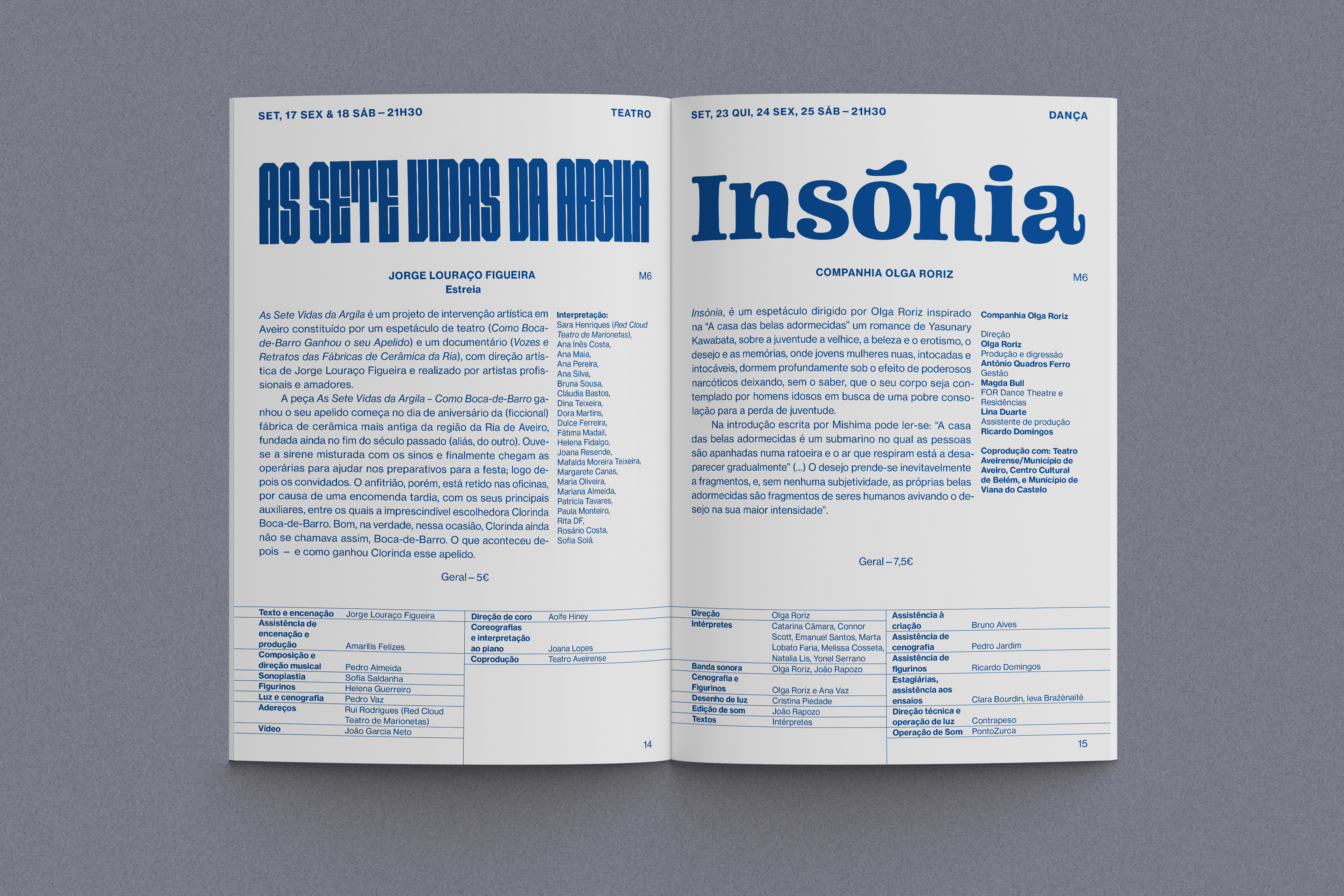
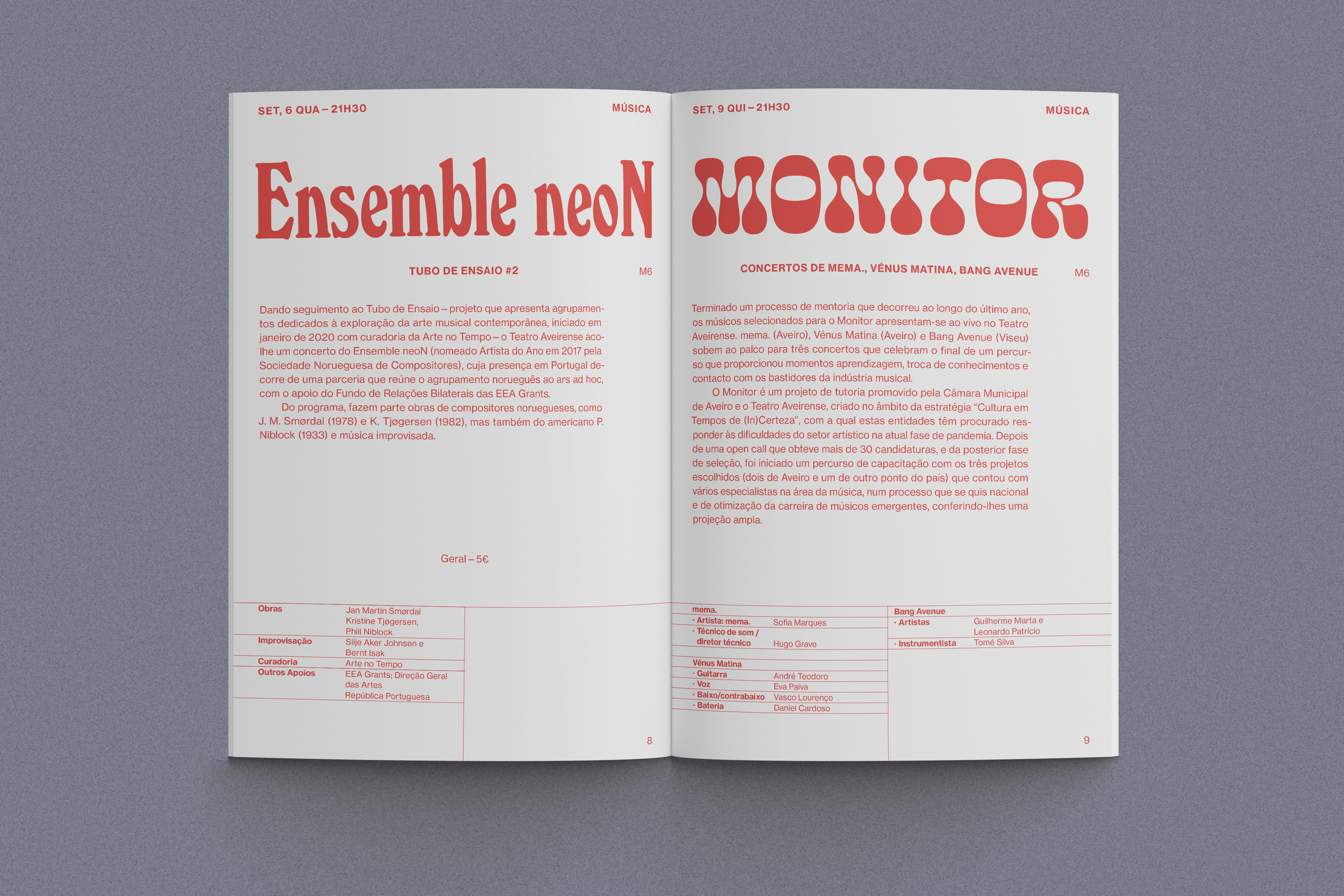
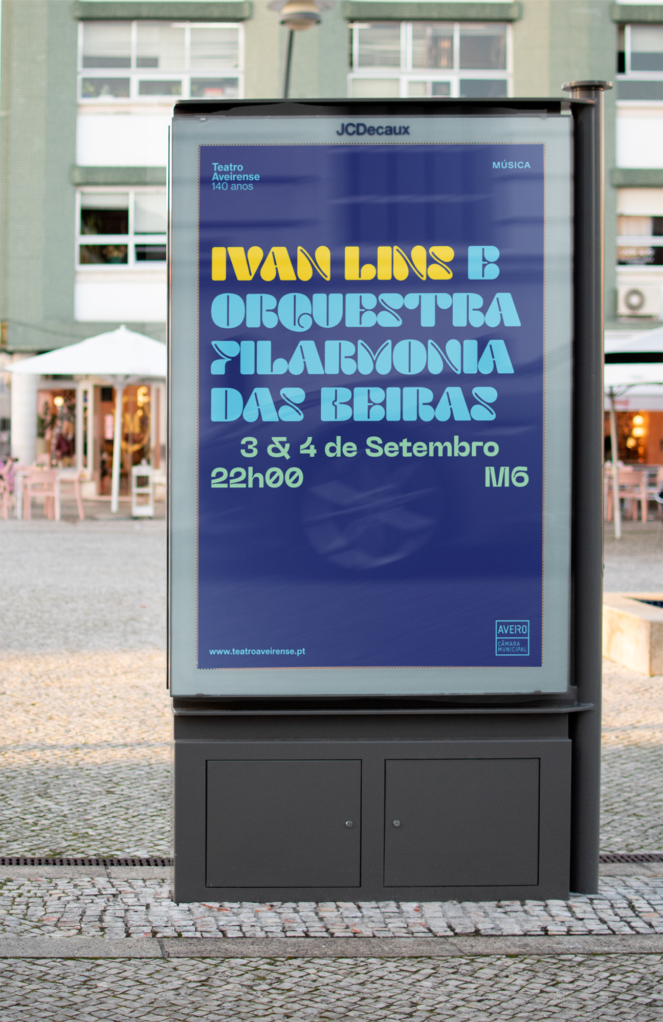
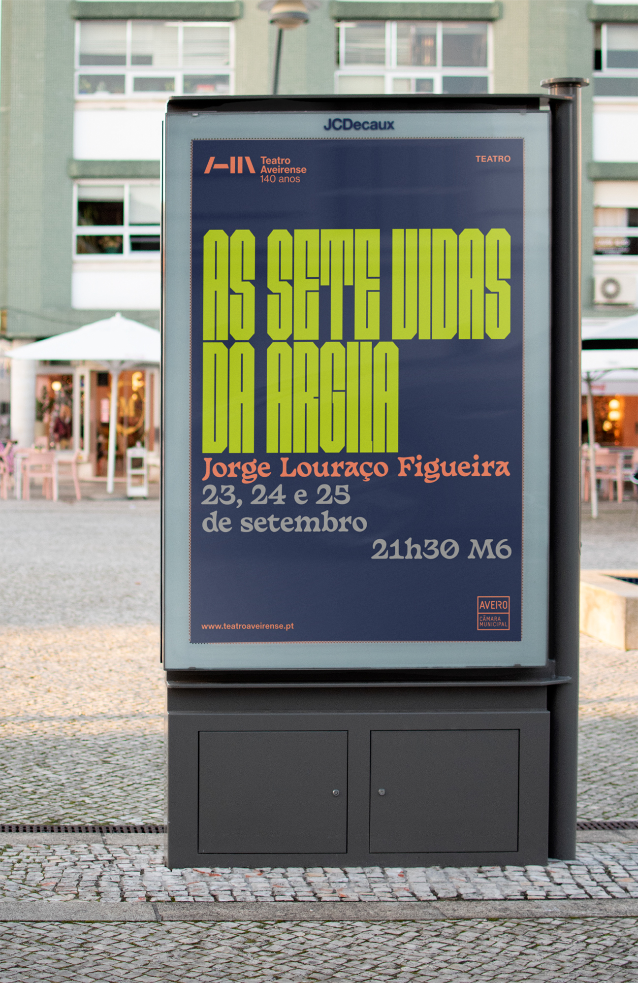
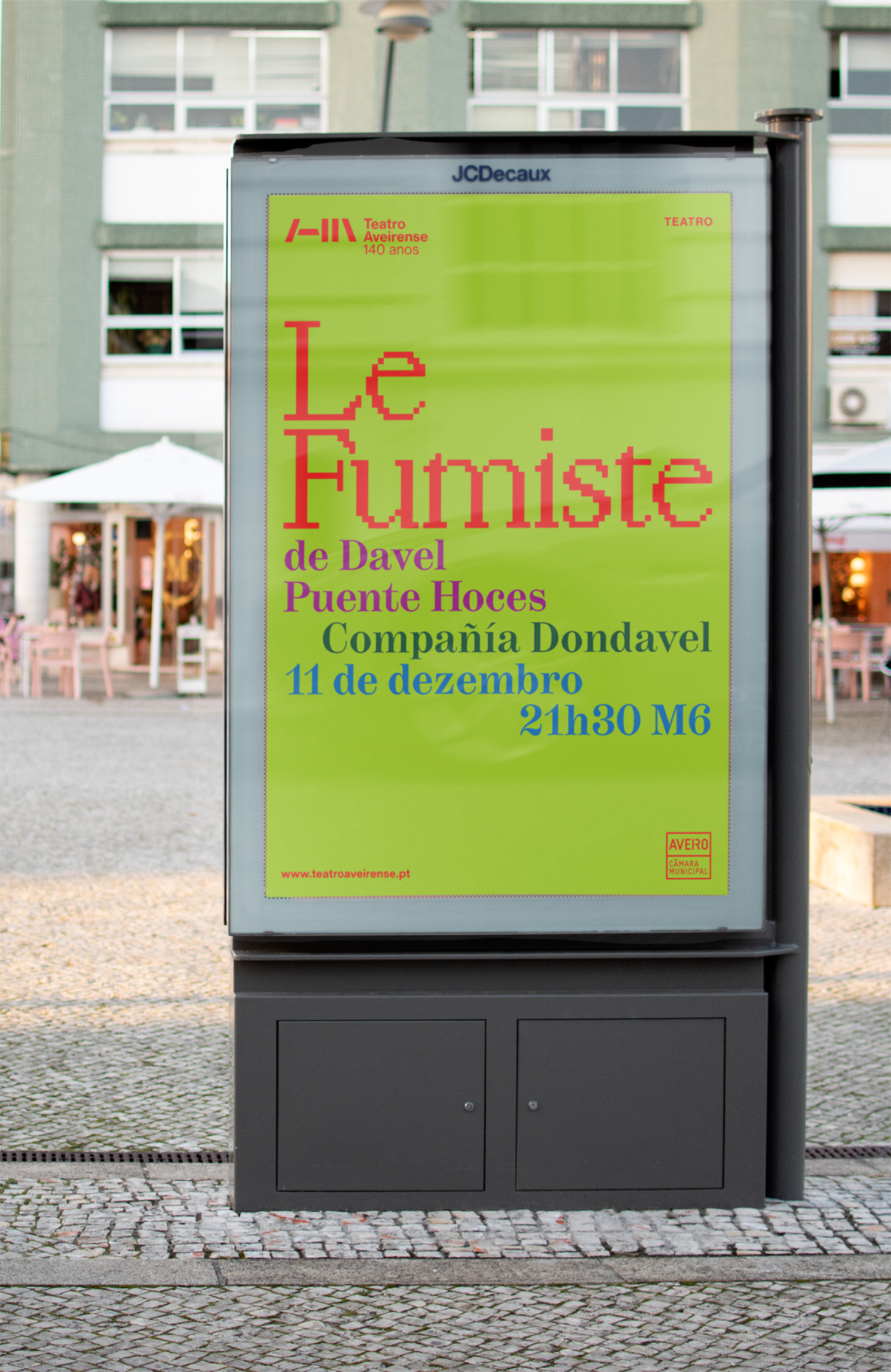
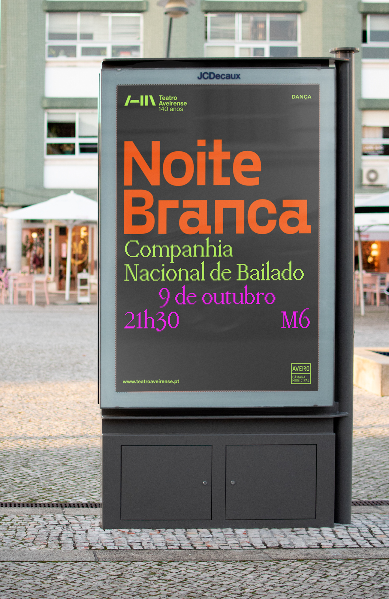
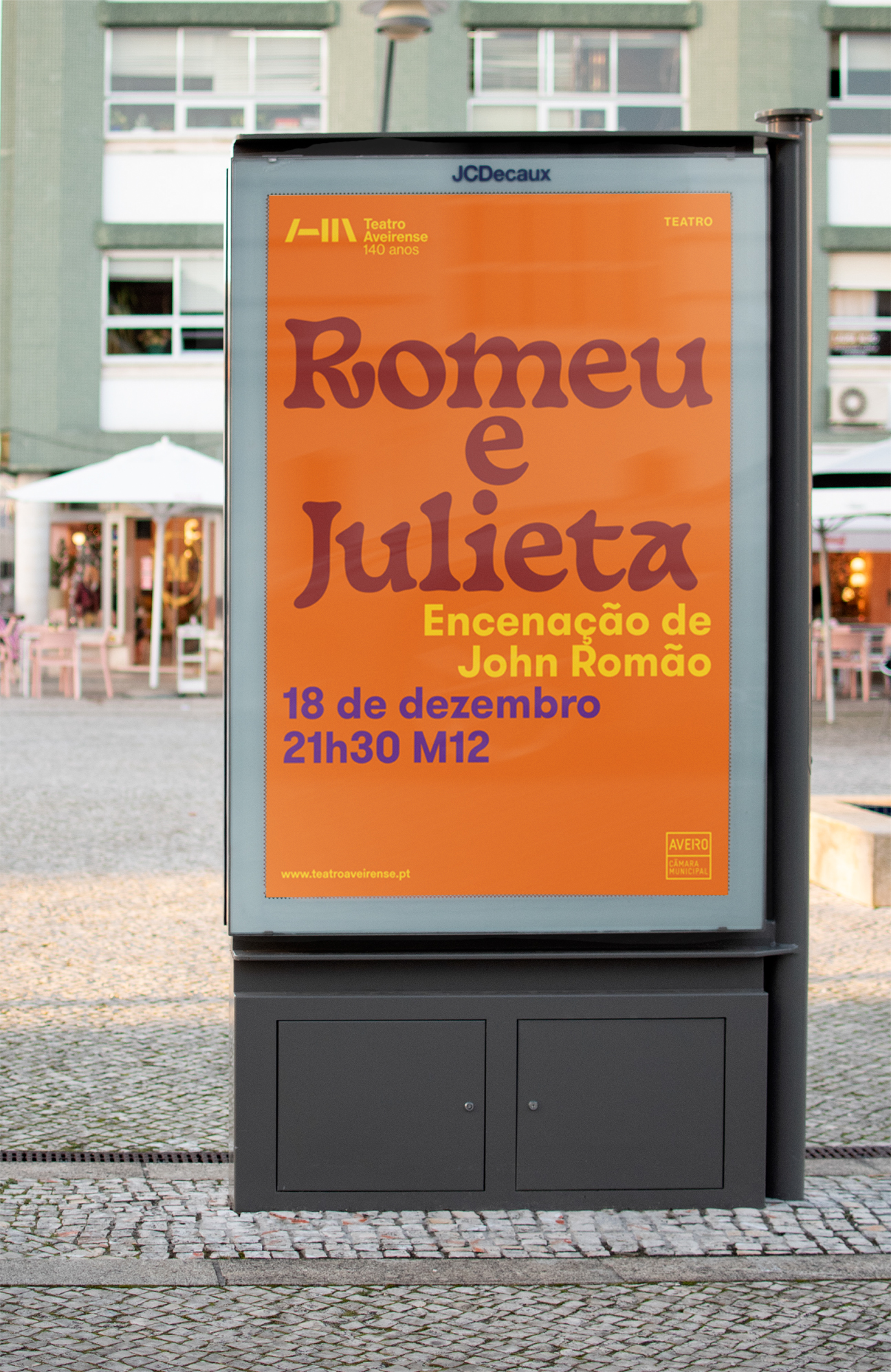
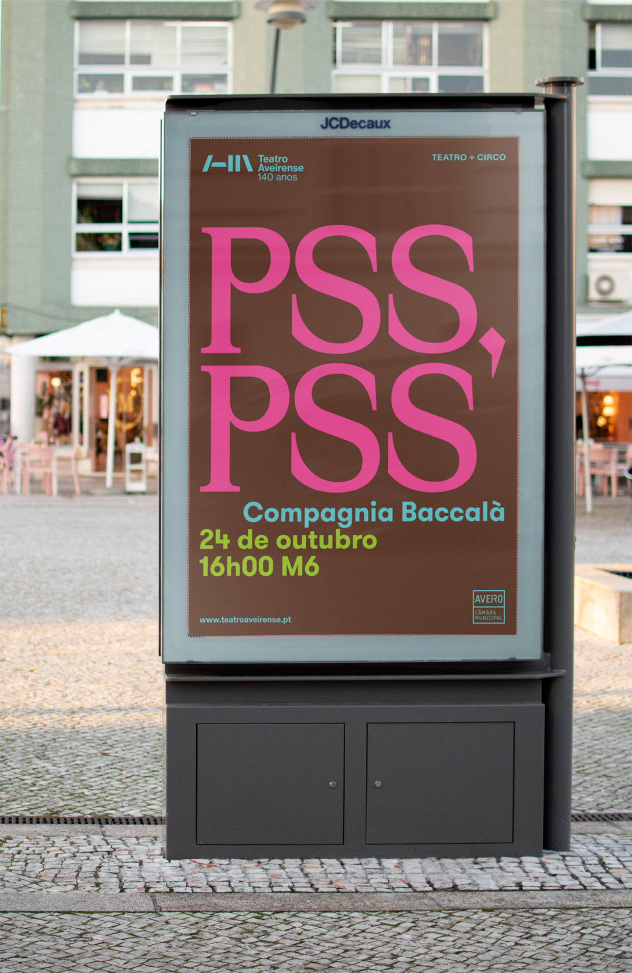
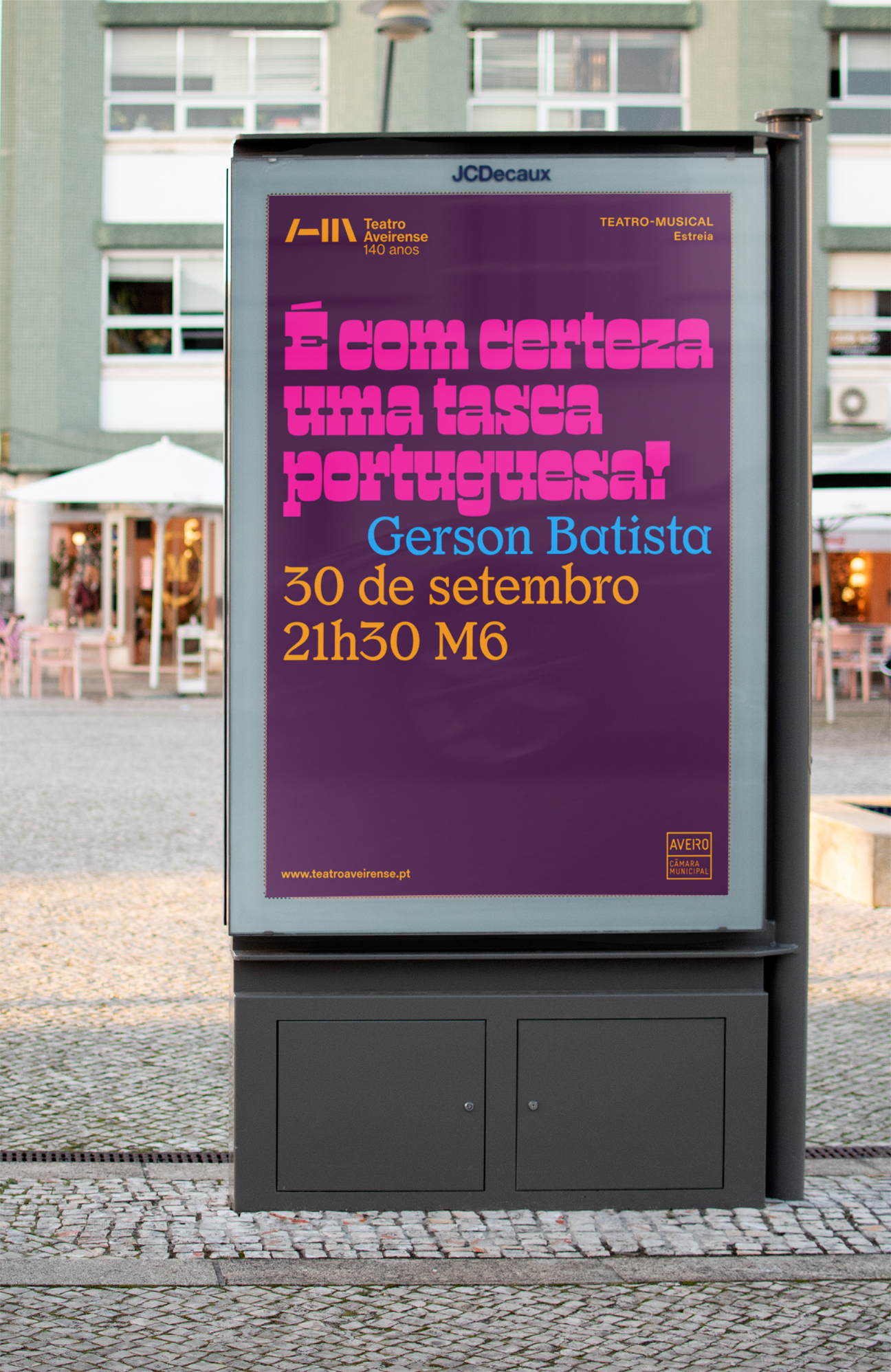
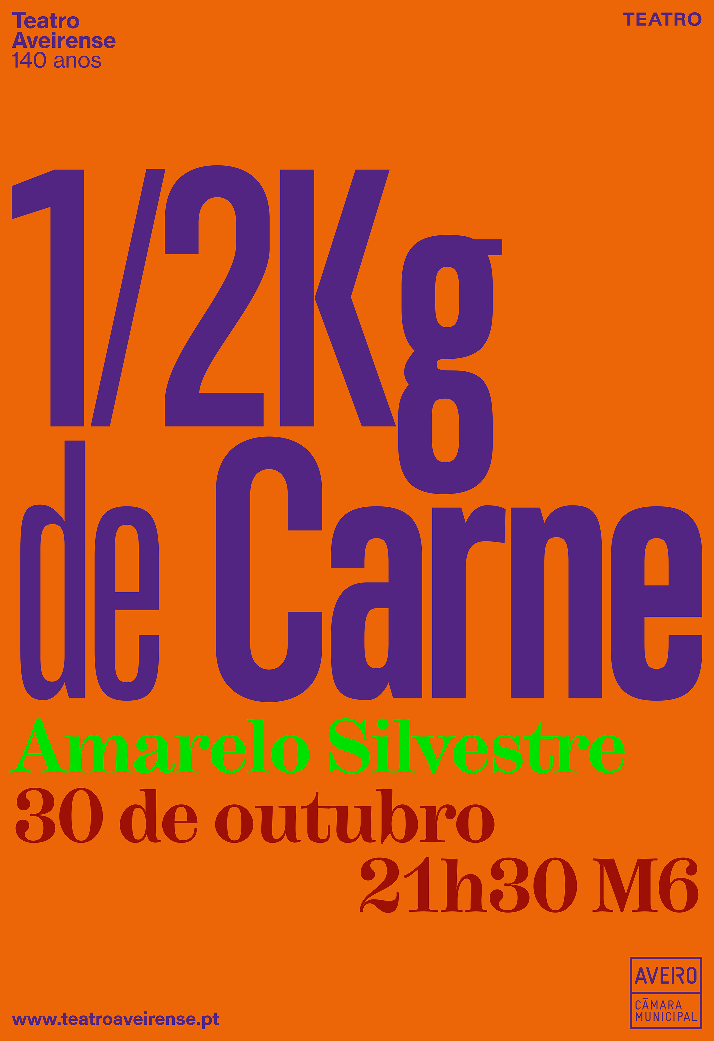
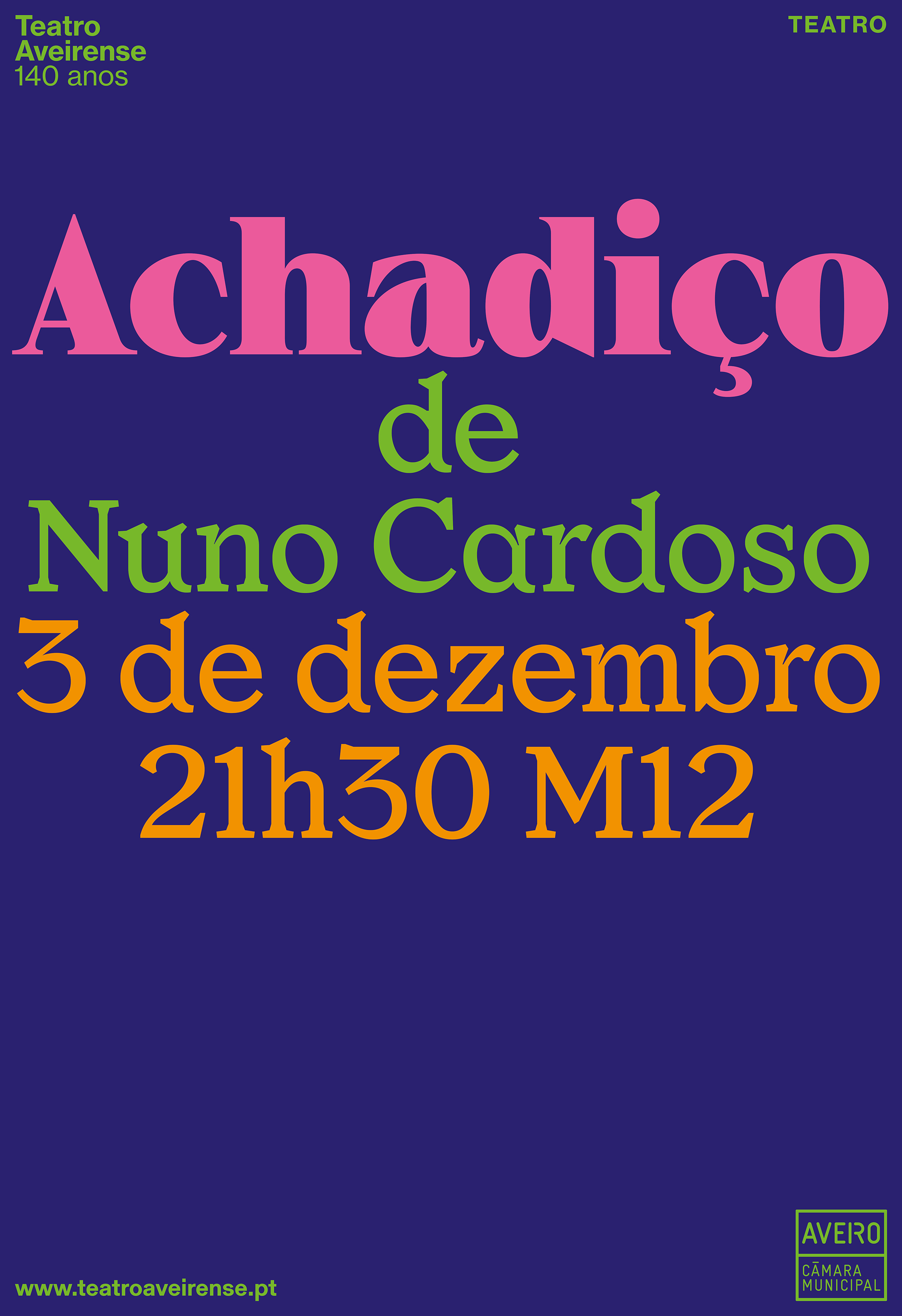
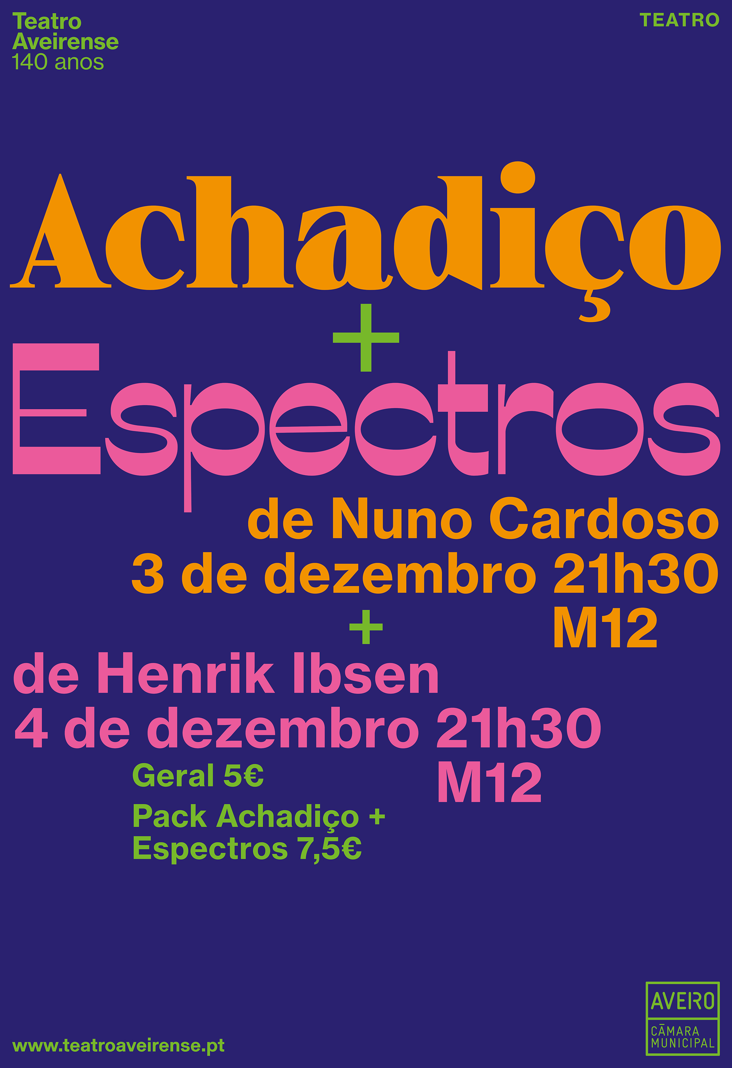
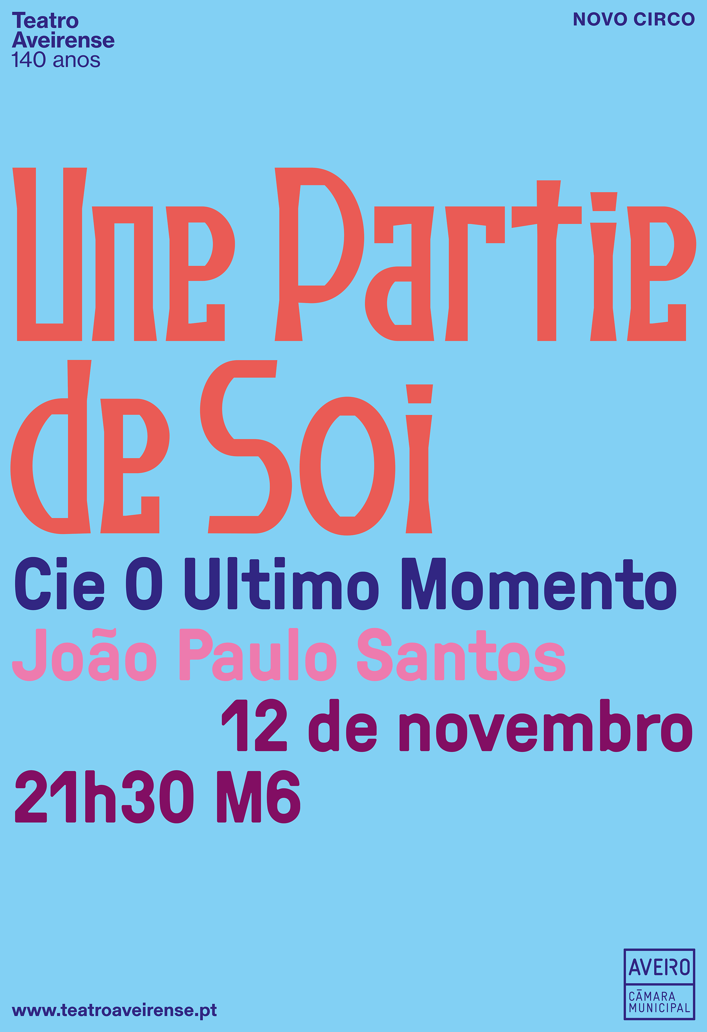
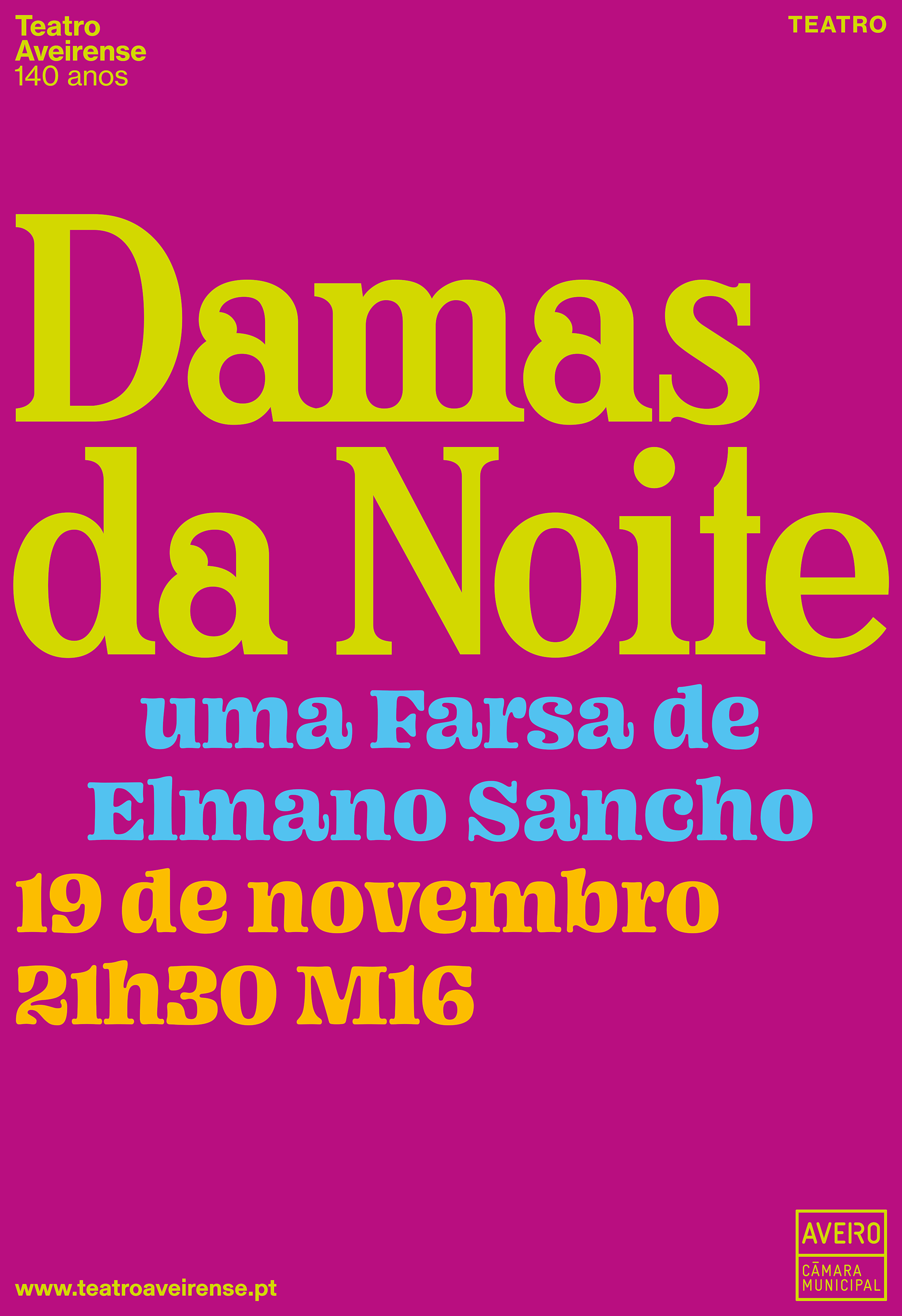
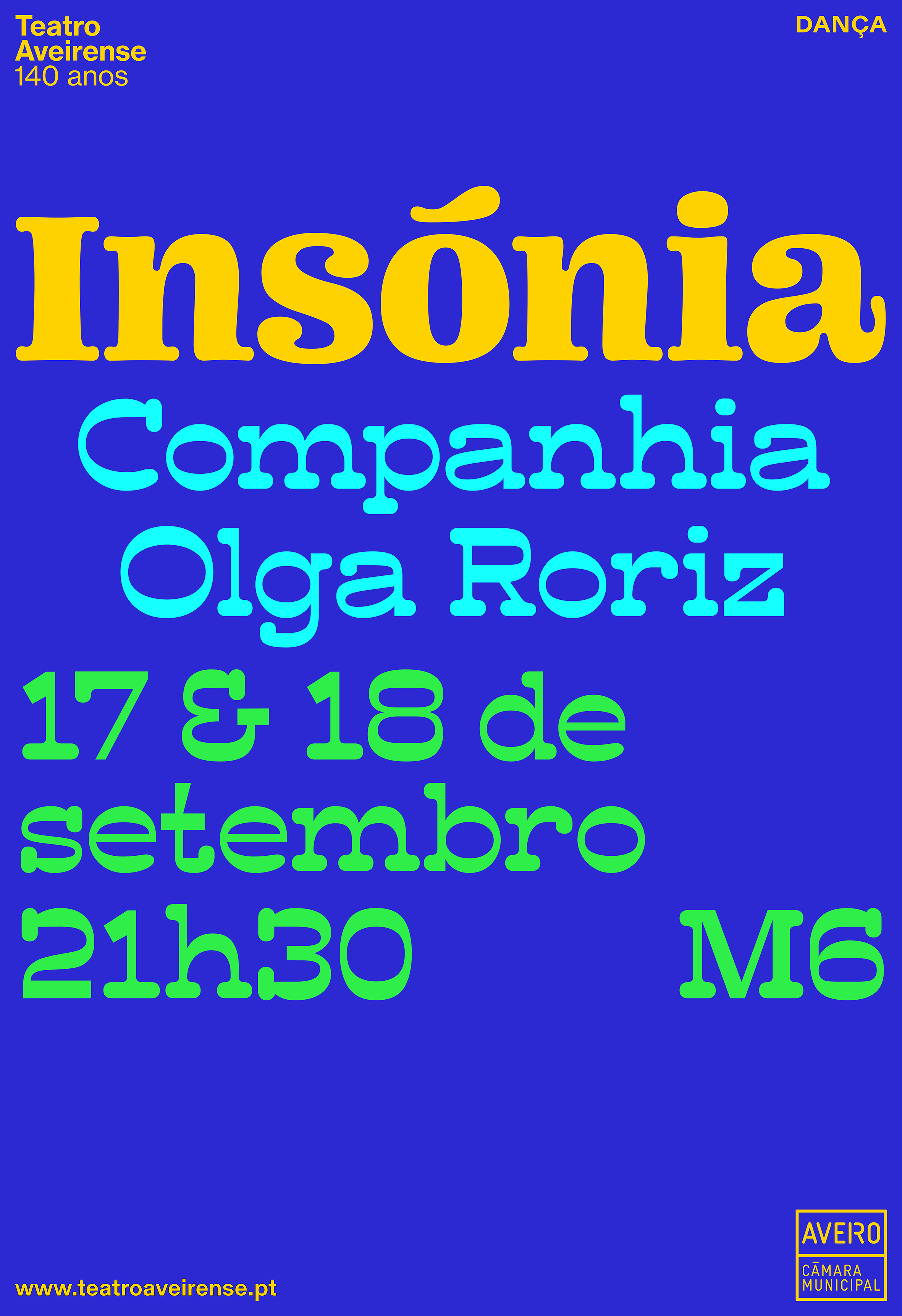
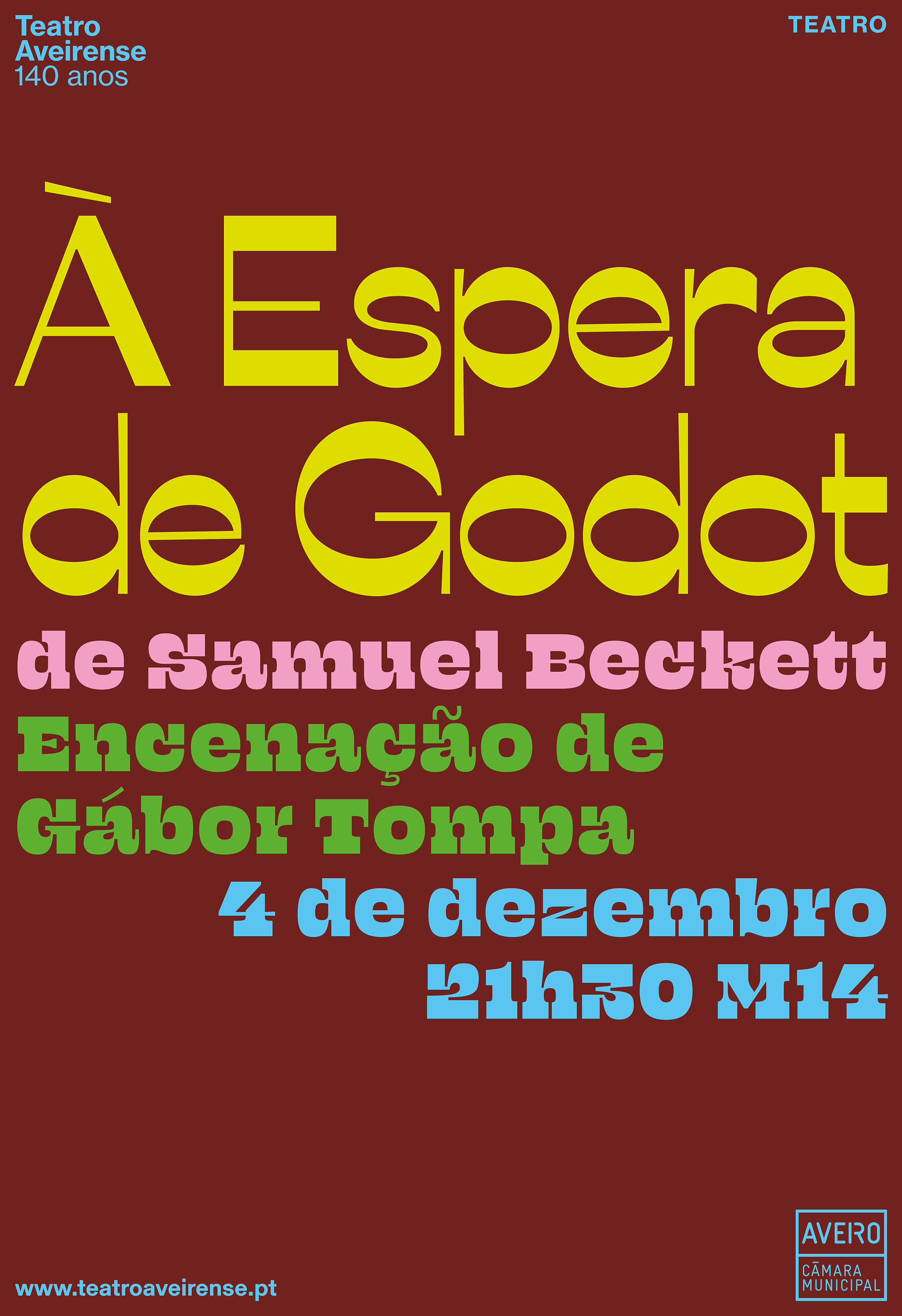
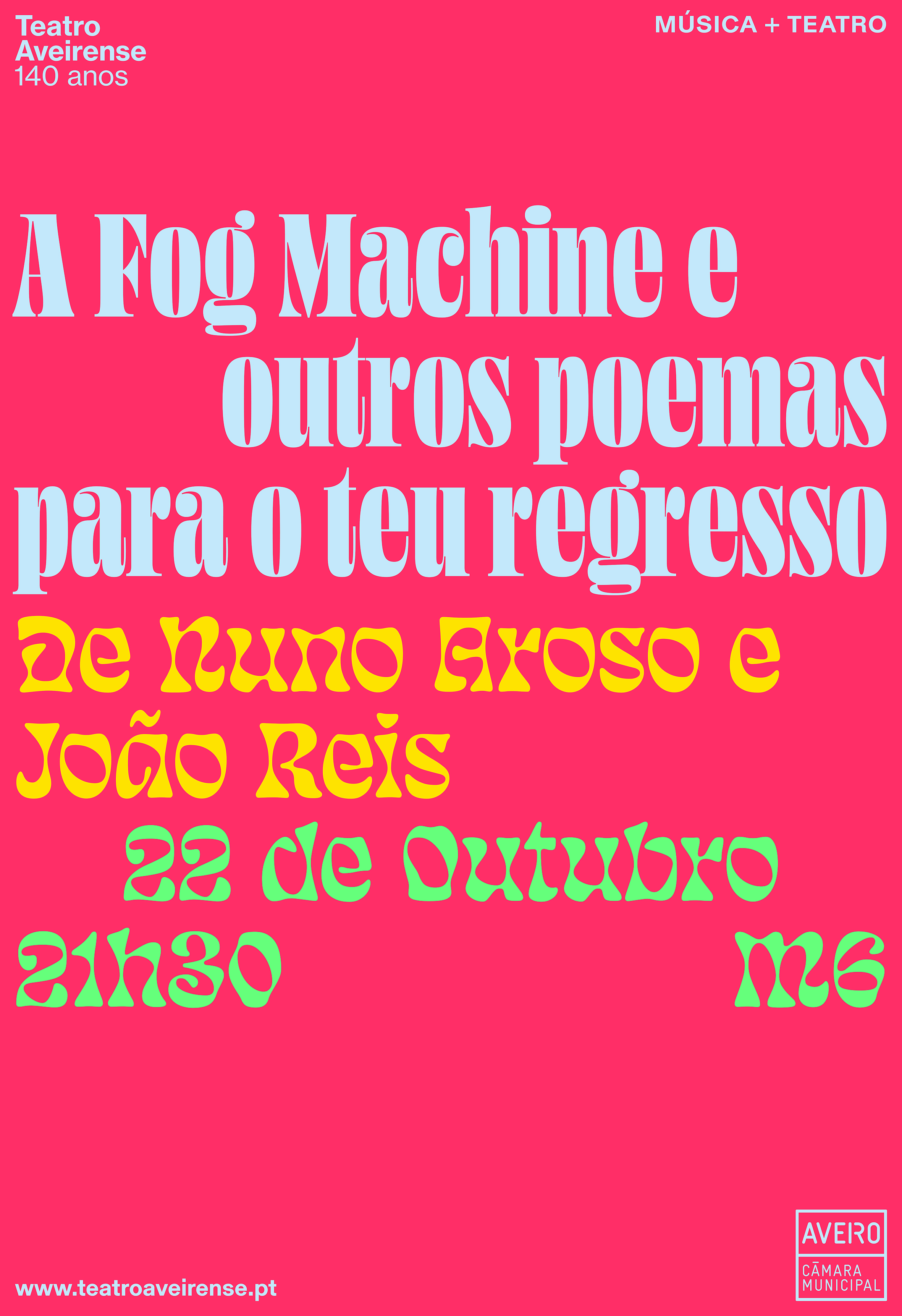
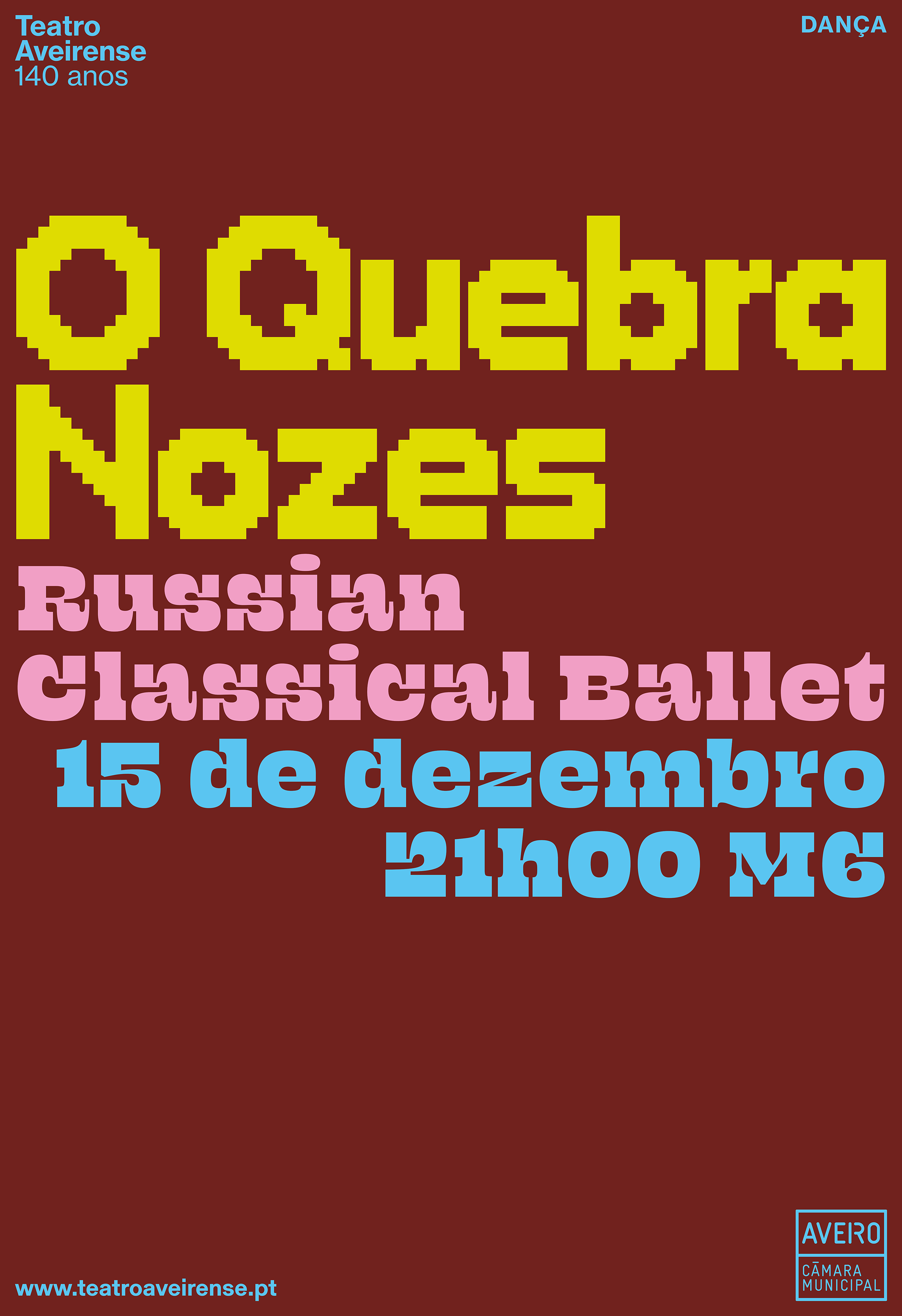
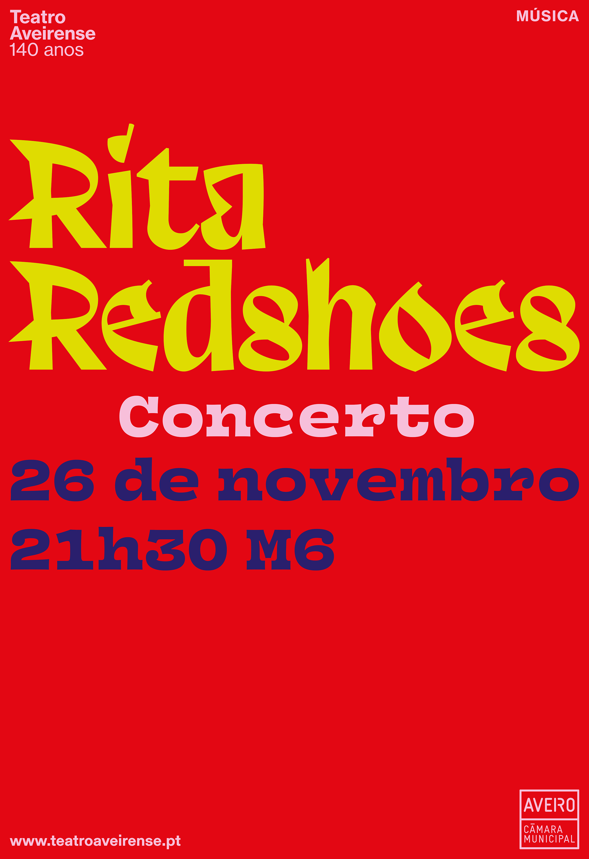
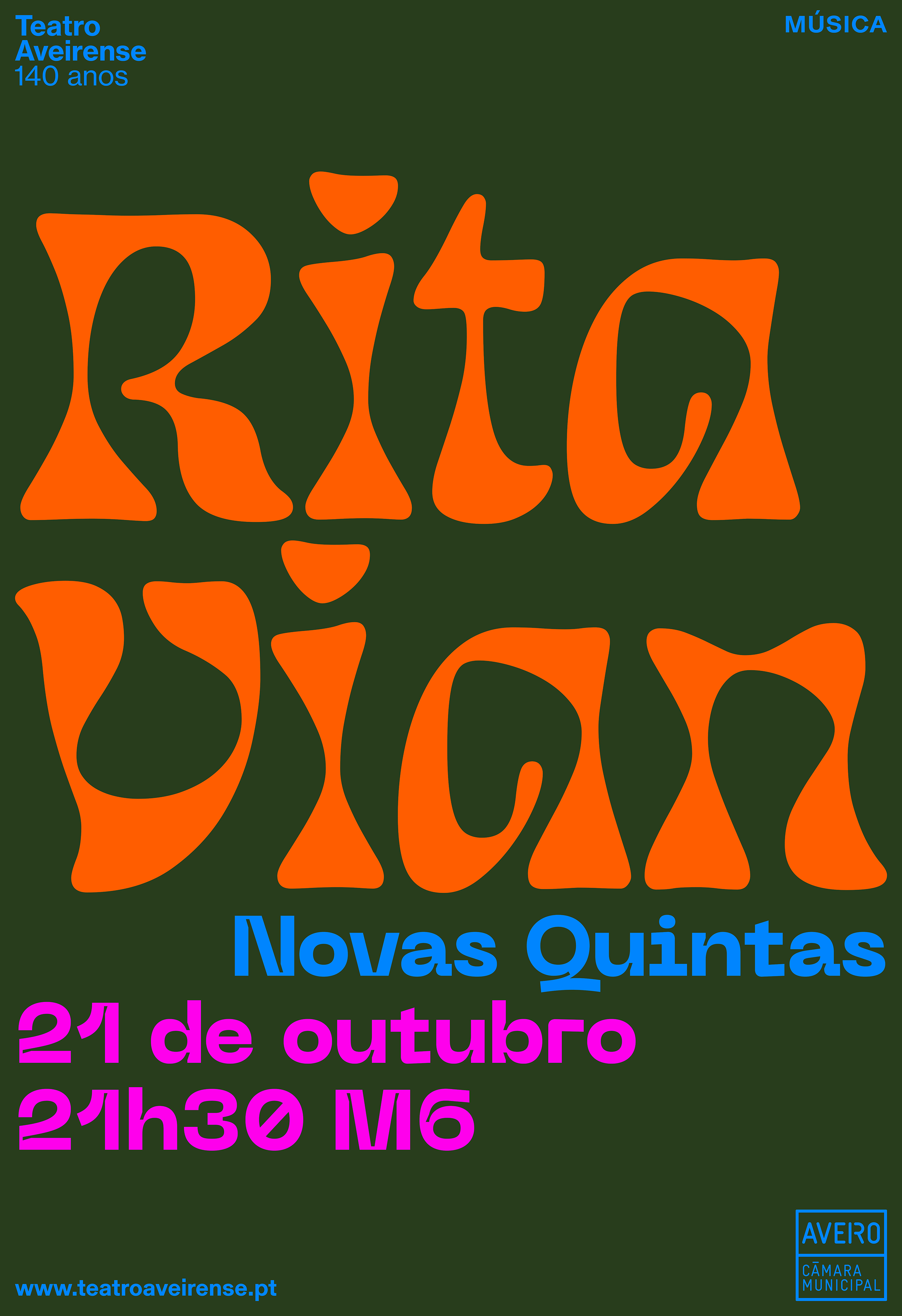
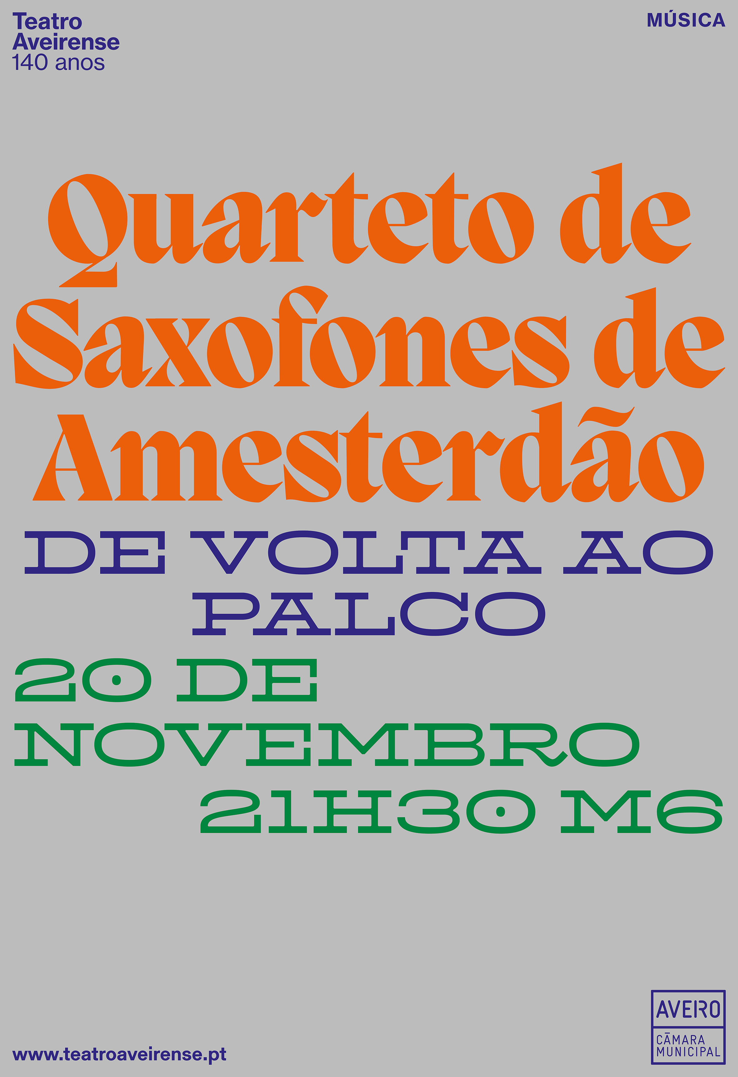
Using this graphic patrimony as inspiration, we figured that by adopting a purely typographic approach to the design of the programme we could eliminate the problem of images whose quality we could not control, and simultaneously, echo the typographic legacy of the historic materials. Using type—words no less—as the principle visual element in all the materials produced by the theatre meant we could construct the visual language we were looking for. If theatre is about words and how they are spoken, the new identity aimed to be about words and how they are made visible.
The first step was to build a library of display fonts, many of them free, most of them not by known type designers. We wanted the type to substitute the use of images.
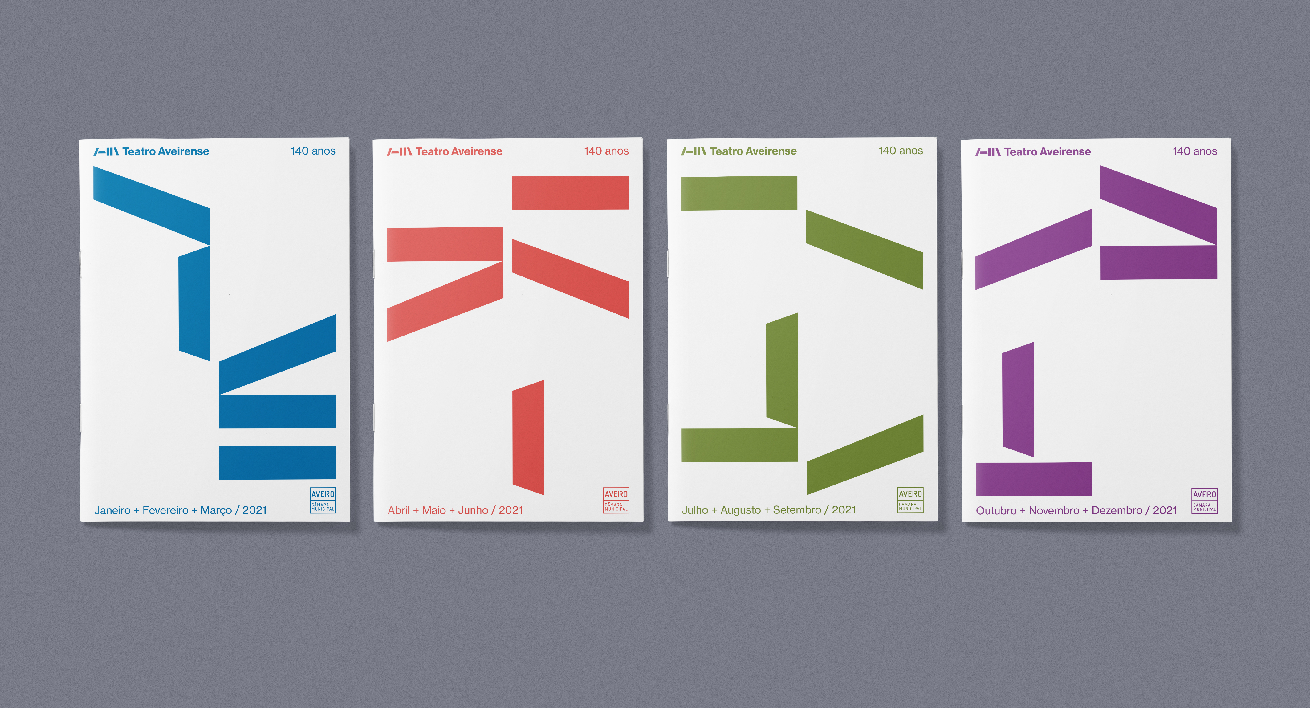
The cover design of the quarterly programme (which can be seen further down) was based on an animation of the new institutional logo we designed.
Parallel to the design of the programme, we began to develop a series of posters whose central visual elements were type and colour, thus substituting the use of imagery.
2. The Logo
The new institutional logo we designed was based on three points of reflection:
– Typography
– Componants – as in the different componants of the theatre
– Construction – as in the construction of a cultural agenda
The visual starting point were the letters 'T' and 'A' from Teatro Aveirense.
Below – the changing arrangment of the logo elements on the cover of the quarterly programme.
3. The disembodiment of the project
The new logo (as part of the overall new graphic identity) was presented to the director of the theatre and elements of the theatre team in January 2021. It was accepted and subsequently presented to the final decision-maker, the president of the Aveiro Municipal Council. It was approved and we continued working to develop a range of materials during the subsequent six plus months.
However, at the end of August 2021, one week before the launching of the exhibition and the new graphic identity, we were informed that the president had decided that he no longer approved the new logo. No reason was given for this calamitous decision, one that shocked not only everyone in the studio but also the team from the theatre with whom we had been working. Months of work were thrown into disarray. In another unilateral executive decision, posters commemorating the 140 years of the theatre that had been approved and had been displayed in the street were then removed without warning.
With no back-up solution possible for the sudden rejection of the logo, materials for the theatre had to be produced with a fundamental element of the identity missing. The bars were removed from the logo leaving only the text element. As a fundamental element, the bars were also planned to be the basis for a series of animations, including the cover of the new quarterly agenda (as shown above). This was now not possible. We were asked to place an image on the cover. We refused. We presented typographic solutions instead. They were rejected.
At no point along the whole process were we given the opportunity (despite my requests) to present or discuss our design proposals directly with the president. After receiving news that the new logo had become 'un-approved', I wrote to the president asking to reconsider the decision to abandon the logo. I received no reply. The new quarterly agendas that we designed were never printed. We were subsequently informed that the typography-based identity (the driving force of the poster designs) would be replaced at the earliest opportunity.
Unilateral executive decisions of this nature undermine people’s time, effort, commitment, and sense of achievement – in short, everything that contributes to effective teamwork and engagement. They are demoralising and belong to an archaic concept of command as leadership. They also demonstrate a lack of regard for professional skills and a complete underestimation (ignorance) of the capacity of audiences to successfully navigate the contemporary world of communication. The inability to think beyond safe and comfortable expectations (beyond clichés), had already been evidenced earlier in the design development when we were instructed to put images in the quarterly programme. This was despite the fact that we had already explained in our proposal that the whole identity was based on type as a substitute for photographs – and that this rational had been approved.
No graphic identity is fully formed from inception. Instead, it grows in use and application over time, sometimes developing in new and surprising ways. I regret that we never had the opportunity to see this process unfold with the identity we created, and most of all, I regret that the studio was obliged to release an incomplete project to a public that could not be aware of this incompletness – that could not in essence know that the work of the studio had been disembodied.
Project Credits
Design Team: Andrew Howard, Miguel Howard, Daniel Lopes.
Logo animation: Nuno Leites.
Date 2021
Client Câmara Municipal de Aveiro