Dafne Editora / Imago series
Editorial (Art History)
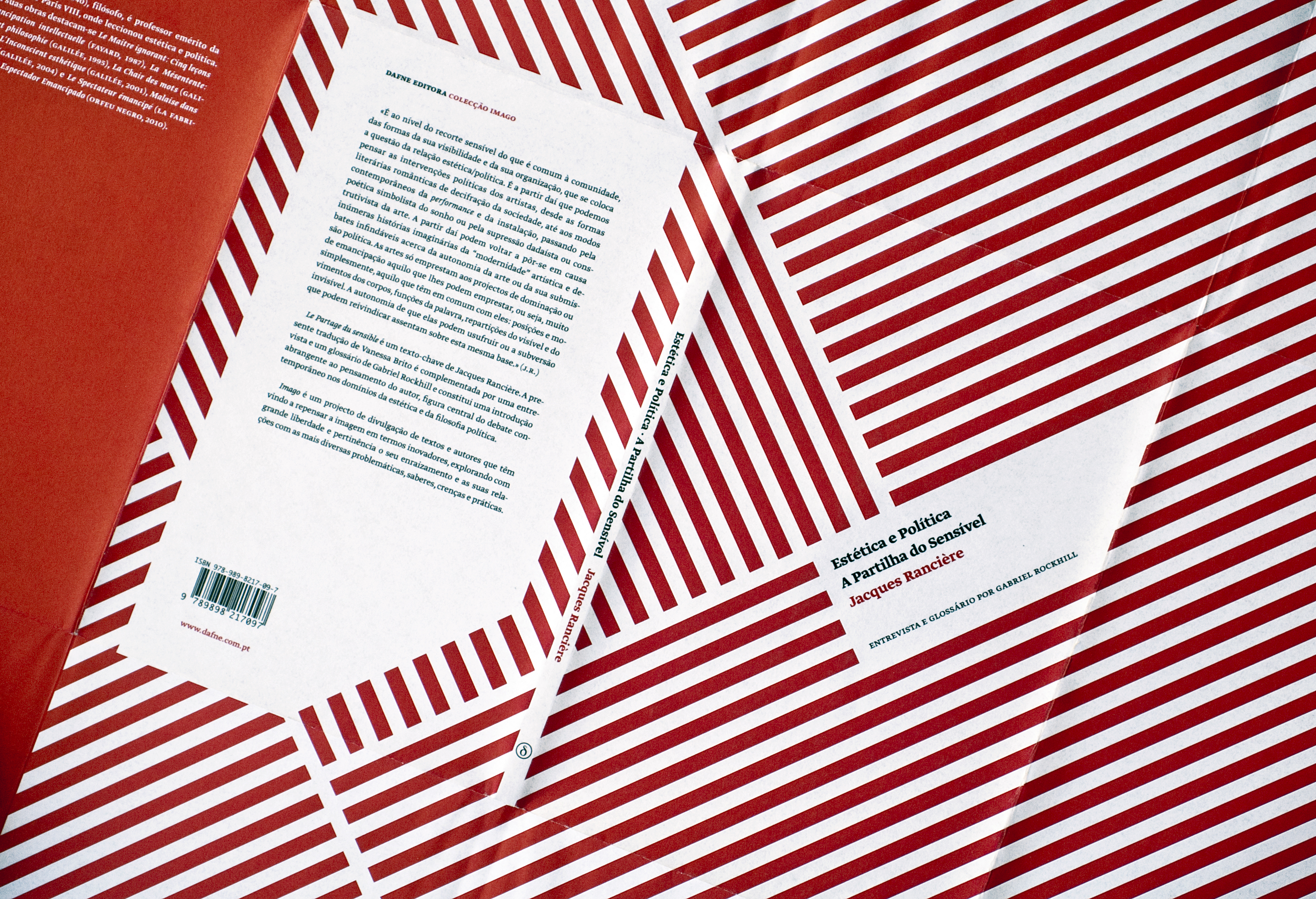
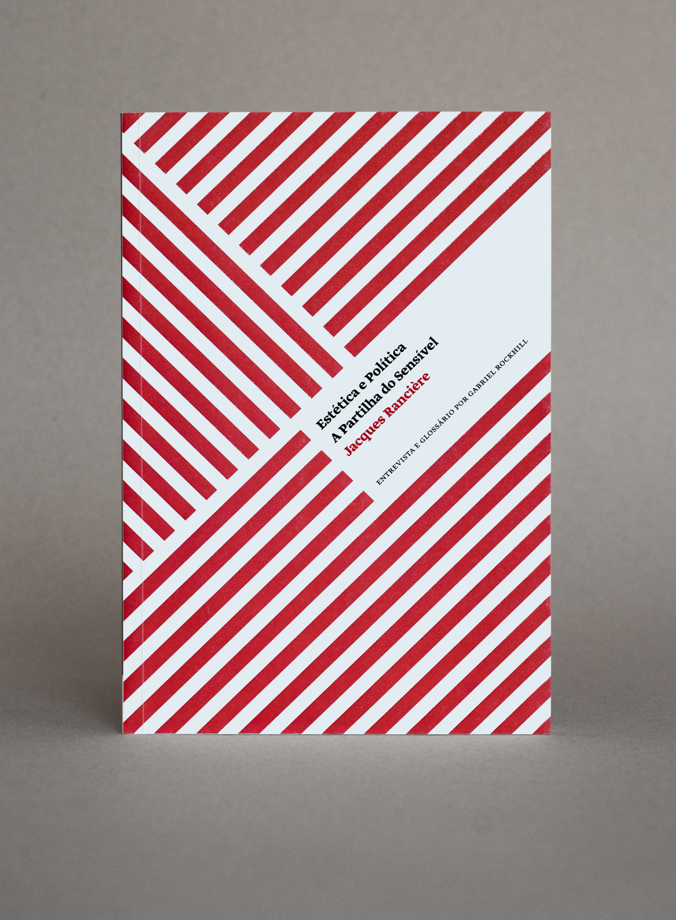
The 'Imago' series for Dafne Editora was planned to be a series of 5 books (three were produced) about aesthetic theory by renown authors such as Jacques Rancière, Georges Didi-Huberman, and Victor Stoichita. These books were not of course conceived as a series – they are by different authors published at separate times, and the originals have diverse cover styles. Instead Dafne Editora choose to make them into a series which immediately implied that some sort of common visual treatment would need to exist in order to express this construct.

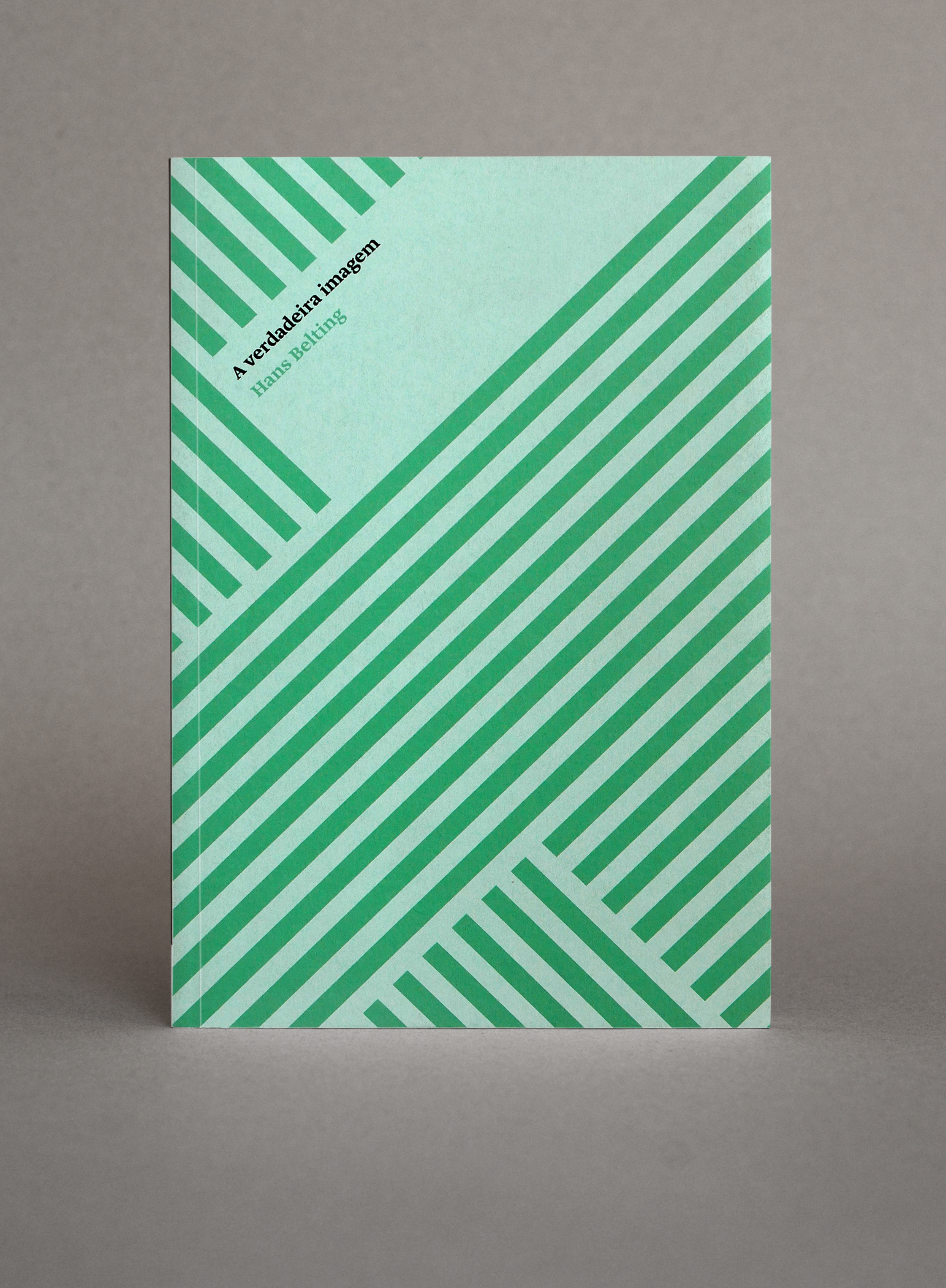
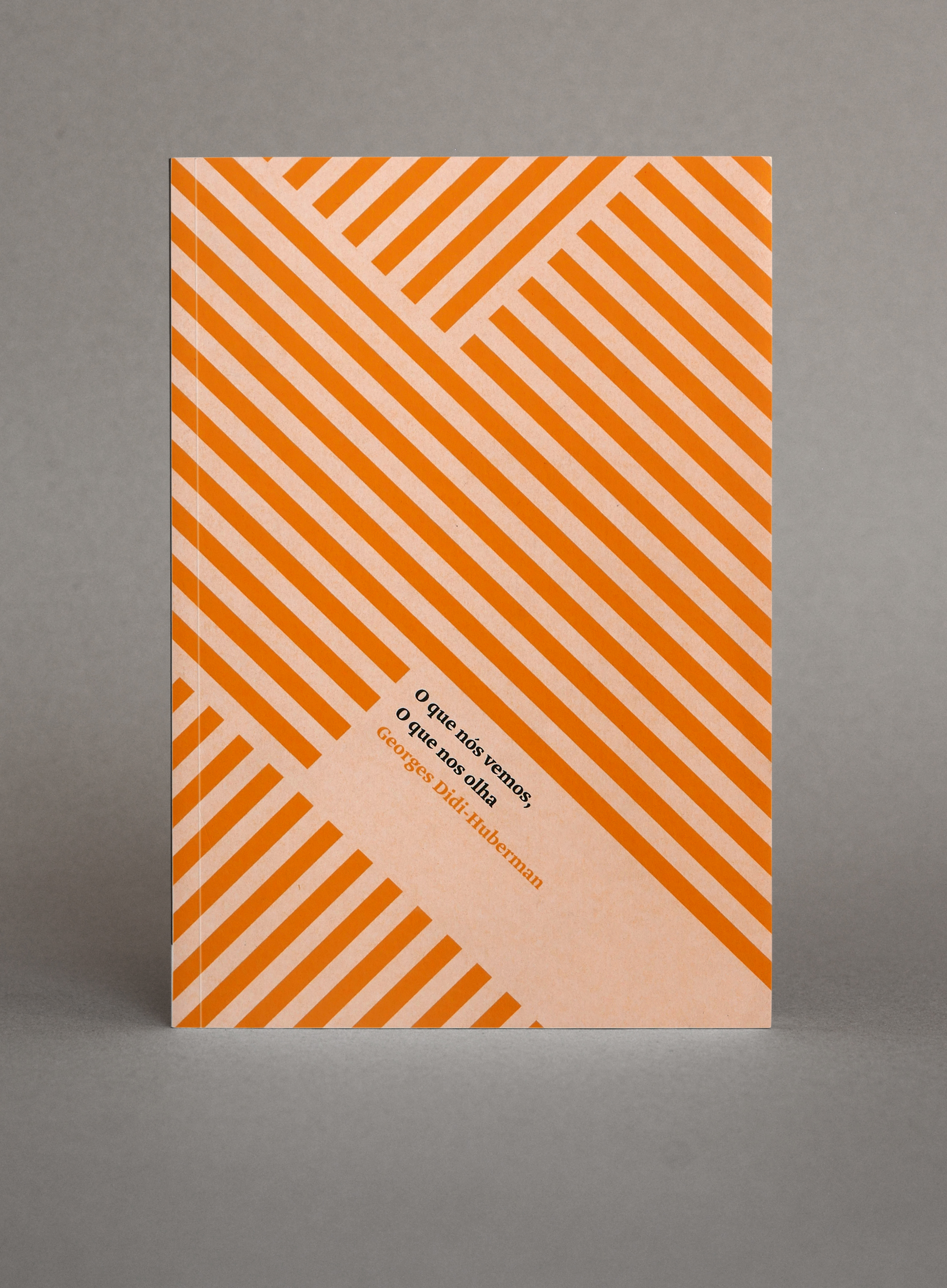
Some books are particularly resistant to visual summary and these are prime examples. They cover a very wide field of visual references and I decided from the outset to avoid even trying to encounter images that might be in some way representative of their content in any literal or figurative sense. Instead, I chose to explore geometric optical patterns that would vary from cover to cover whilst maintaining an overall identity. I was attracted to the idea of patterns of recognition, in themselves abstract, in relation to aesthetic concepts, and the idea of a code which was both visual / optical, and sensory. The sensory element – which is difficult to represent in images – is contained in the printing of the covers through the use of paper (board), printing inks, and finish.
The original print idea – where a single spot colour was printed onto white stock – was to reverse the normal procedure by placing a UV varnish not on the printed colour but on the unprinted paper stock. The objective was to create a sensory (tactile) as well as an optical contrast between the matt printed colour and the high gloss finish of the paper. Things didn't work out as we expected. The UV varnish didn't take well to the thin wrap-around loose cover paper and showed signs of cracking on the folds. This led to a rethink for the 2nd and 3rd volumes which were printed subsequently.
This time we decided to reverse the colour production by using coloured stock and then screenprinting the white. The effect is very different from the first book but still produces a particular tactile finish. The only regret is that the first cover ended up being different from the subsequent two.


Date 2010–11
Client Dafne Editora
Format 15cm x 22.5cm