Mãos 32
Editorial (Journal)
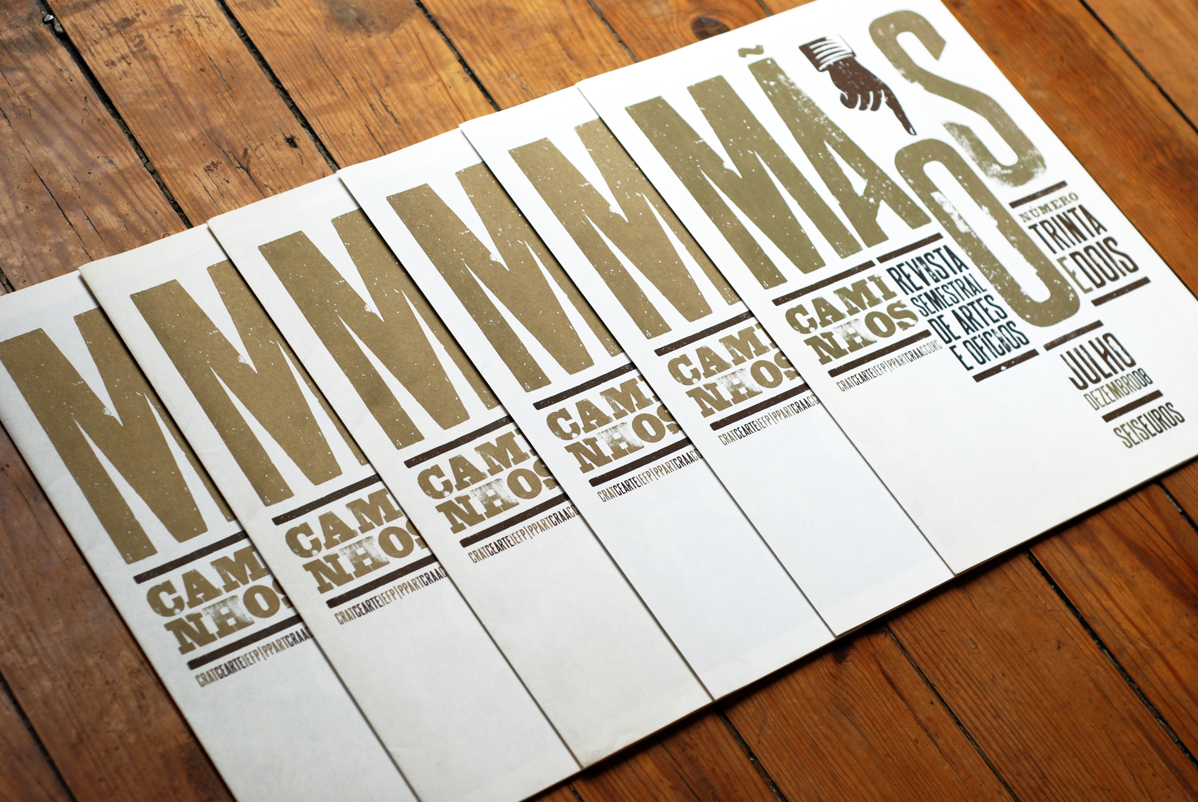
The first issue of the redesigned Mãos (issue 31) turned out to be a great success. In addition to the many favourable comments from readers, we are pleased that it was attributed a prestigious 'certificate of typographic excellence' by the New York Type Directors Club. Although we recognise that the value of professional awards is open to discussion, we can't deny that they produce a degree of satisfaction, however momentarily. At the very least they serve as encouragement for our clients, confirming that investment in design is noticed.
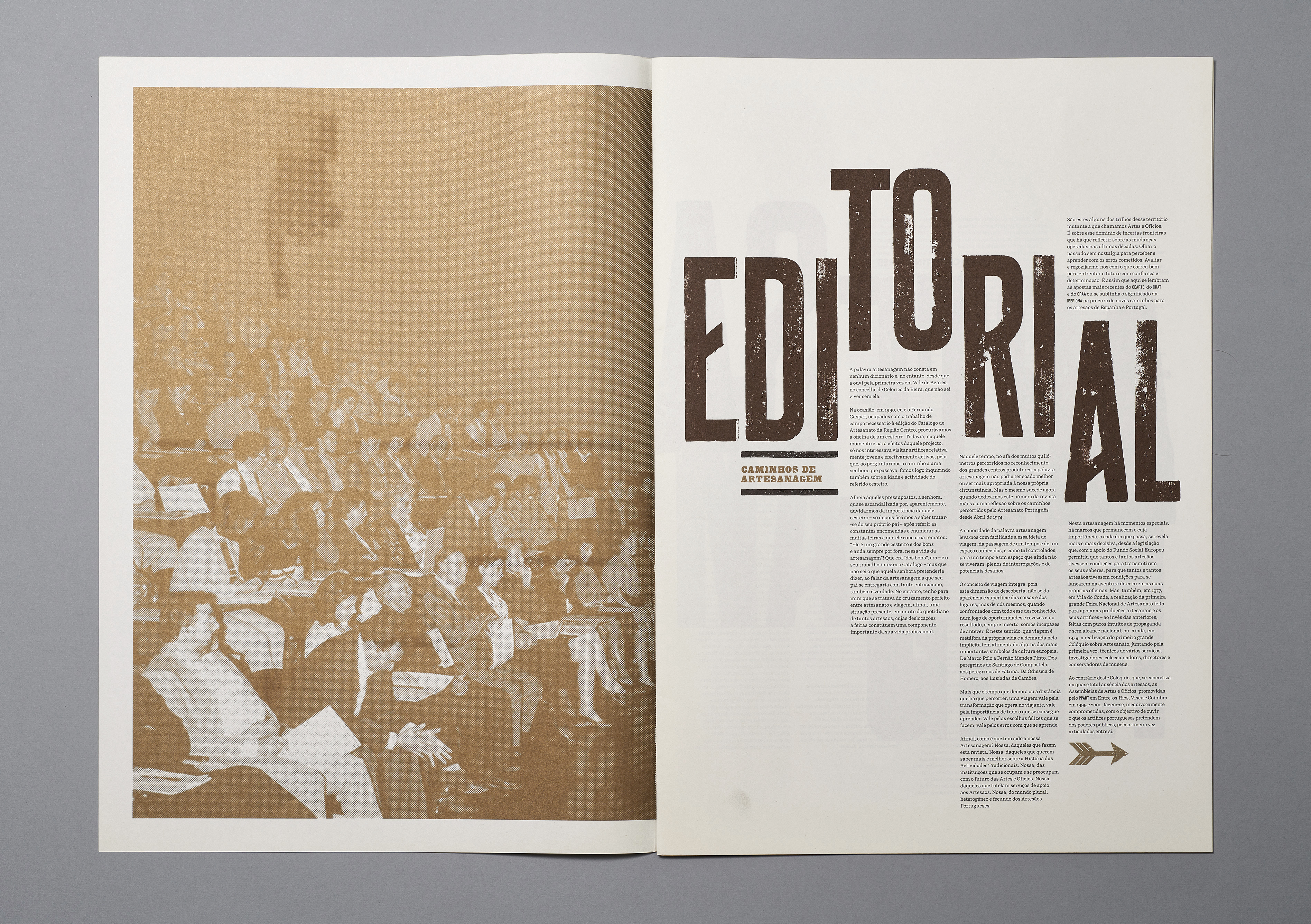
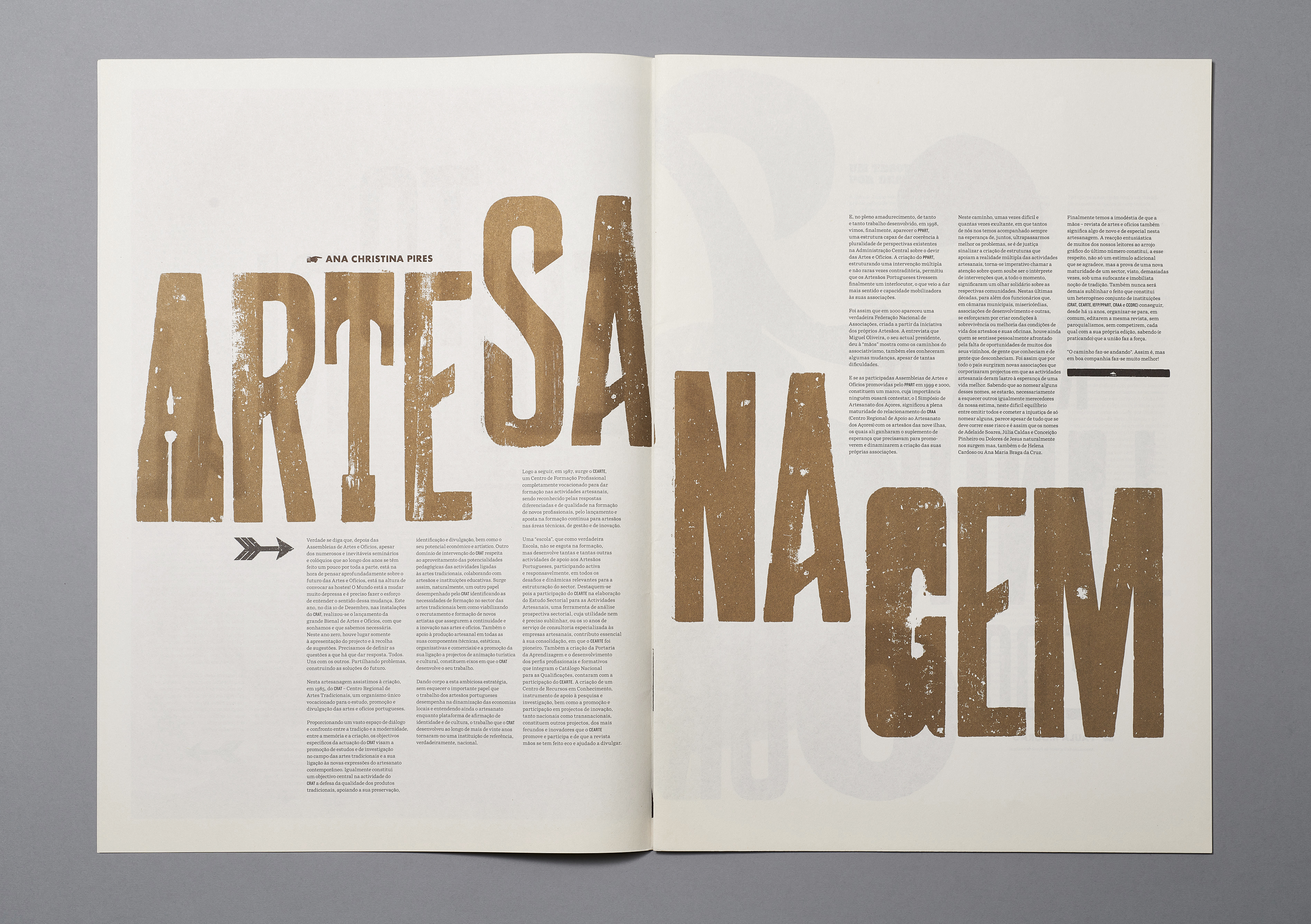
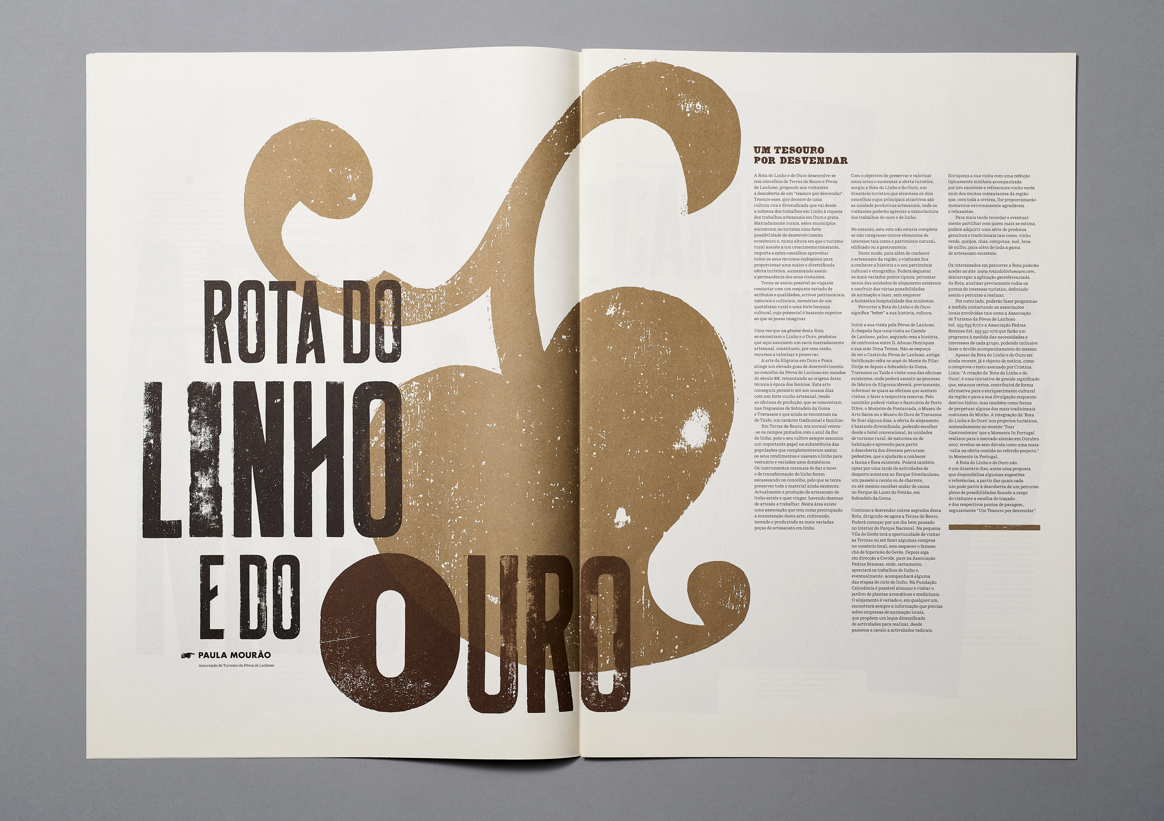
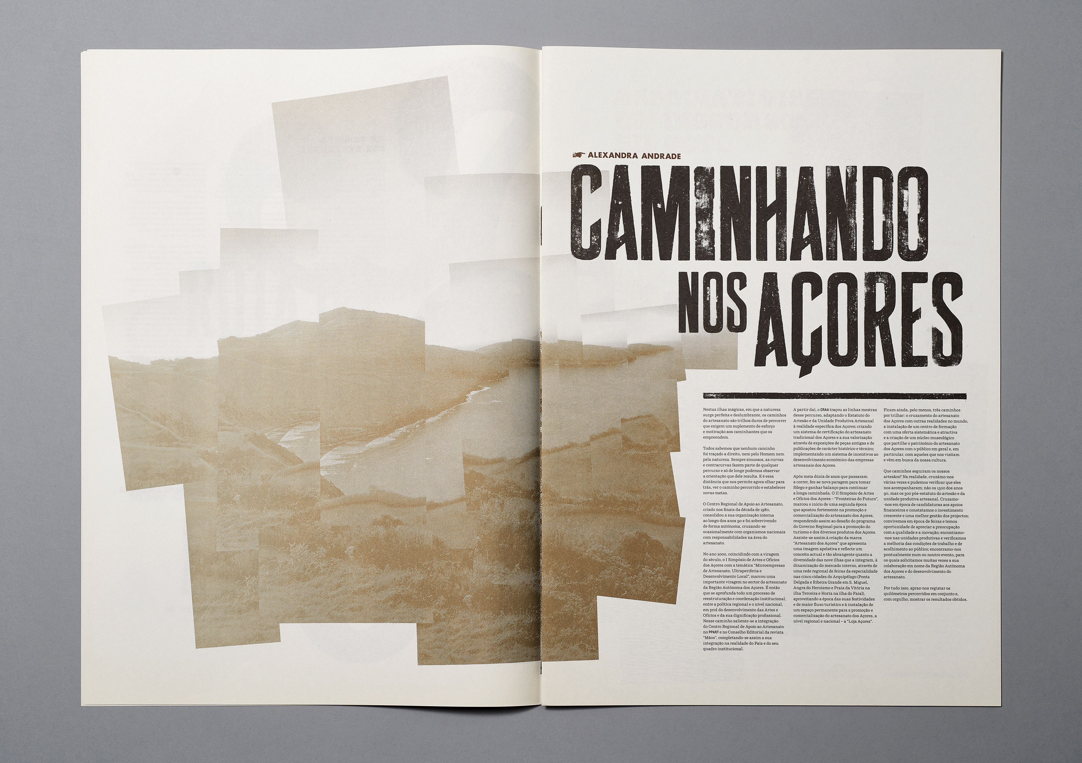
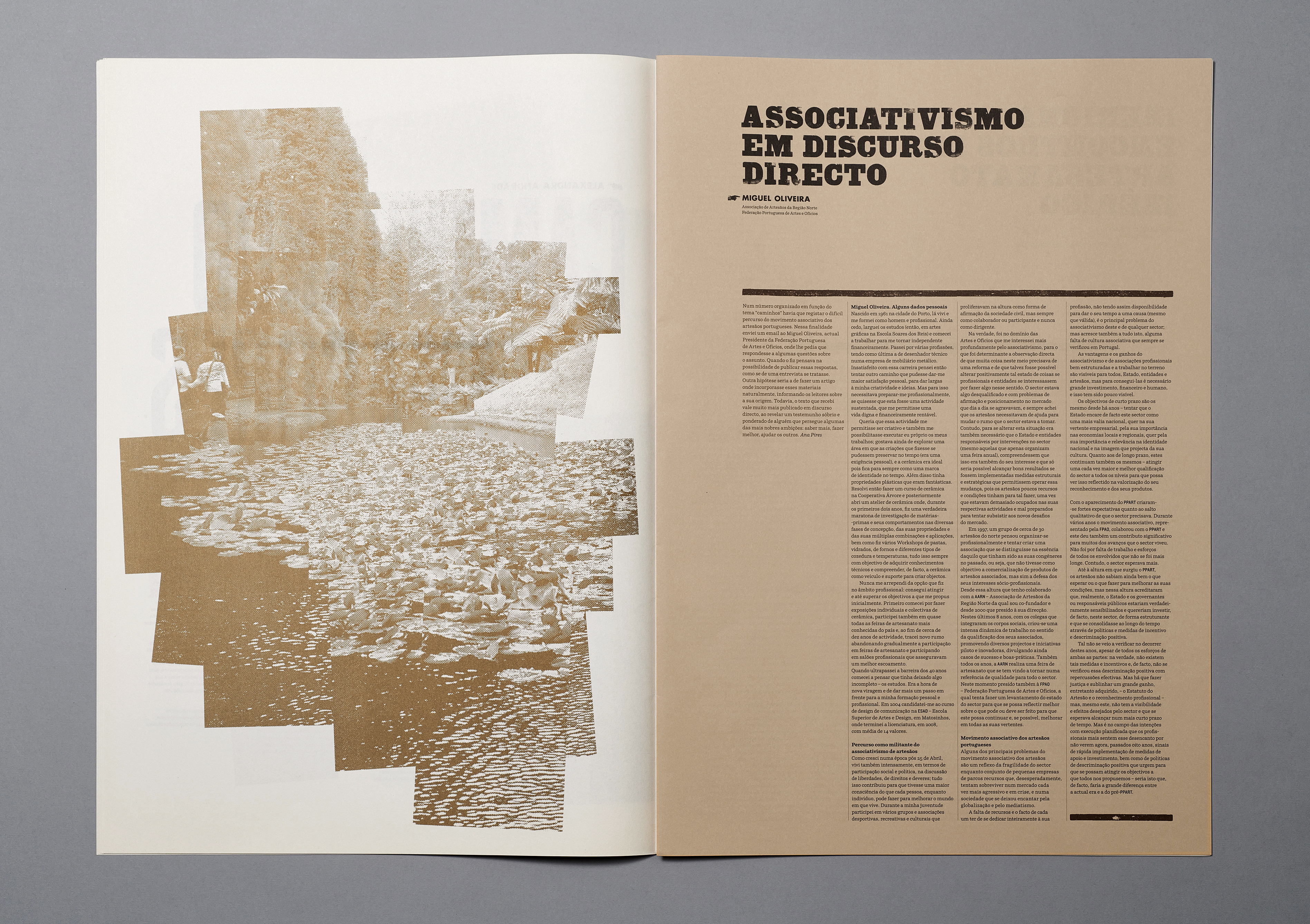
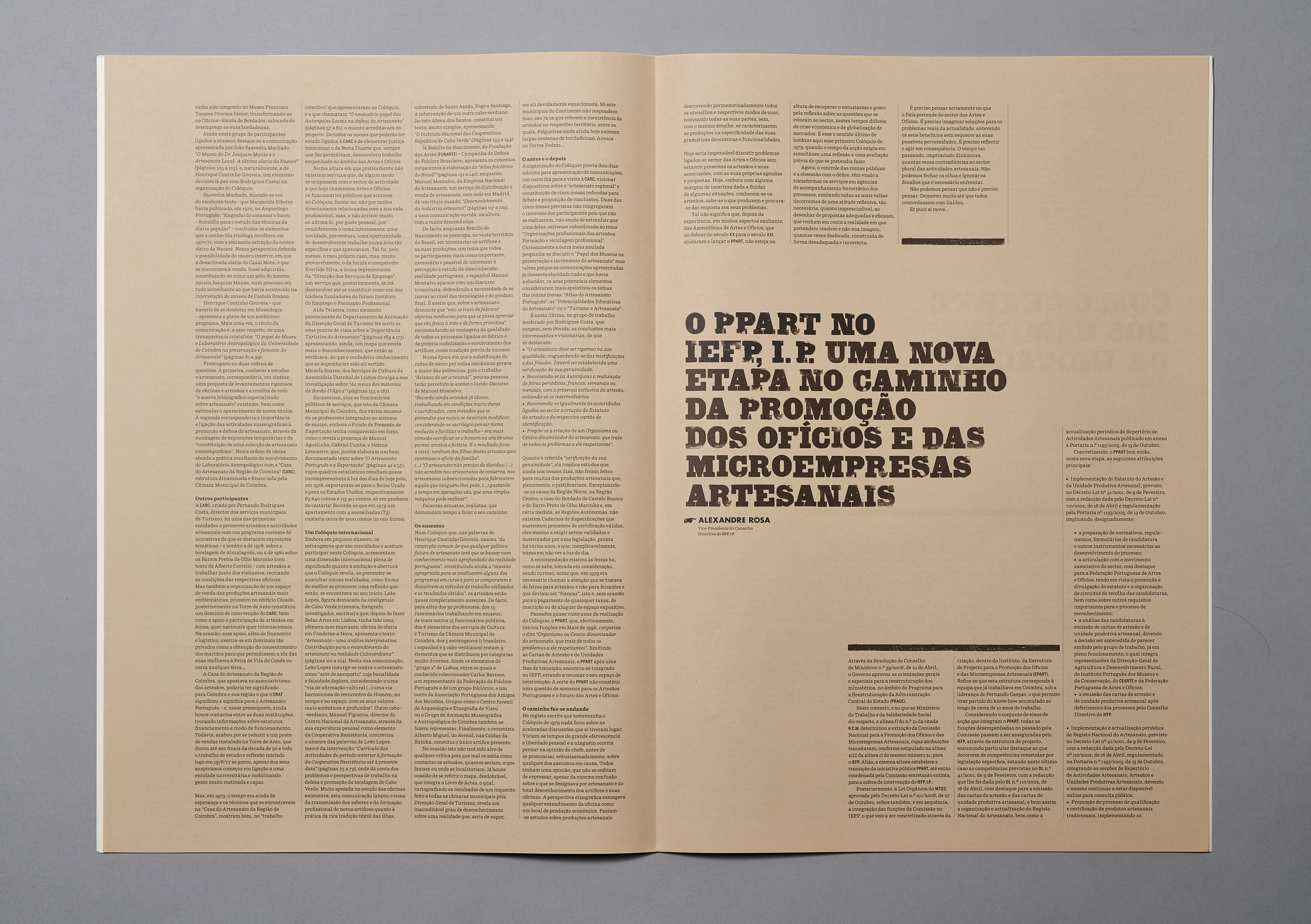
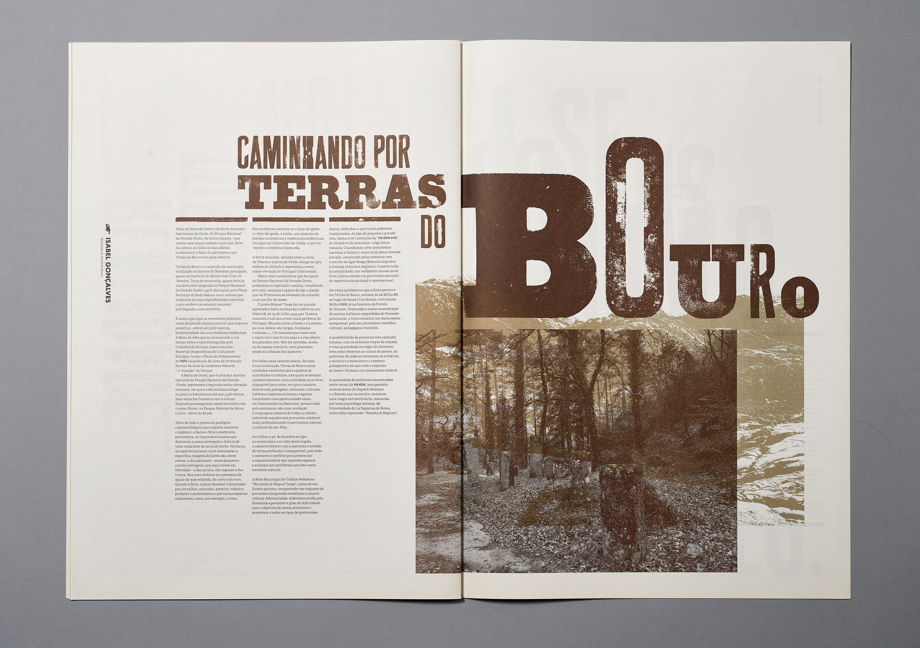
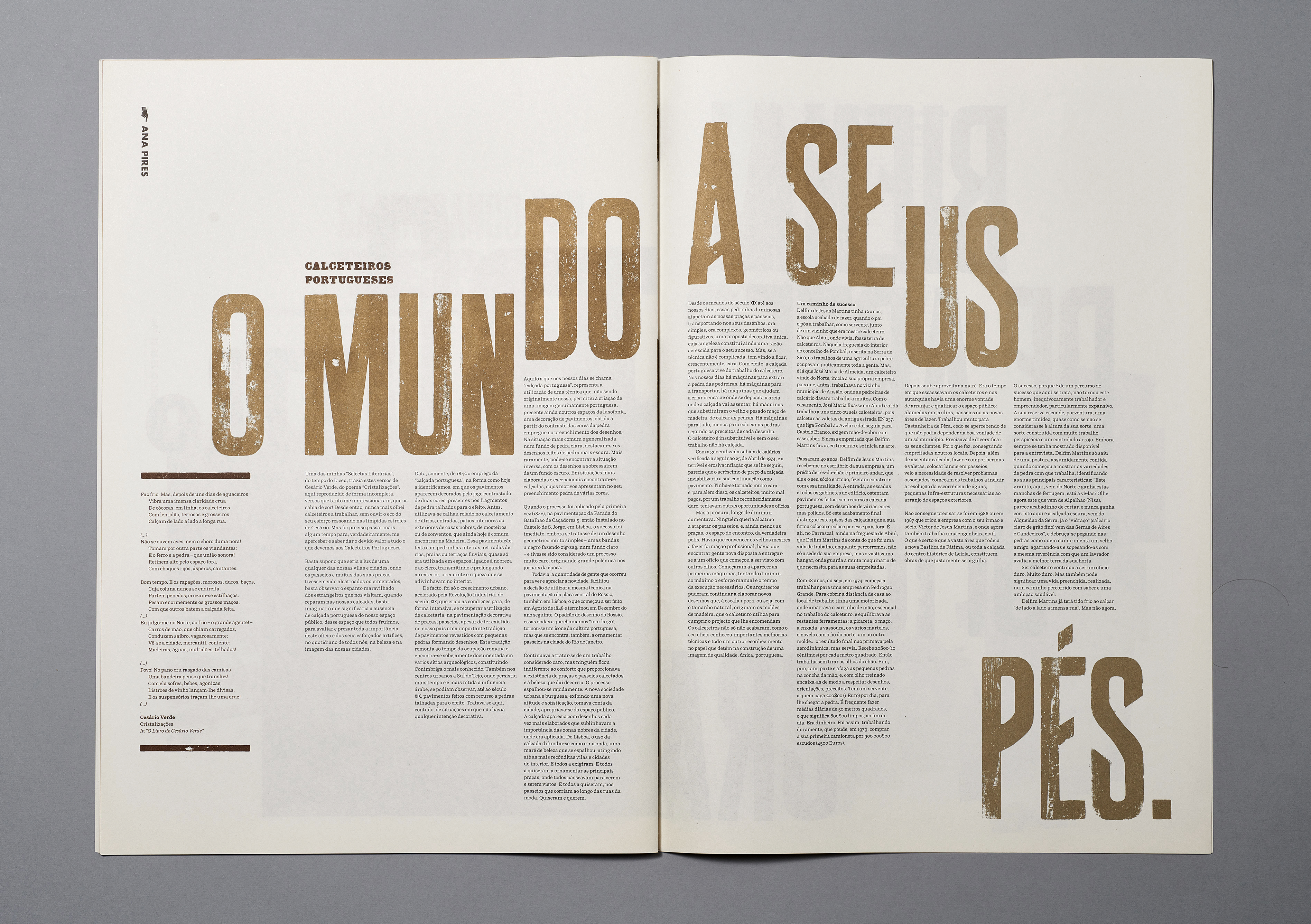
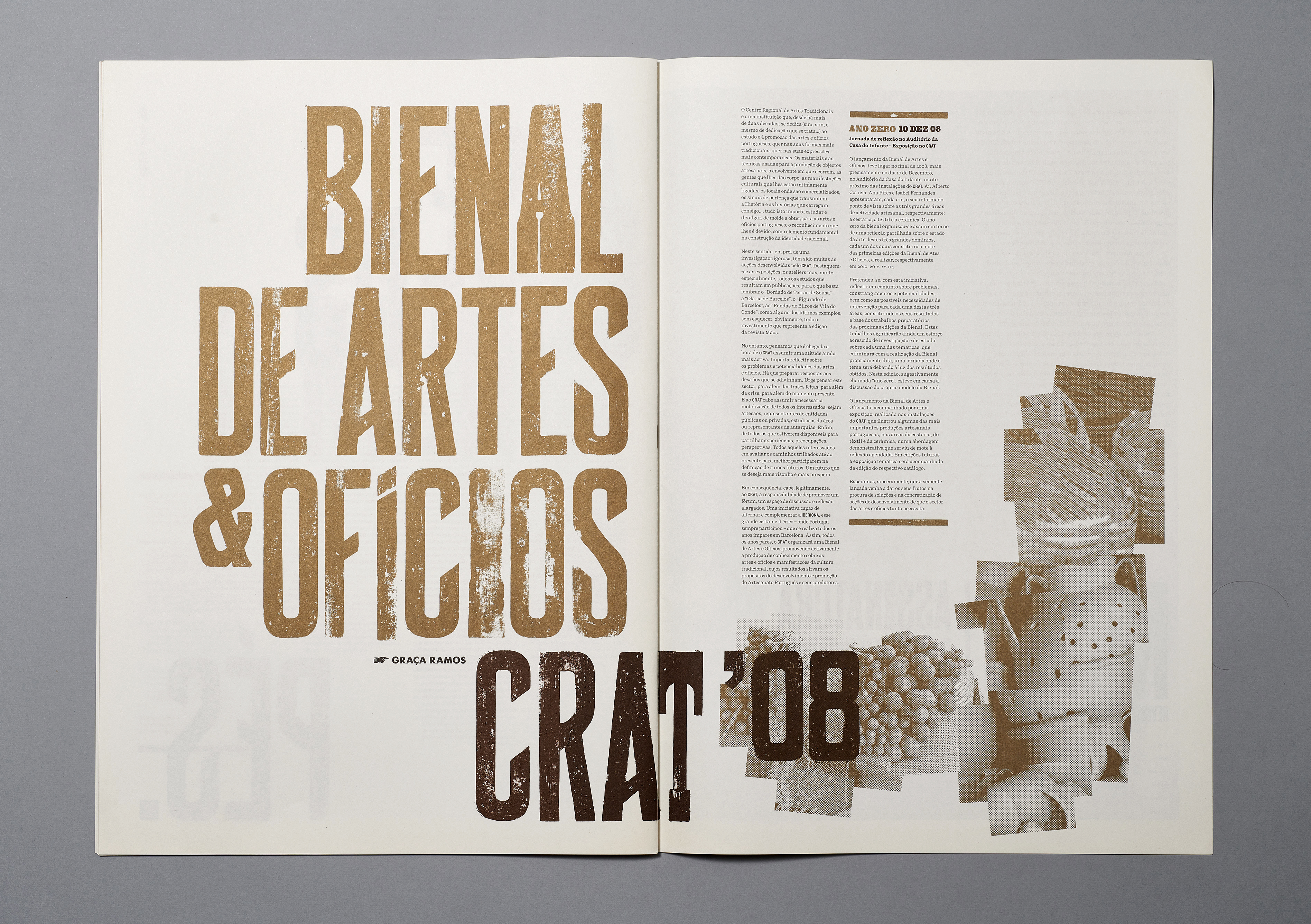
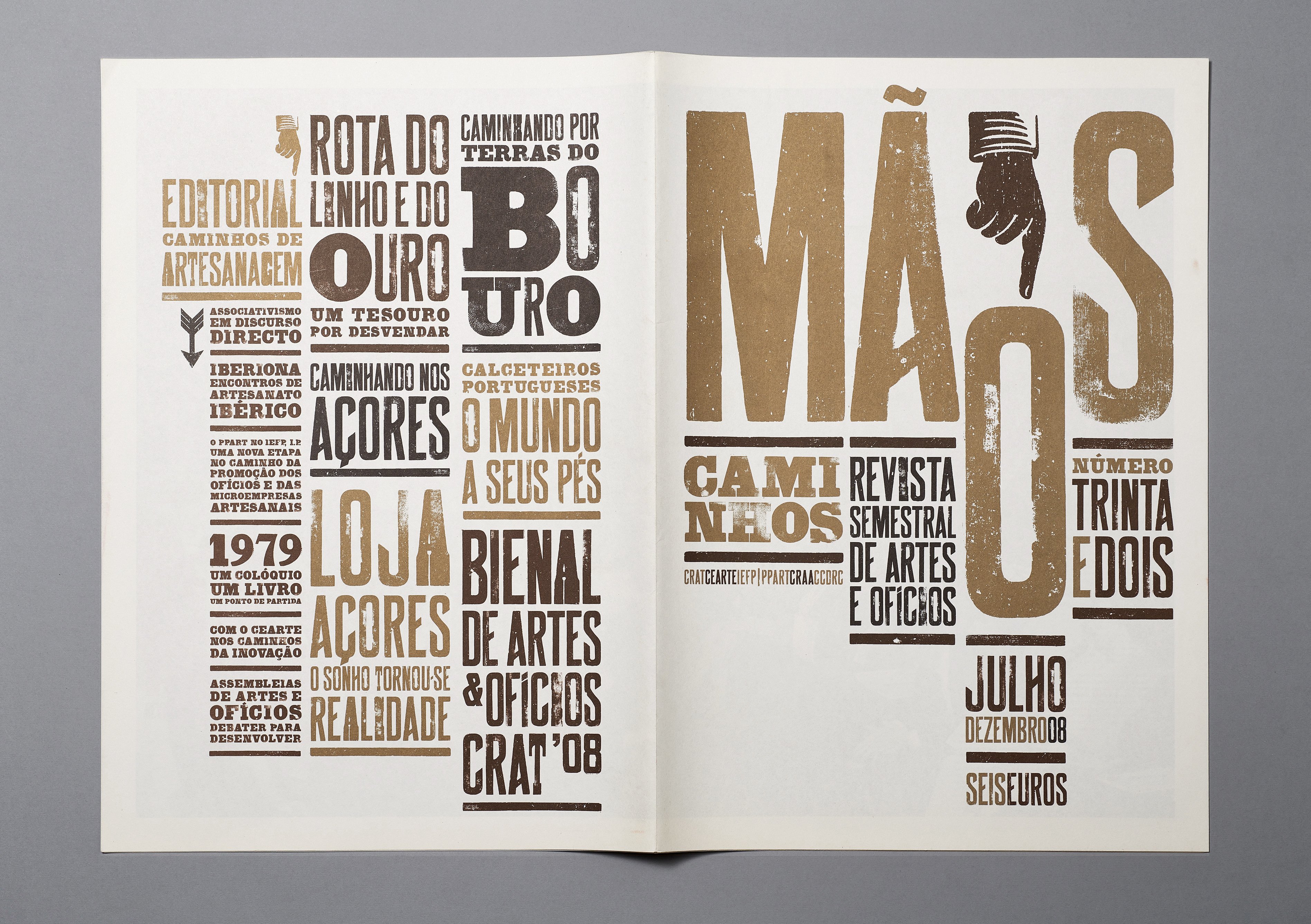
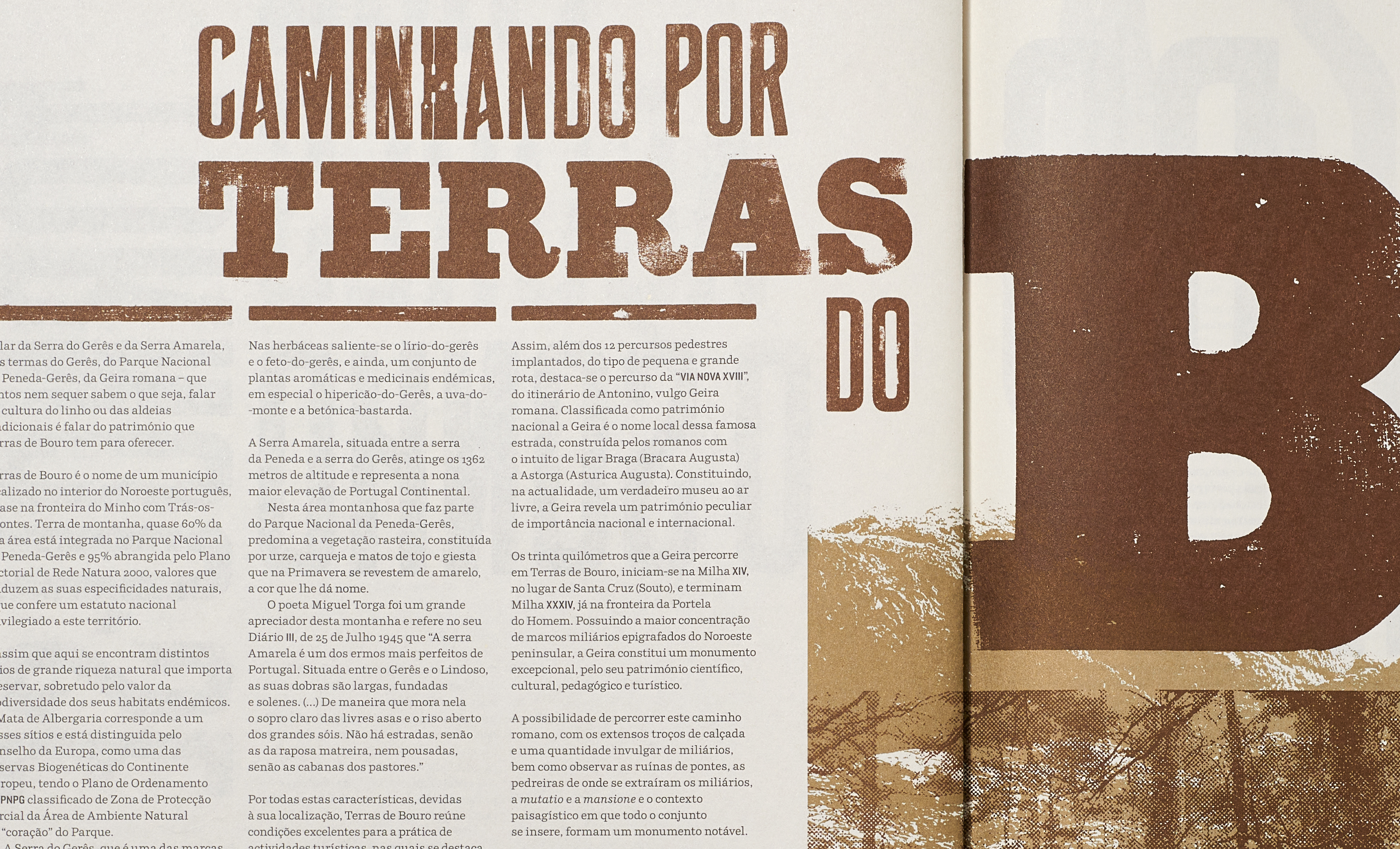
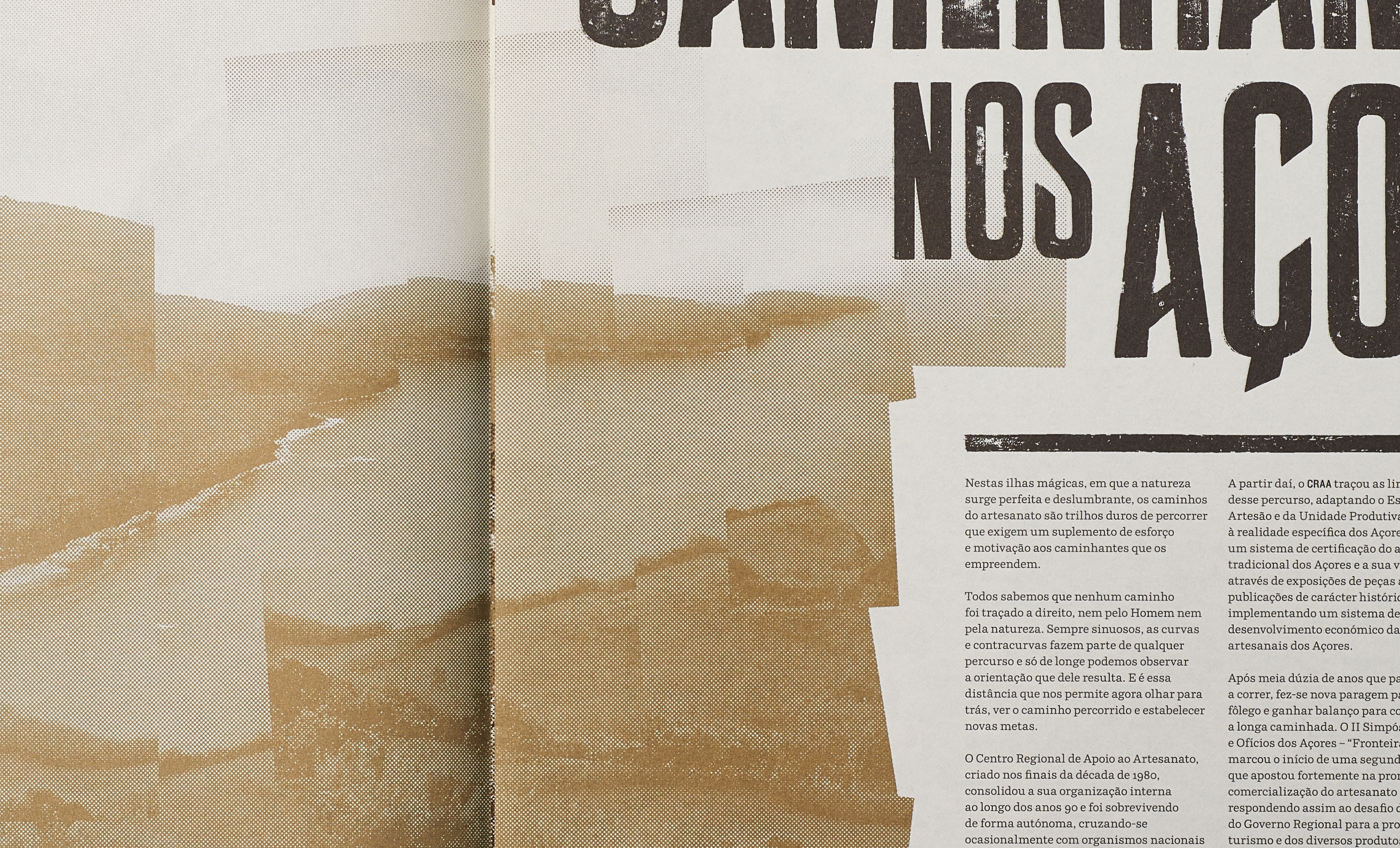
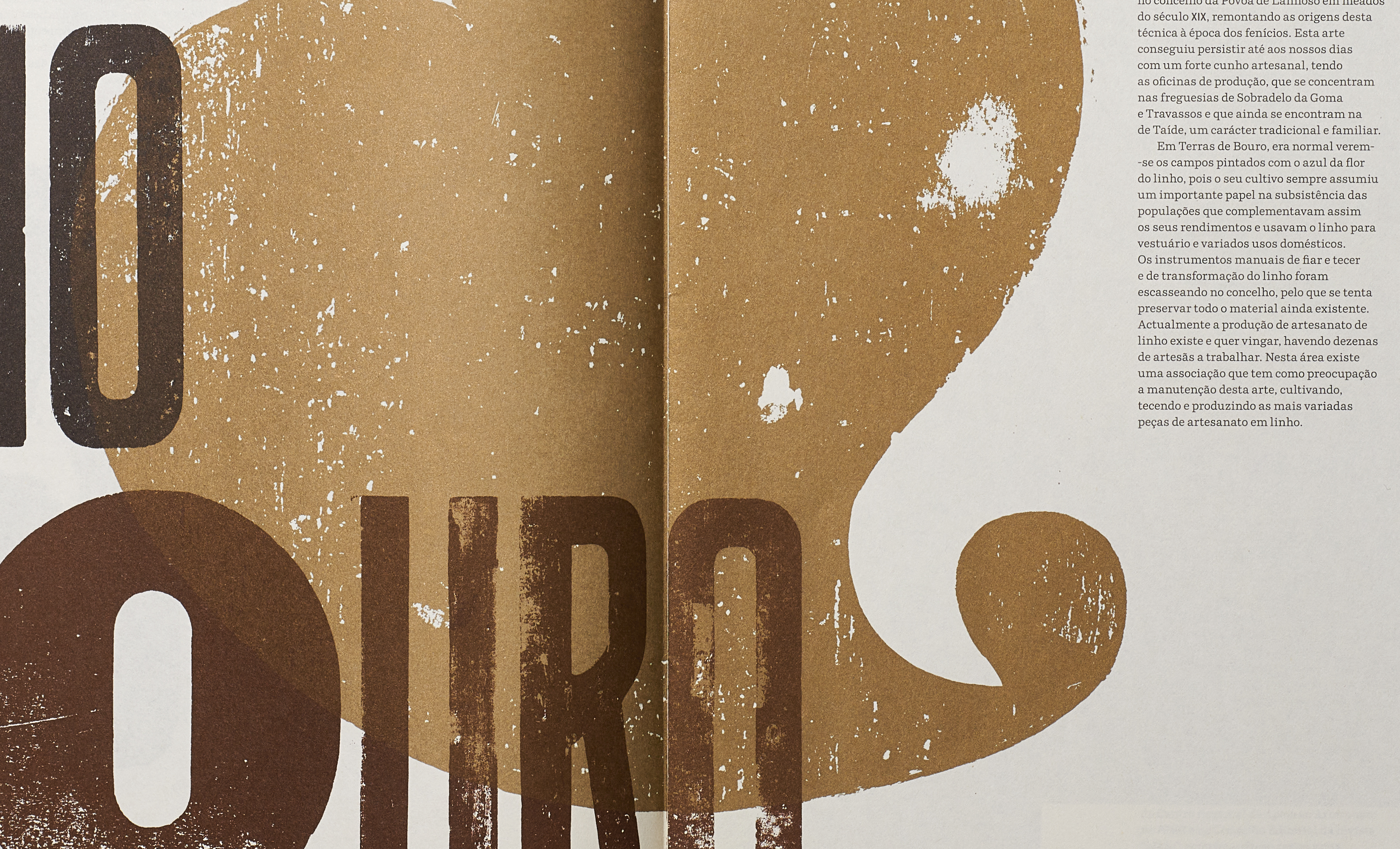
In this current issue we have continued to pursue a design approach modelled on the singularities of the content and the possibilities of design and print production.
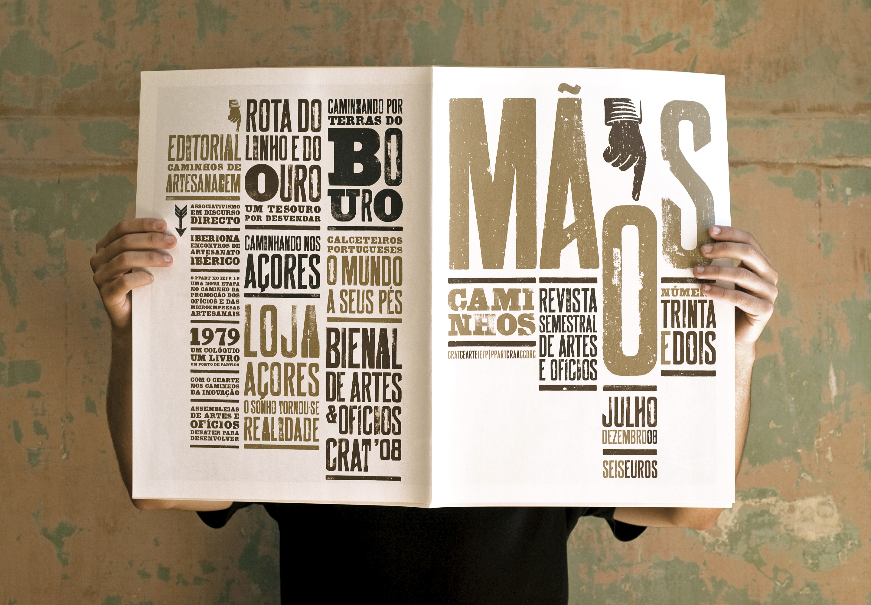
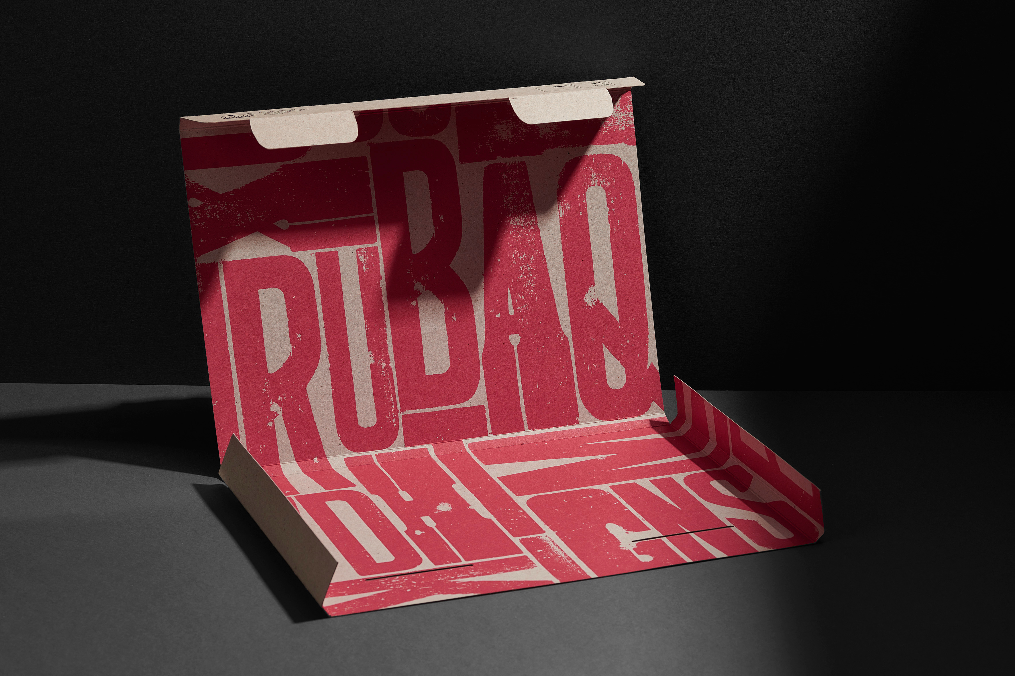
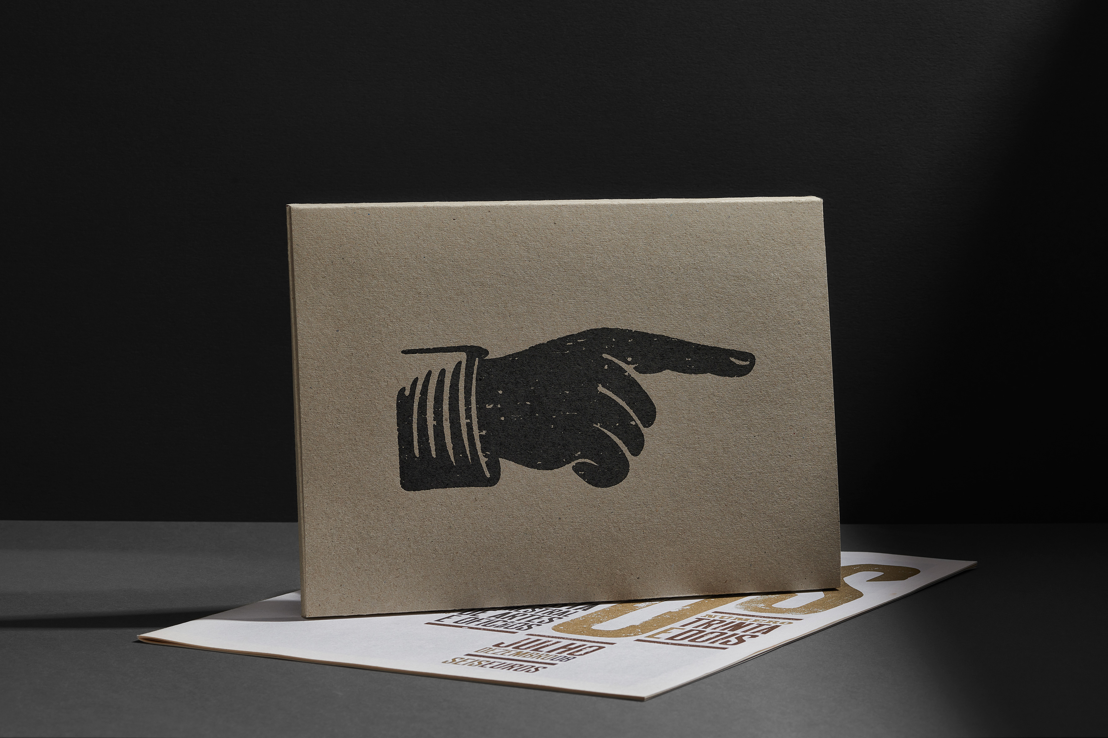
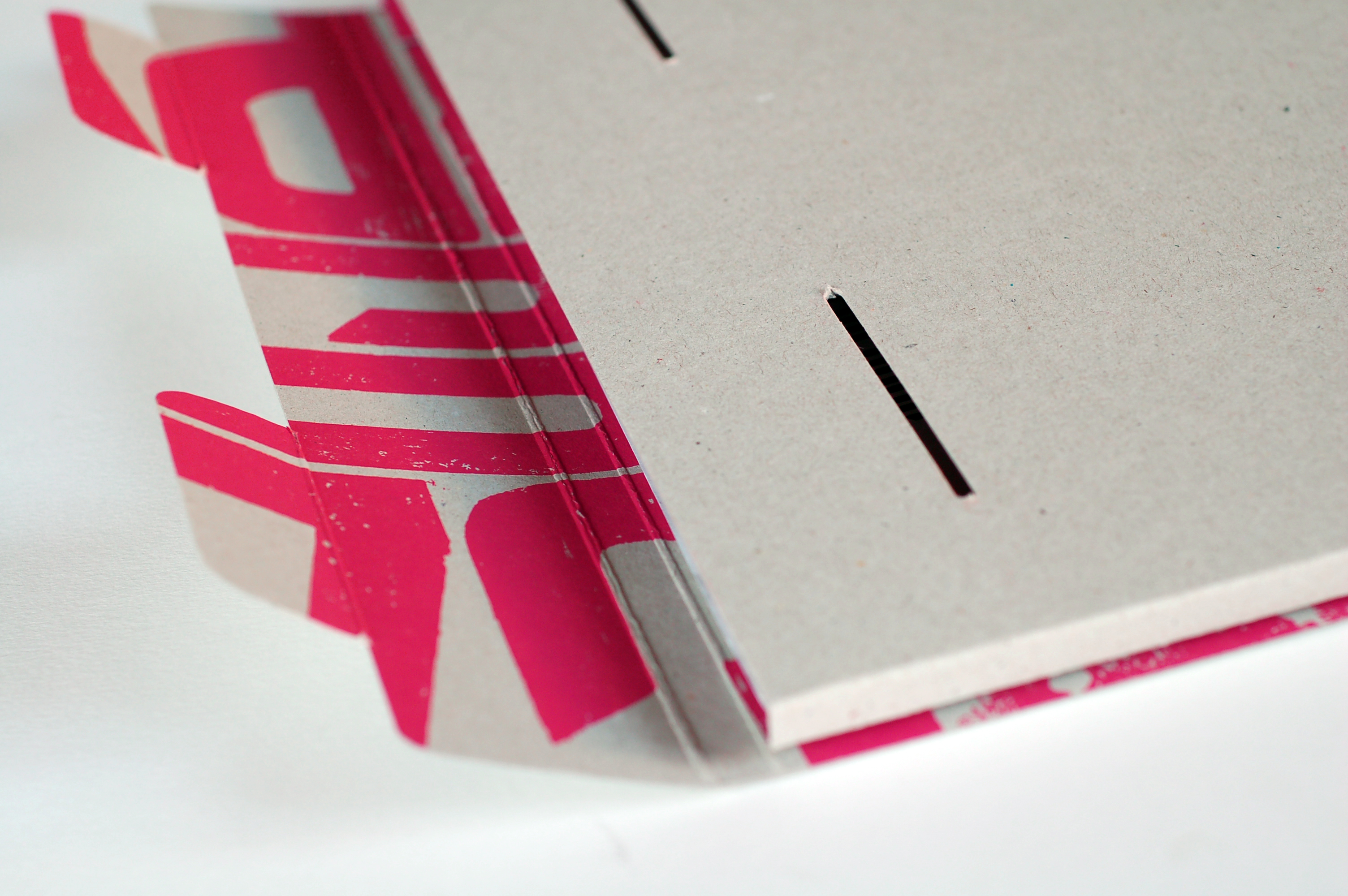
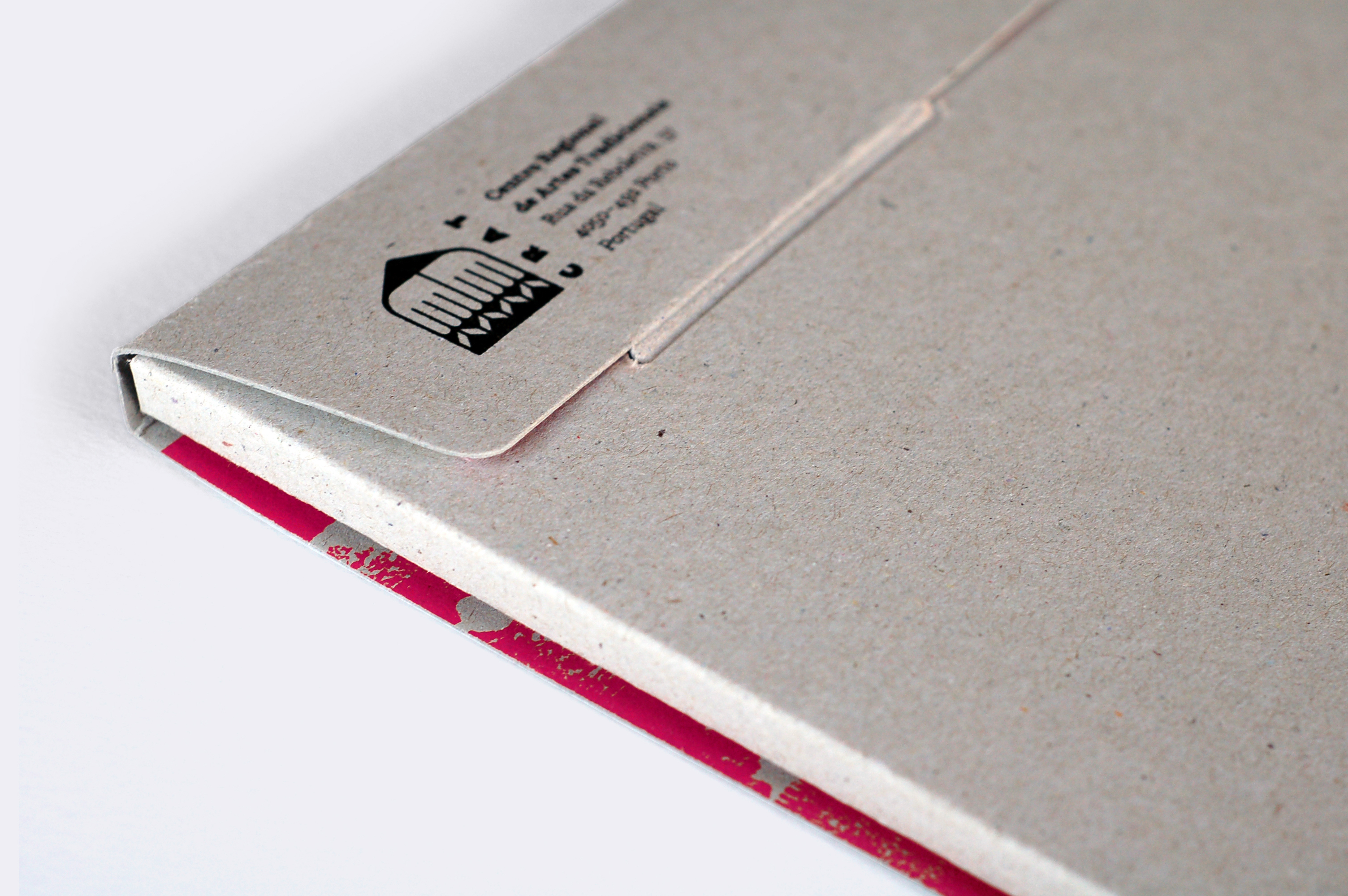
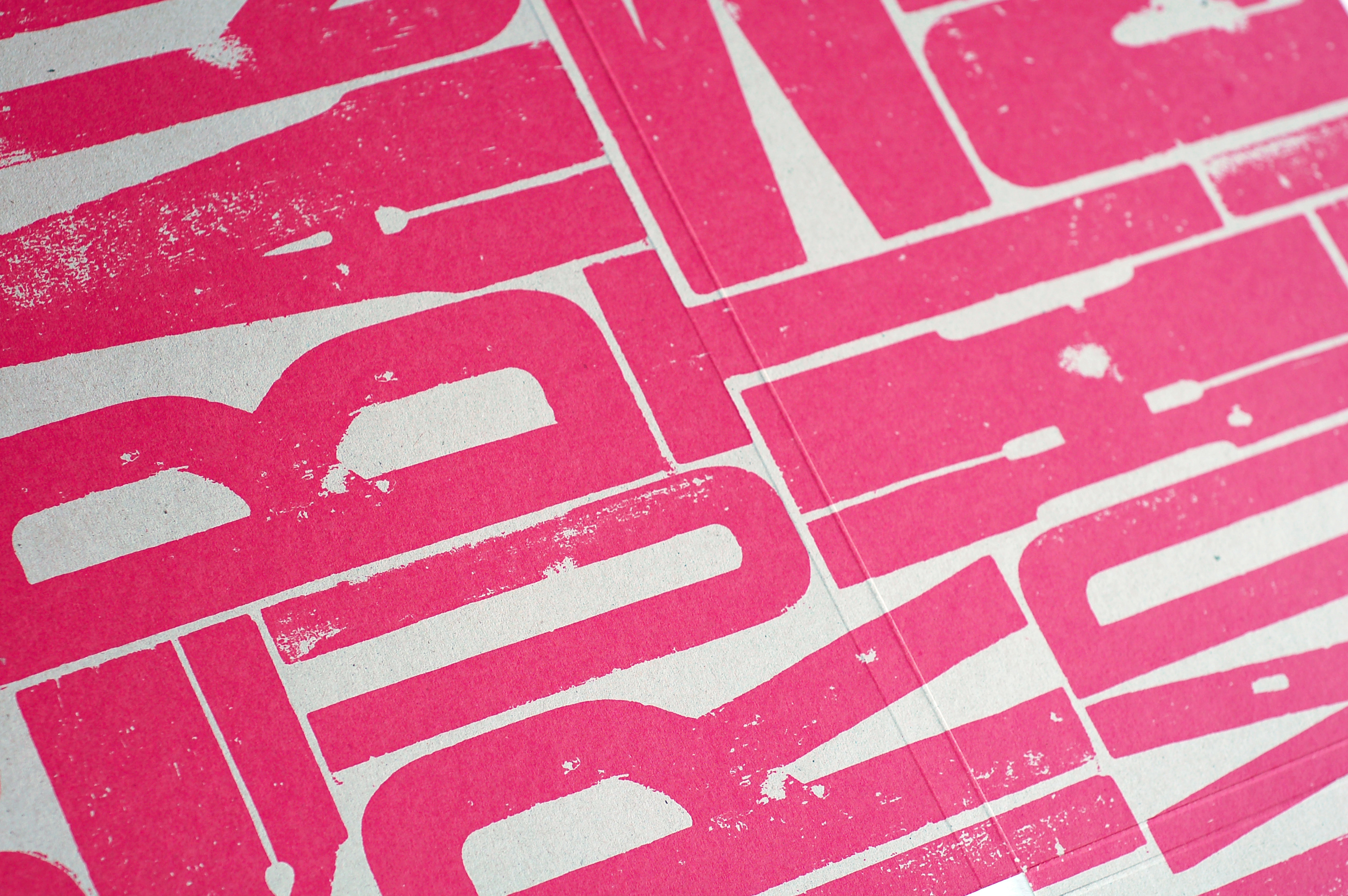
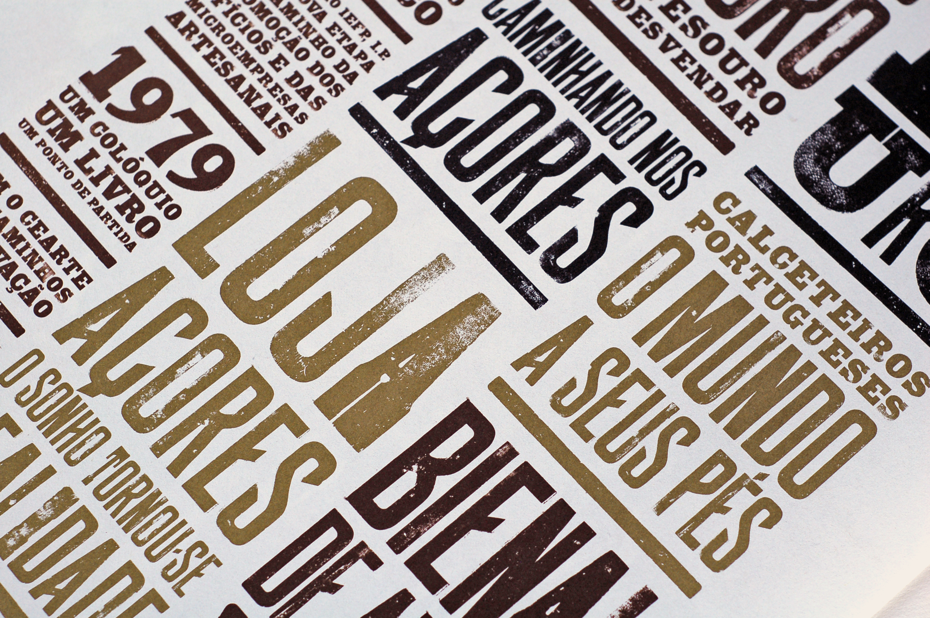
Considering the historic overview which this issue presents, we considered a newspaper format a most appropriate form; one which allowed us to handle large amounts of text in relation to a small amount of images. Always with craft in mind, and because newspapers are largely typographic compositions, we decided to explore the tradition of printed type. We visited the Museu da Imprensa (Press Museum) – to whom we would like to express our gratitude – in search of type examples from an era in which the form and use of type retained a tactile expression. We found what we were looking for and made original hand-inked prints on a manual press using large wooden type. These were subsequently scanned and we have used them for the titles and subtitles of this issue. Special attention was also made to the materials used. Although the design is visually expansive we have restricted both the colour palette and the sophistication of the paper and card is order to match the utilitarian nature of the publication.
Date 2009
Client CRAT (Regional Centre for Traditional Crafts)
Format 34cm x 48cm
Pages 28 including cover
Portfolio photos by Nuno Moreira – https://www.numo.pt