Leituras de Marques da Silva
Editorial (Architecture)
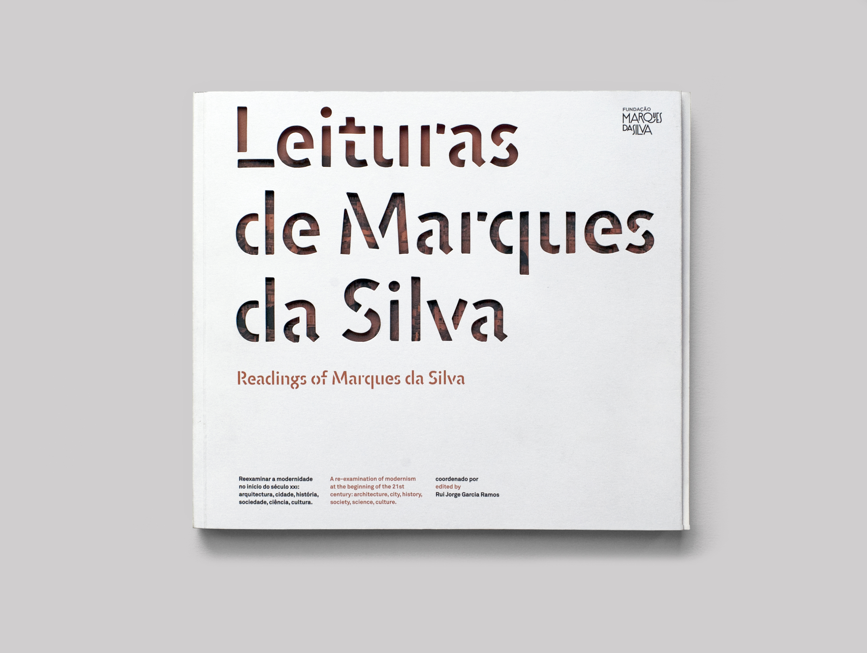
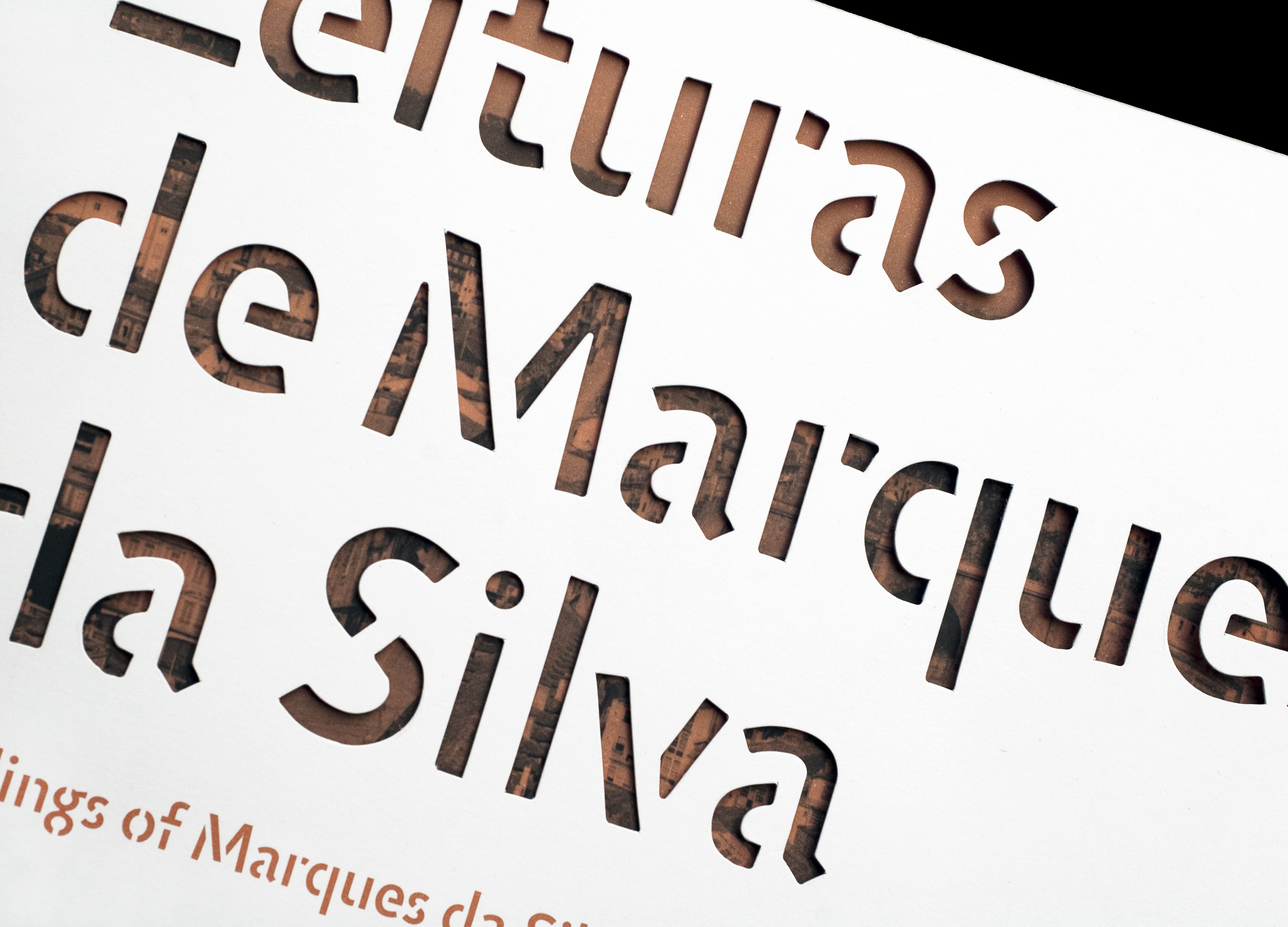
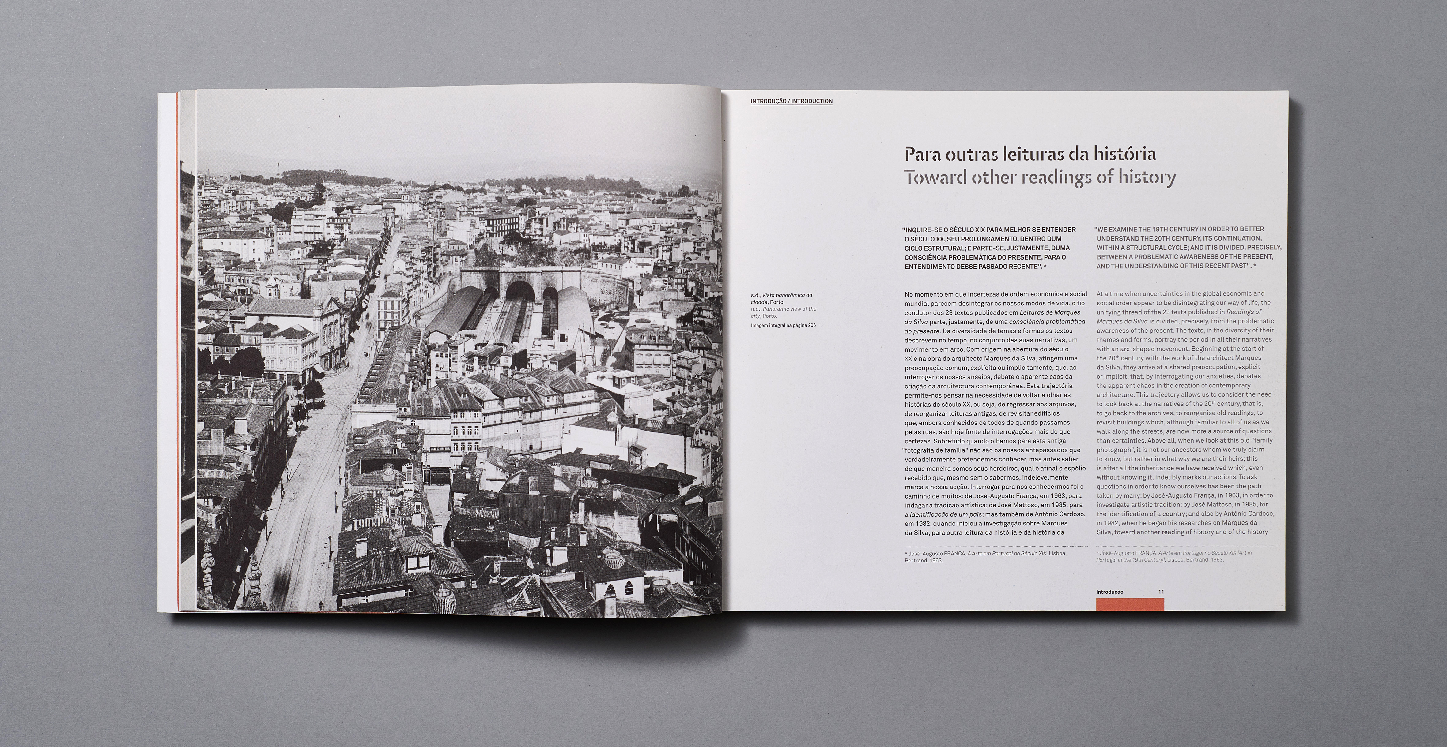
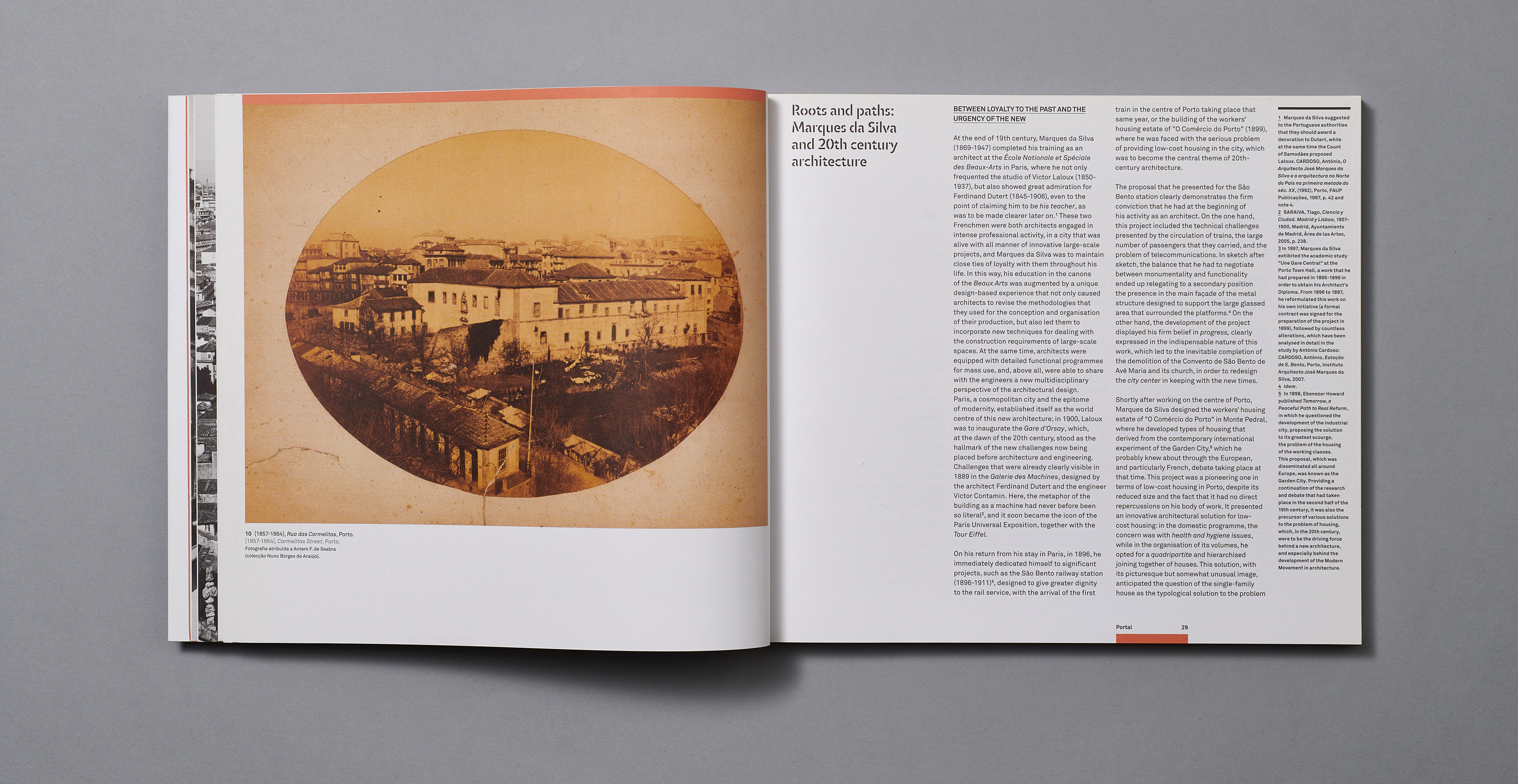
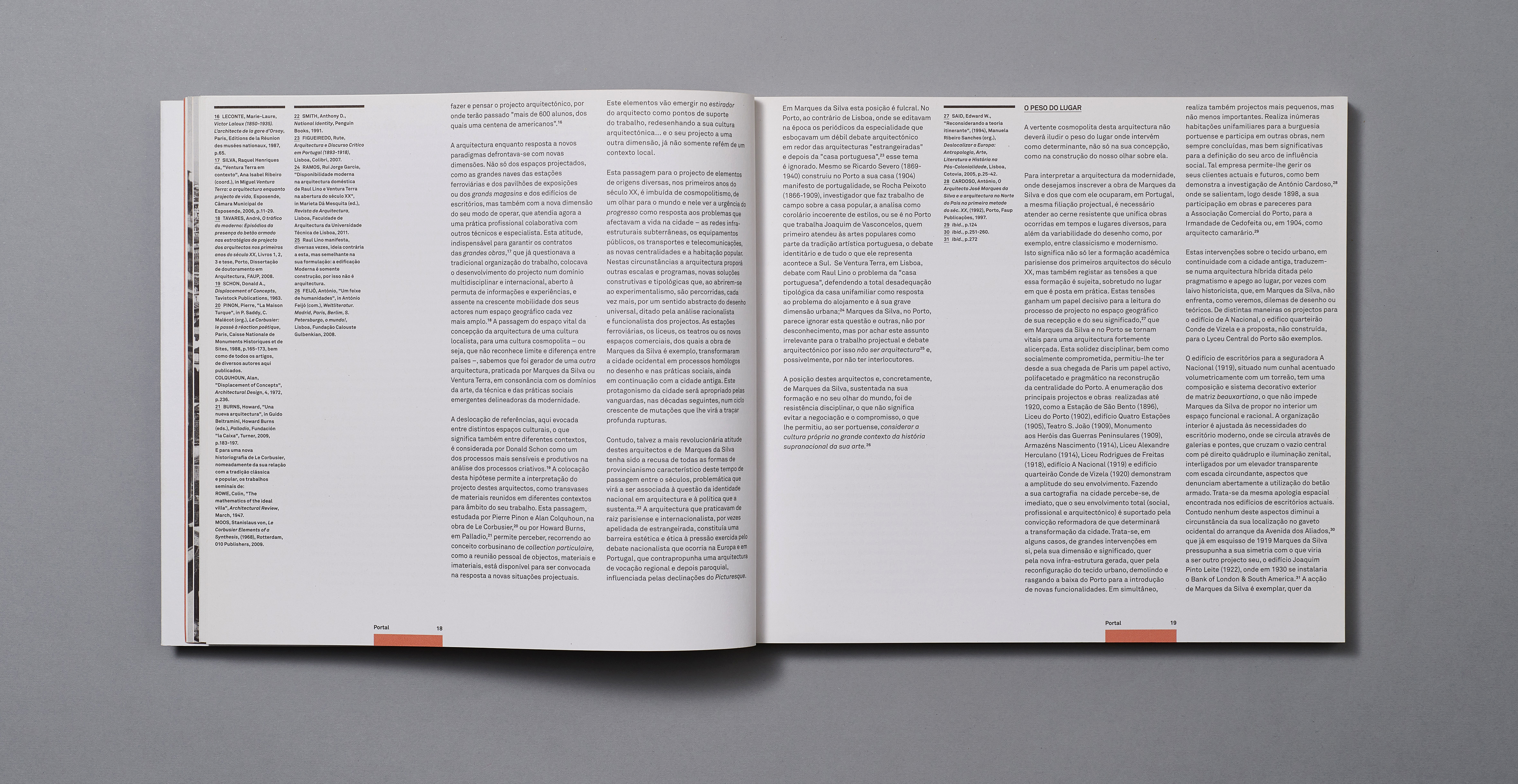
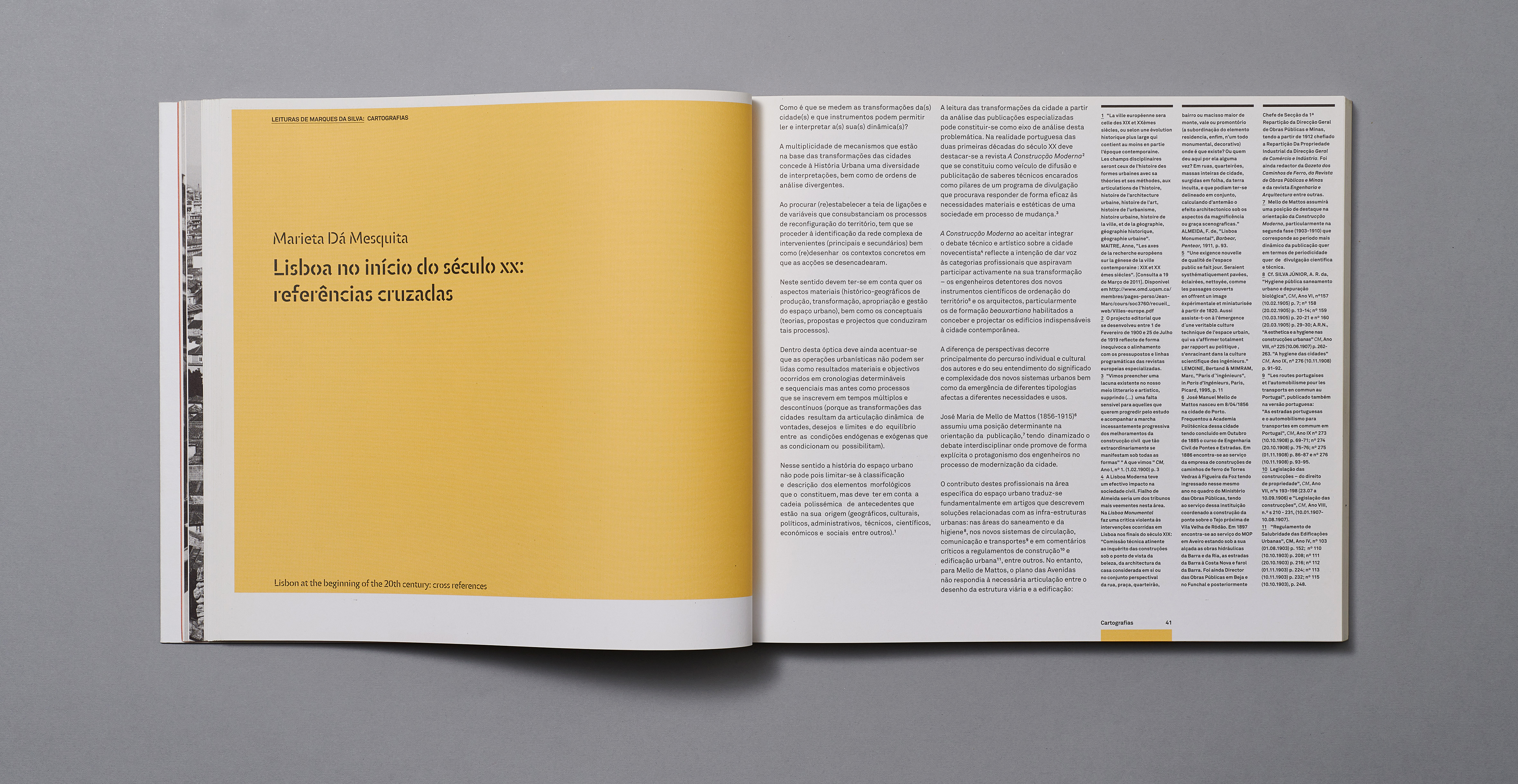
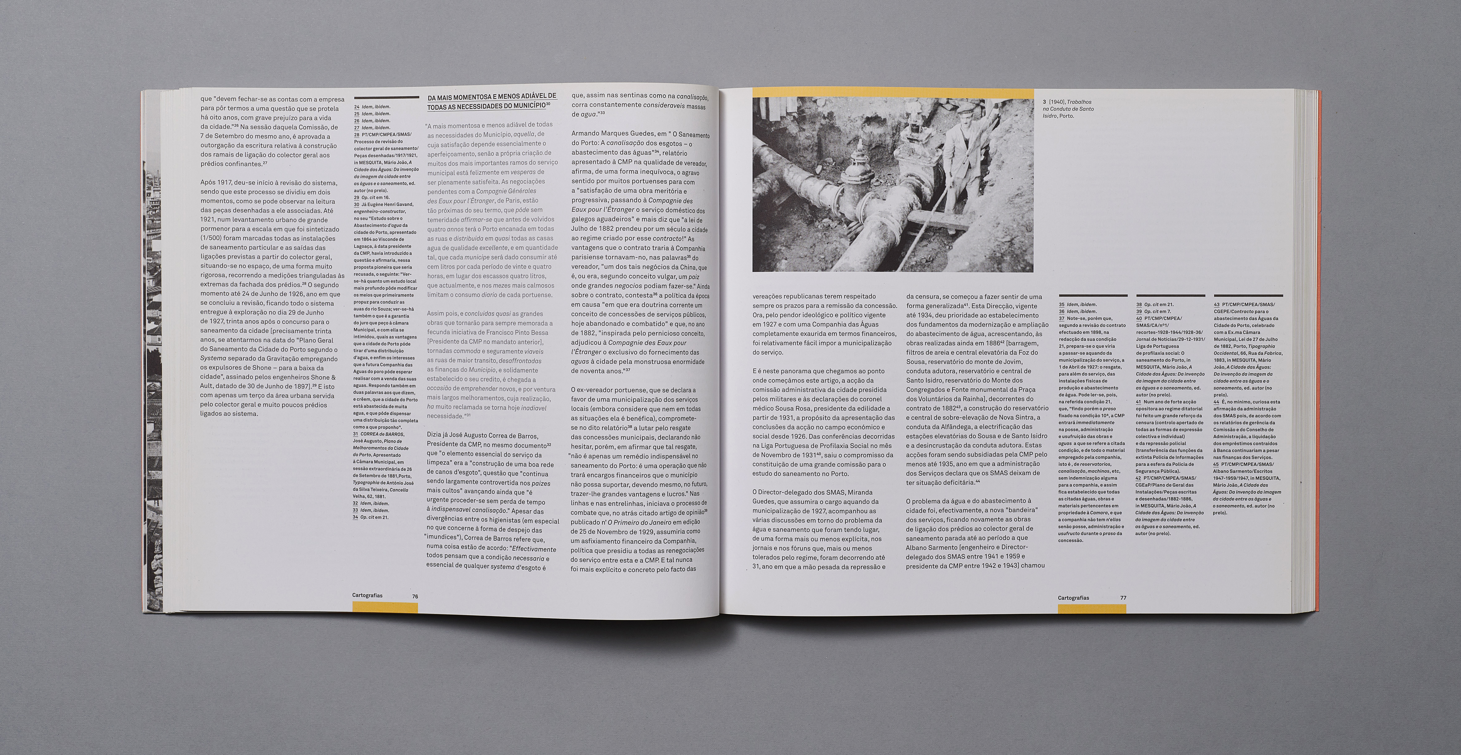
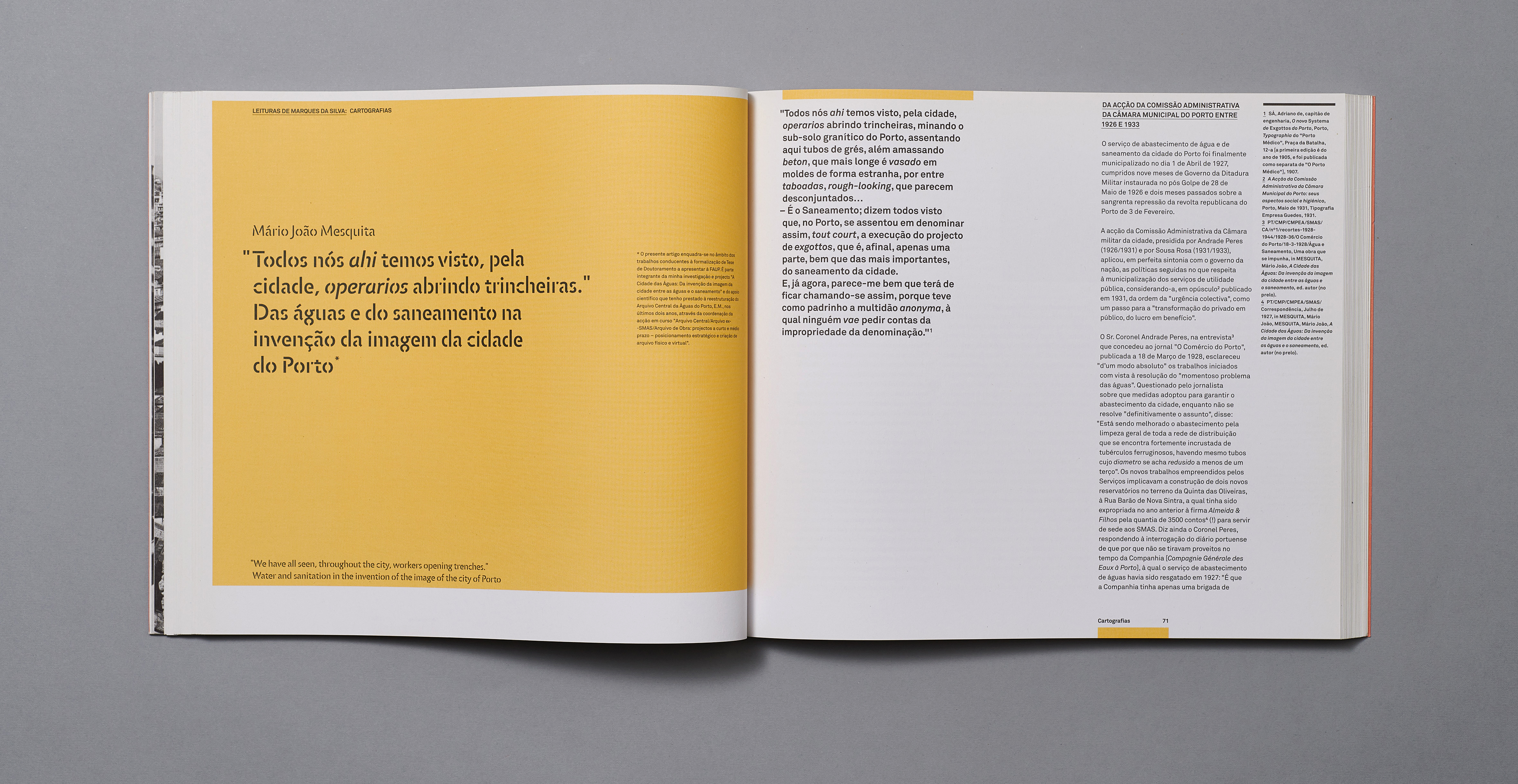
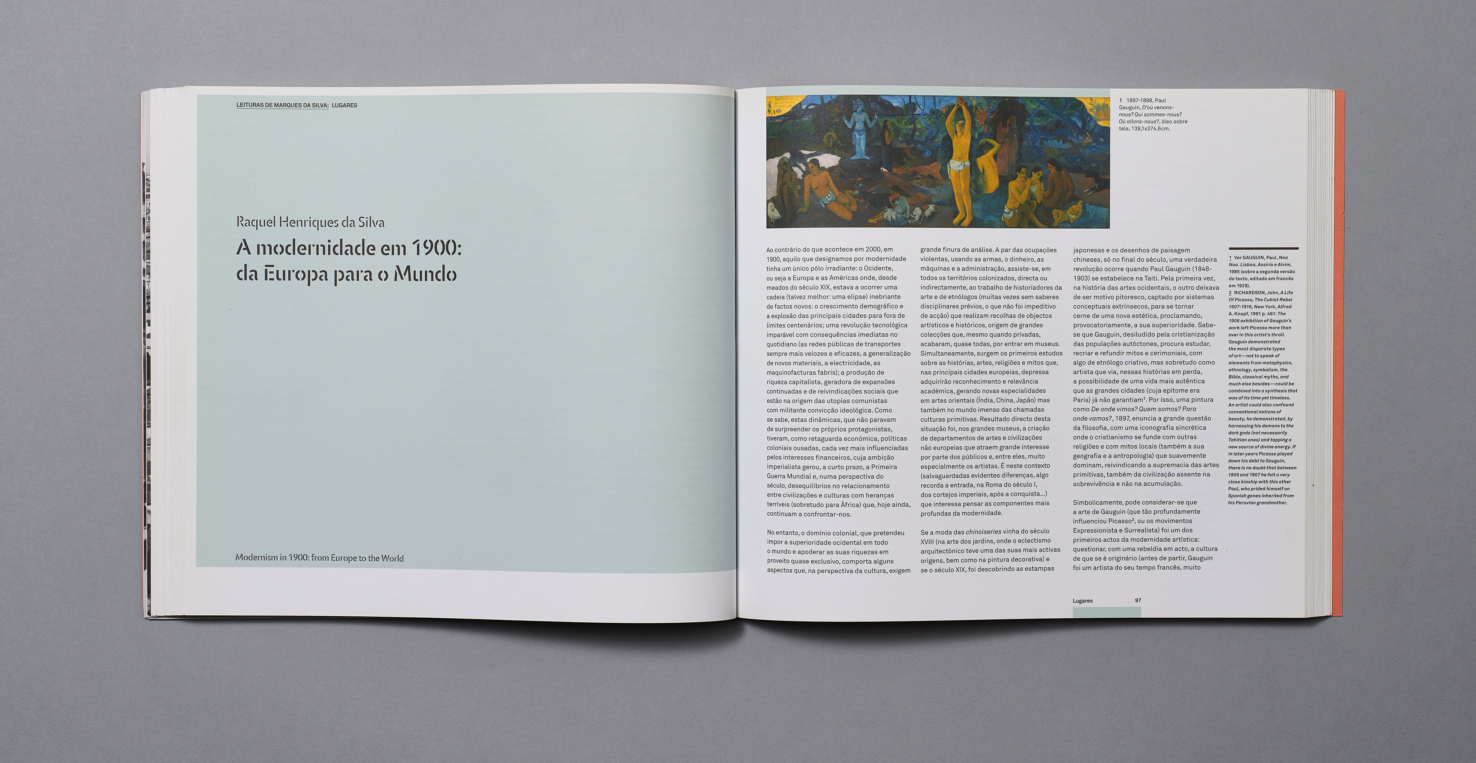
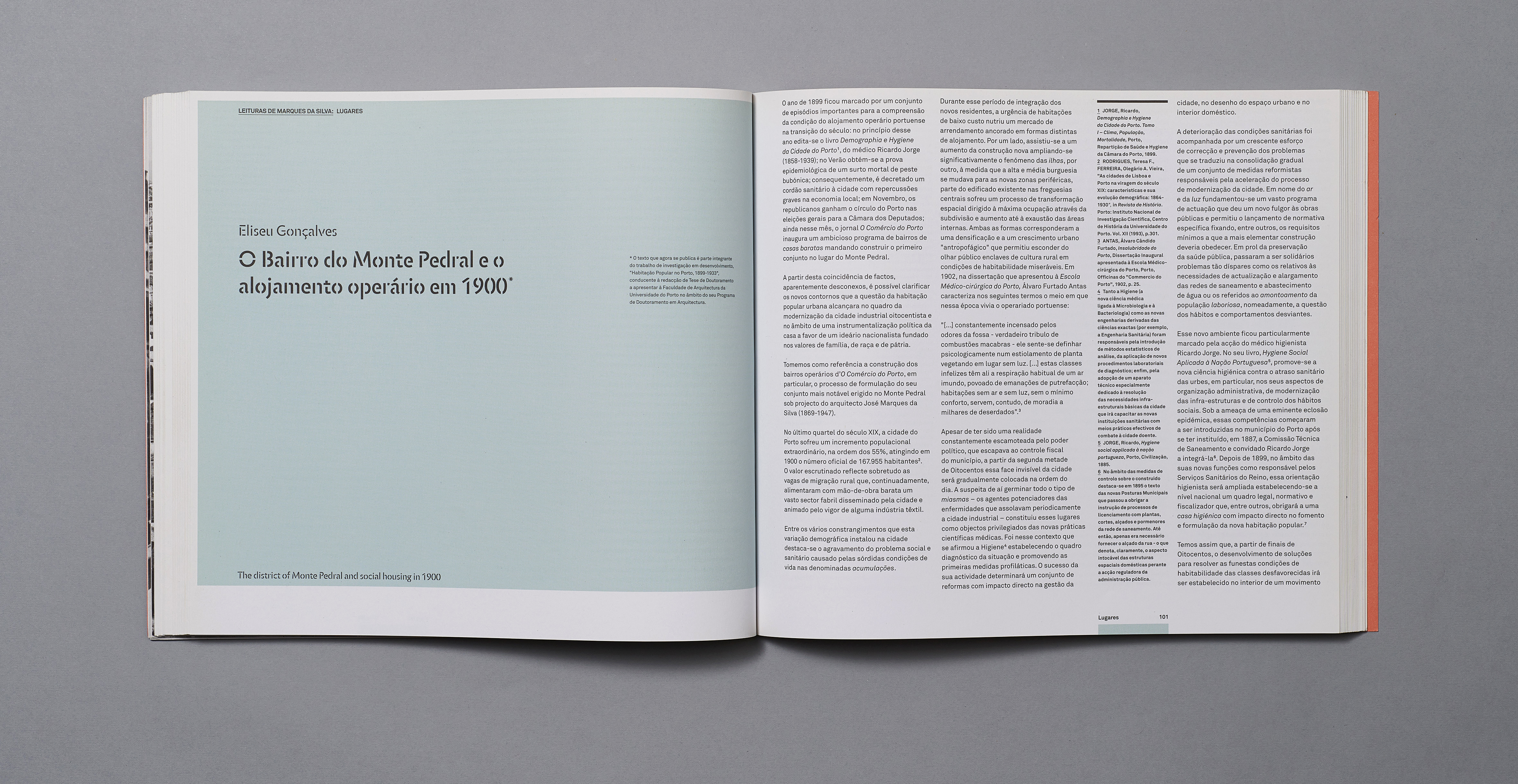
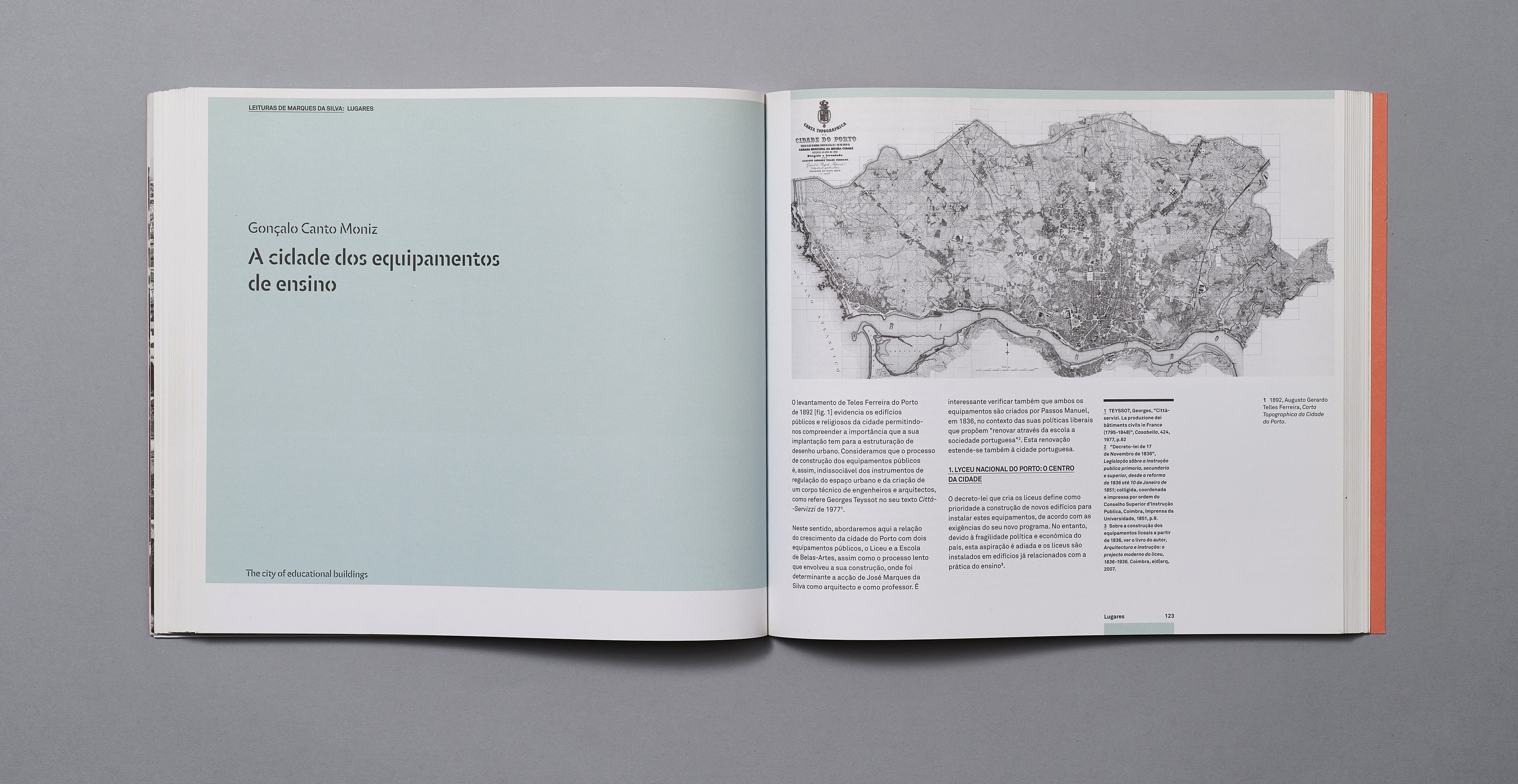
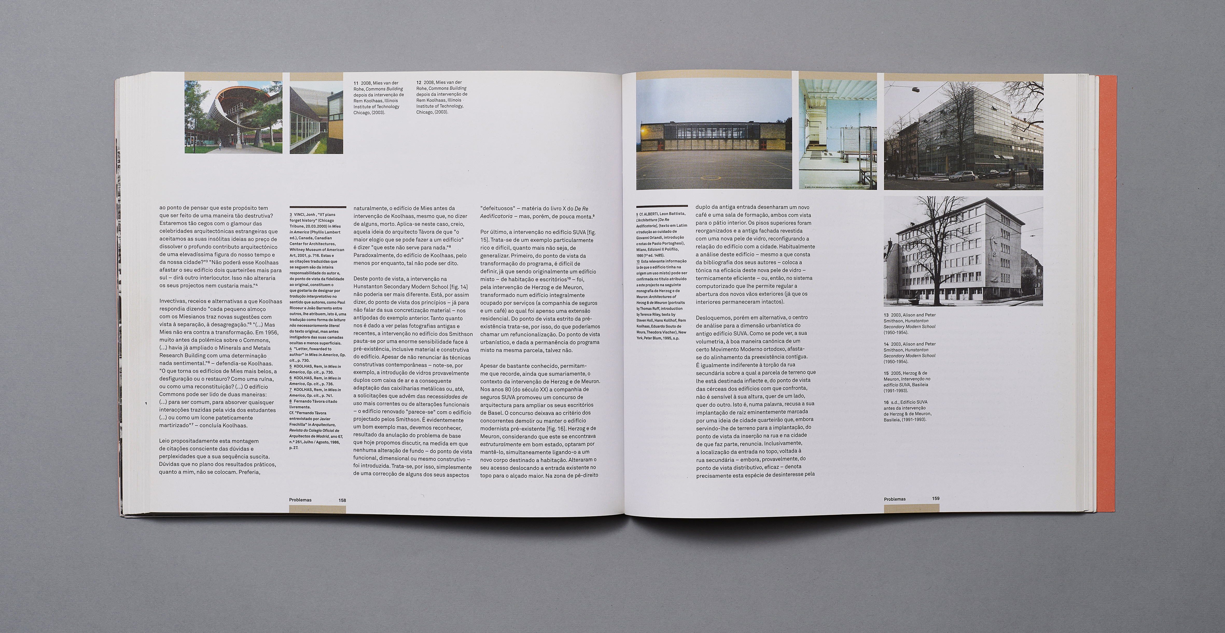
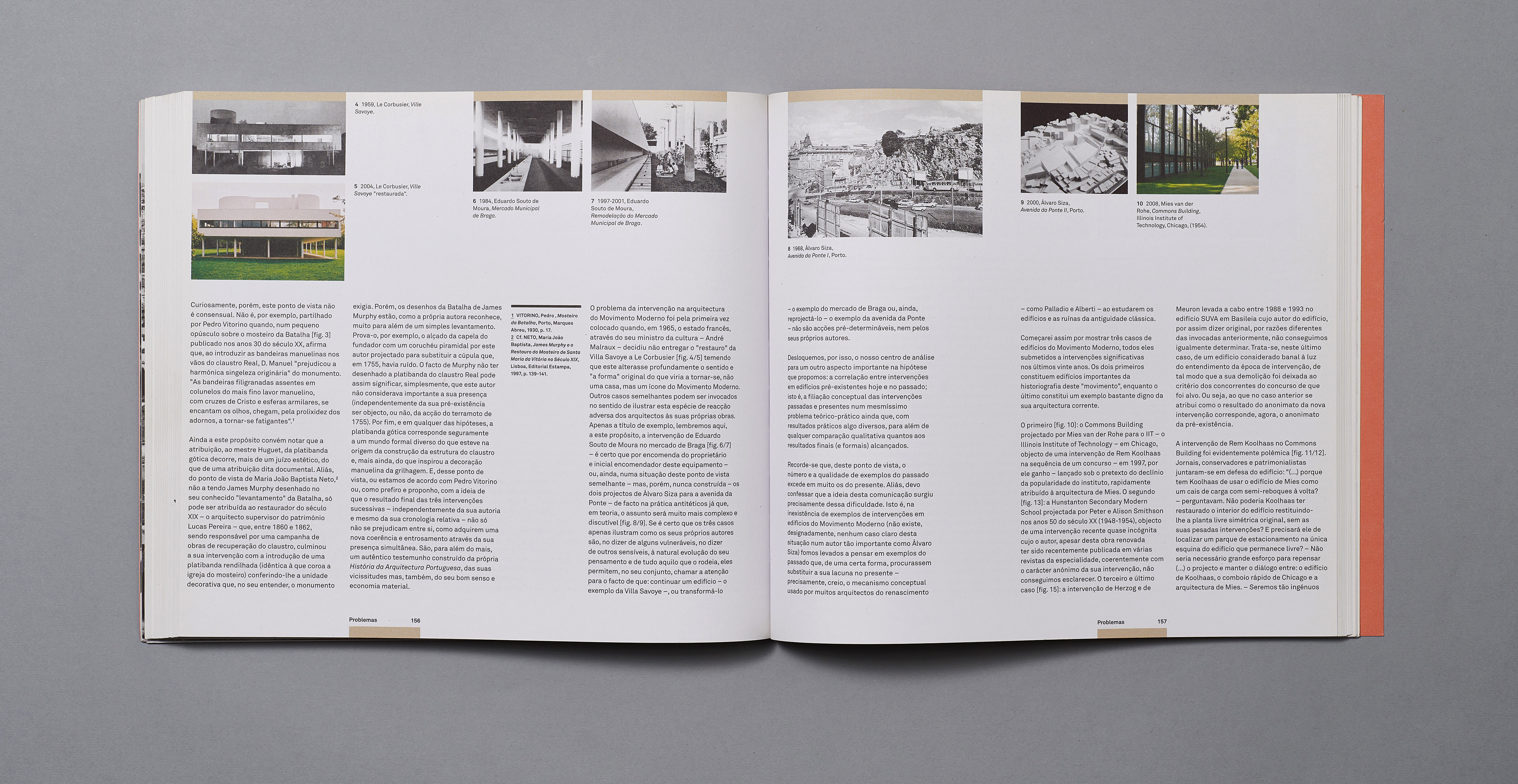
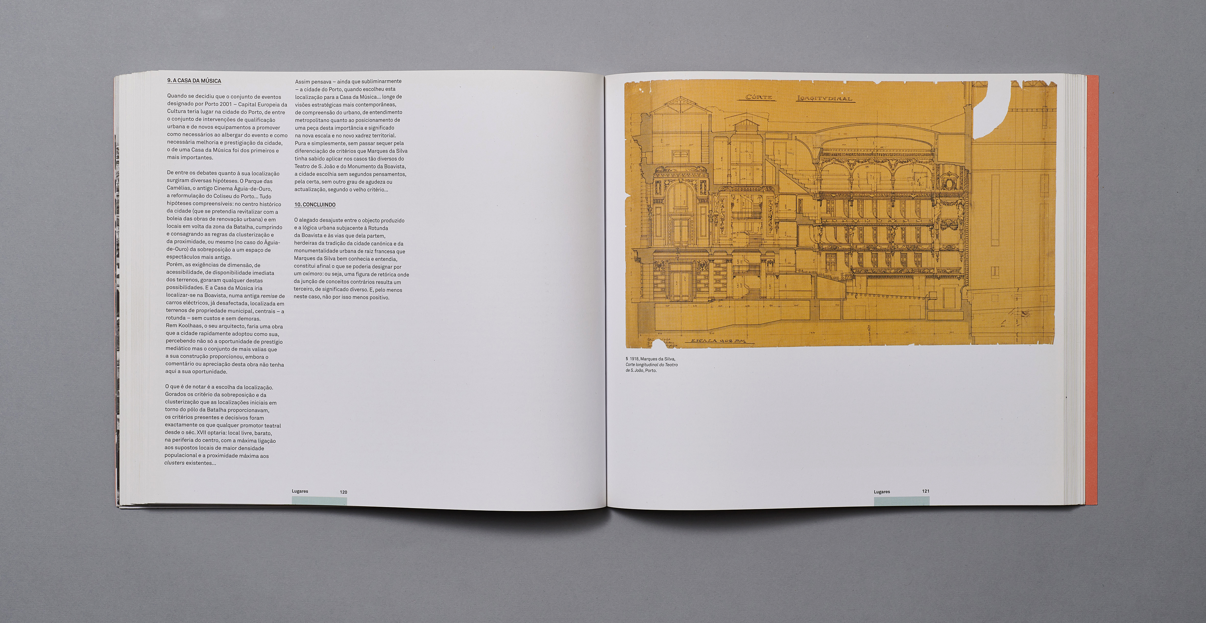
This complex book took 6 months to design. Following the Conference 'Recoonstuir Cidades; Cartografias a Partir de Marquea da Silva' which took place in 2009 (and for which we designed the graphic materials), the studio was originally asked to reproduce the conference papers in the form of a pdf to be made available on the Foundation website. This request later transformed into a request to design a book – a very different proposition. A very detailed but flexible grid was designed to be able to control the text image relationship. A general rule was established whereby images would run in the top section of the pages and exceptions were dealt with individually. Part of the adventure in the design of this book was to push the grid to it's limits with regard to the margins. For the cover design, an historic photo of Porto, printed on the reverse of the cover flap, is visible behind the cut-out letters of the title, reflecting a concept of being able to see the city through Marques da Silva.
Date 2011
Client Fundação Marques da Silva
Format 24cm x 27cm
Pages 216
Book photos by Nuno Moreira – https://www.numo.pt